Donut chart in Excel for Dashboard with Beautiful Design
Donut charts help visualize data structure in a compact and stylish format. Customization and interactive elements in Excel let you use this chart type on dynamic dashboards. This approach adapts the visualization to specific metrics, improves data perception, and makes analysis more convenient.
Beautiful donut chart template in Excel

The main feature of this visualization template is its functional design. The chart displays beautifully, and its design includes readable cursors and depth created by shadows. Learn how to build an interactive customized donut chart in Excel using our video tutorial. There you will see:
- Reviewing formulas in the source data table.
- Building a standard donut chart template in Excel.
- Adding a second data series to create cursors on the chart.
- Changing the chart type for the second series to scatter and adjusting settings.
- Adding a shape to design the background of the visualization block.
- Coloring all chart elements with a beautiful gradient palette.
- Adding buttons to control the pivot table and chart.
- Creating depth and volume with shadow effects.
- Testing the functional design with the chart’s interactive features.
See an example of how to use this beautiful donut chart effectively on a dashboard with dynamic design:
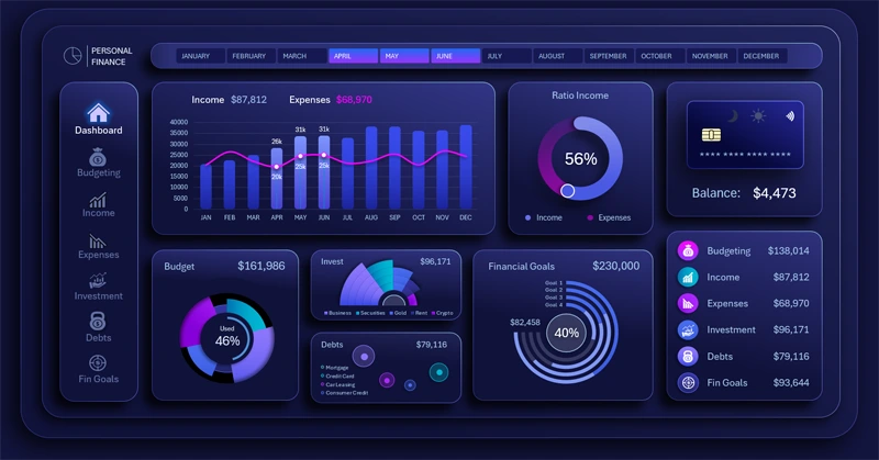
How to manage personal finances effectively in Excel
The interactive customized donut chart makes an Excel dashboard more visual and flexible. It helps highlight key data, improve design, and simplify metric analysis. Use this approach to create modern and attractive reports that are easy to work with.


Data Visualization Charts for Interactive Report Creation in Excel.
Dashboard Templates