Advertising Campaign Analysis Dashboard in Excel
Analyzing an ad campaign requires quick access to key metrics: reach, clicks, conversions, and return on investment. To simplify this process, it's convenient to use an interactive dashboard in Excel. This article presents a template that brings all metrics together in one view. The interactive Excel template allows you to filter data by reporting periods and instantly see the results.
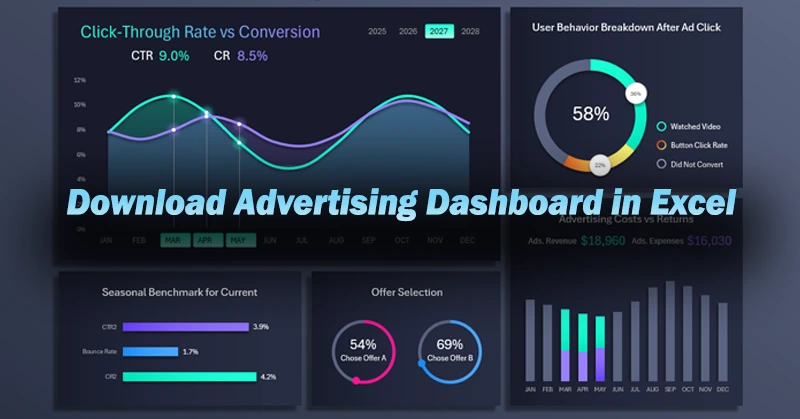
What Metrics Are Included in the Interactive Advertising Dashboard in Excel
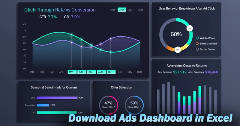
The interactive Excel dashboard makes your advertising report clear and easy to navigate. You can quickly assess the performance of different channels, compare time periods, and identify growth opportunities. This approach helps you promptly adjust your ad strategy and improve your budget efficiency. You can also create dashboards like this yourself by following the video tutorial, which shows:
- The base layout for data visualization in Excel.
- Preparing the raw data and setting up pivot tables.
- Adding slicer buttons as dashboard control elements.
- The first formula table used as the source for the main dynamic chart.
- How to create a clean, interactive curve chart for comparing conversion metrics.
- Building a bar chart to analyze the influx of new clients and monitor returning customers.
- Visualizing user behavior analysis after clicking on ads.
- Two pie charts to present audience preferences during an ad campaign.
- An example of how to clearly show seasonal benchmarks for the current month.
- A light version of the beautifully designed Excel dashboard.
- Presentation of the advertising campaign analysis dashboard in Excel.
If you want to learn more about the practical use and purpose of the visual elements in this dashboard, explore the following resources:
Excel Dashboard for Evaluating Advertising Campaign Performance
The ability to design and use Excel dashboards is a step toward more professional marketing management.


Data Visualization Charts for Interactive Report Creation in Excel.
Dashboard Templates