Interactive Excel Dashboard for Advertising Report
A simple dashboard template for analyzing ad campaign spending efficiency in Excel. Two interface design modes: light (day) and dark (night). Effectiveness is evaluated by the ratio of CTR to the conversion rate of visitors into buyers. You can download the ready-made dashboard example at the end of the article.
Excel Dashboard for Ad Performance Analysis
Advertising drives sales. But it’s important to remember there’s always a risk of wasting the advertising budget. Moreover, predicting ad ROI is nearly impossible. Every factor in the campaign affects the outcome—product quality, target audience, ad creatives, placements, and so on. Even lead handling and customer communication during deal closing matter.
Running an ad campaign is a continuous process requiring testing, regular analysis, and expense control. The risks are always high, but today nothing sells without advertising.
The idea that a good product sells itself or that a quality item doesn’t need advertising is a myth. This was proven by one of the most famous modern violinists, Joshua Bell. In January 2007, The Washington Post conducted a social experiment. Joshua Bell, a Grammy-winning musician, performed as a street musician in a Washington, D.C. metro station. He played a 1713 Stradivarius violin worth about $3.5 million. For 45 minutes, he performed complex pieces by Bach and Schubert. Over 1,000 people passed by—only a few stopped to listen. He earned just $32, $20 of which came from someone who recognized him. Even a great maestro playing a magnificent instrument with masterpiece compositions can go unnoticed without advertising.
As long as money exists, trade will exist. As long as trade exists, so will advertising. Trade is a natural interaction between people, based on exchanging surpluses for things in short supply. That’s why it always exists—as a way to balance human needs.
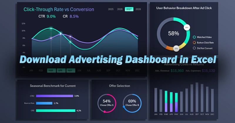
So how can you reduce the risk of poor conversion or wasted ad spending? Regular analysis is needed throughout the entire campaign. If you're a small business owner and the analytics provided by your ad platform are insufficient or unclear, you can use Excel. Learn to build simple yet useful interactive dashboard templates to analyze performance and control ad spending. What does such a dashboard look like? Let’s look at a real example.
CTR to Conversion Rate Ratio in Excel
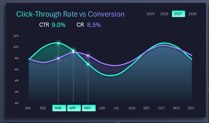
The first chart is two curves spanning the entire year. Remember, advertising is a continuous process that runs parallel to sales. Each month brings different click-through rates on your creatives (visual ad banners), but those clicks should be confirmed by solid conversions. This chart clearly shows which months had more appealing creatives that also converted well.
This visualization block includes buttons for switching between months. You can select multiple months at once to analyze quarterly, semi-annual, annual, or seasonal periods. In the example image, the spring sales season is selected.
In the top-right corner is a block of buttons for switching between years, also supporting multi-selection. These buttons affect the entire dashboard, not just the current block.
Seasonal Benchmark for the Current Month
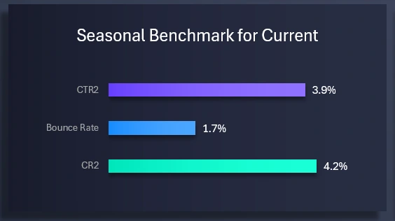
Below is a block for comparing the same CTR and Conversion indicators from a previous equivalent period. To distinguish them, a “2” is added to their names:
- CTR2 – Click-Through Rate from the previous reporting period.
- Relative bounce rate in percentage.
- Conversion Rate – from the previous period.
Truth is revealed through comparison. This lets us evaluate progress by comparing to previous results.
Offer Preference Analysis

In this visualization block, we compare which offer in the ad campaign was more appealing to the target audience. Don’t be confused if the total percentage of both offers exceeds 100%. That’s because some customers took advantage of both offers.
User Behavior Analysis After Clicking on Ads
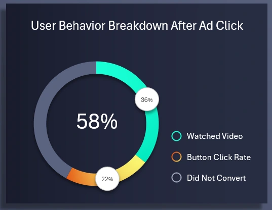
To understand the real reason behind low conversion, we analyze user behavior after they click on a visual interactive ad. The chart segments users into three behavior categories:
- Viewing the introductory information about the offer.
- Clicking the button to place an order.
- No action taken.
The third point is also important to consider, because a negative result is still a result.
Revenue and Expenses from Advertising
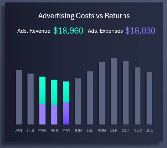
Finally, we arrive at the concluding bar chart that analyzes revenue generated solely from sales related to the advertising campaign. The chart displays revenue and what portion of it is taken up by expenses associated with generating that revenue via advertising. If the bar is fully purple, it means expenses exceeded revenue, and the expense bar may not be visible at all because it surpasses 100% of the revenue. Be cautious! If monthly expenses approach the amount of revenue, this is a serious reason to consider stopping paid ads.
Helpful tip about the template. To better view this auxiliary visualization block, you can make it the main focus on the dashboard. If you click the revenue and expenses bar chart in this template, it will automatically move to the main block position. At the same time, the click and conversion line graph will switch places with the bar chart.
Advertising Effectiveness Dashboard Template in Excel
This is a simple example of how you can use Excel to create helpful custom reports with interactive data visualization in dashboard format.
Download the Advertising Effectiveness Dashboard in Excel 
If you run a small business, you’ll have to work with advertising. Just as business is impossible without sales, today sales are nearly impossible without advertising. This was clearly demonstrated above through a real-world experiment. Learn Excel and create unique reports no one else has imagined, and gain a competitive edge with well-earned rewards for your creativity.

Data Visualization Charts for Interactive Report Creation in Excel.
Dashboard Templates