Interactive Calendar with Heatmap in Excel Template
In Excel, it's often necessary to visualize workload or activity across different workdays. An interactive calendar with a heatmap is a great solution. It shows the intensity of events by day using different color fills and updates automatically when new data is entered.
Benefits of a Heatmap in an Excel Calendar
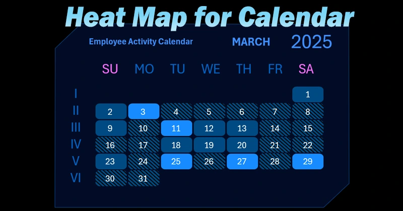
The heatmap calendar helps quickly analyze day-by-day and week-by-week data, highlight periods of high or low activity, and easily present the information in reports. You can learn how to build this type of heatmap for interactive dashboards by watching the training video. You'll learn:
- Template design for a new chart type layout in an upcoming Excel dashboard.
- Source data tables and formulas.
- Building the heatmap structure — a bar chart filled with different colored shapes.
- Formulas for processing source data to fill the heatmap with various colors.
- Creating control buttons for interactive work with the heatmap.
- How to build an interactive calendar in Excel.
An example of how a heatmap is used inside an interactive calendar on an Excel dashboard is shown in this overview:
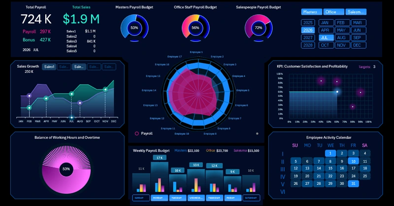
Excel Dashboard for Payroll Analysis in Small Business.
Just download the file, enter your data, and get a clear multicolored view aligned with calendar days directly in Excel.


Data Visualization Charts for Interactive Report Creation in Excel.
Dashboard Templates