Download Excel Payroll Dashboard for Small Business
Managing employee Payroll is an important task for small businesses. Companies with limited financial resources often cannot afford automated systems for managing employee compensation. Without such systems, it becomes much harder to control costs, bonuses, and overtime. It is also difficult to forecast Payroll expenses and build effective growth strategies.
Thanks to standard Excel features, it's possible to create alternative solutions suitable for small businesses. For example, you can use an Excel dashboard to manage and track Payroll. This article explores how Excel dashboards can help visualize Payroll data for small businesses.
Interactive Excel Dashboard for Employee Payroll Analysis
This dashboard template is designed specifically for small businesses. It doesn’t use macros, and no programming skills are needed to understand how it works. The Excel report is created for ease of use and low entry barriers. You can download the free template at the end of the article. To start working with the interactive dashboard, follow these three simple steps:
- Fill in your initial data in the “Data” worksheet.
- Press the shortcut CTRL+ALT+F5 – this will refresh all pivot tables in the Excel workbook.
- Start visually analyzing your data using the interactive dashboard.
If needed, you can customize the dashboard template to fit your business needs. The file is not password protected — feel free to edit and improve it. To learn how to create and edit data visualizations in Excel, use the video tutorial provided on this page.
Below, we’ll review each chart and graph used in the dashboard step by step. This will help you understand the business logic behind the structure of this Payroll report designed for small business teams. And if you don’t find all the necessary report blocks in this dashboard, here’s another option to consider: Excel Payroll Dashboard Template.
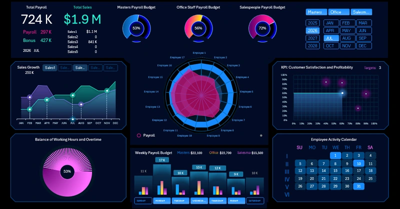
Summary Information at the Top of the Dashboard
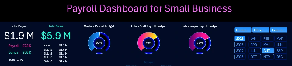
Following business intelligence dashboard design practices, the summary section with high-level metrics is usually placed at the top. Detailed information follows below. This template also includes a control panel with buttons at the top. On the left, you’ll find a summary table. In the center, there are three summary charts representing budget spending across three main employee categories:
- Payroll budget for skilled workers.
- Salary spending on office employees.
- Share of the Payroll and bonus budget used for sales staff.
On the right side are slicer buttons. These are linked to pivot tables that process data from the source tables. When selecting a new reporting period, all values update automatically. Multi-selection is supported as well. For example, by holding down the CTRL key, you can select three months to analyze Q1 performance. If you select only one employee category, the entire dashboard will automatically filter to show data only for that group. In this block, all slicers are interconnected. However, below this section, there are also independent control buttons for managing other visualization elements. We’ll cover those in the following sections.
Radar Chart for Payroll and Bonus Distribution by Employee
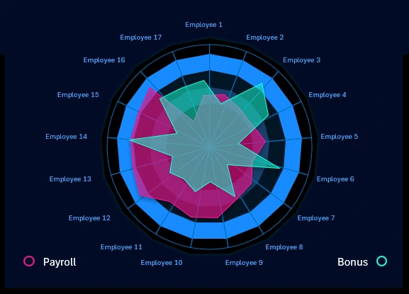
Small businesses usually have a limited number of employees. In this example, there are 17. This Radar chart (also known as a “Wind Rose”) displays two budget allocation schemes among company employees:
- Base salary – shown in pink.
- Bonus rewards – shown in green.
You can turn off the second scheme if needed. To do this, click on the Bonus label or the green circle next to it. As a result, only the background scheme will be displayed.
If we segment the dashboard by job categories, some filtered employees will be excluded from each budget allocation scheme for fair financial compensation and motivation.
Employee performance analysis
How to Create a Chart to Analyze Sales Growth Points in Excel
To make the most of such universal Excel reports, it's important to use them to analyze results from investments in employee motivation. That’s why it's reasonable to display a visualization block with summary analytics on sales performance. Small businesses, like any other business in any market sector, depend directly on sales. It’s their key KPI. It’s very logical to compare payroll costs and sales performance within one report.
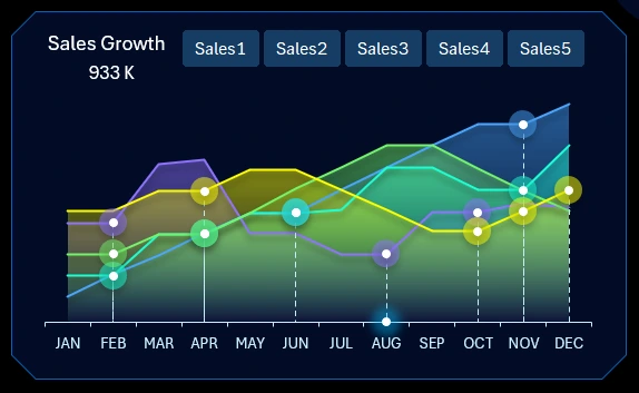
This visualization block includes its own set of buttons to improve readability and visual perception of indicators. For example, this block shows monthly sales over a year across five retail locations simultaneously. To make analysis easier and more effective, you can temporarily exclude some sales points. Thanks to autonomous slicer button connections, this can be done locally within this visualization block at the user interface level without updating source data or pivot tables. As a result, the report will look like the image below:
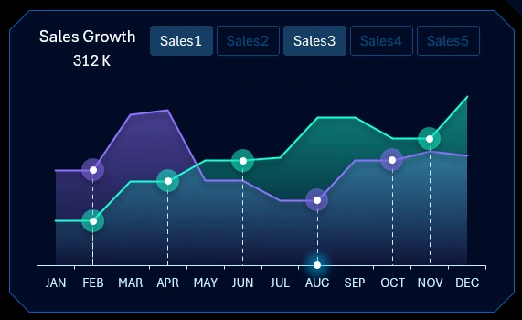
Now we can see that the user selected a multi-comparison of sales growth history for two retail locations: 1 and 3. It’s easy to analyze growth points, which are marked by circles on the lines. Likely, sales boosts were used after each slowdown or decline.
We can also compare sales indicators across two or more different locations. All other report data remains unaffected – which is an advantage in this case.
The point shown at the very bottom of the X-axis is the cursor indicating the selected month. In the image, August is selected. When multiple months are selected from the dashboard control panel, several cursors appear simultaneously. For example, if a quarter is selected, there may be three cursors. The pivot table at the top of the dashboard will automatically recalculate and update sales metrics for the selected reporting period.
KPI Report: business profitability and customer satisfaction
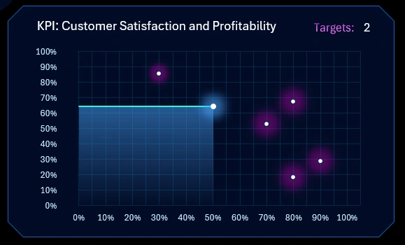
This visualization block is also linked to employee performance. Here, instead of sales, we analyze customers as a KPI. After all, customers are the source of sales and the most critical success factor for any business. The most important thing in any business – in one word – is the customer!
The chart is based on a “love” scheme. In this type of chart, the Y-axis always shows meaning level, and the X-axis shows satisfaction level. At the intersection of business profitability and customer satisfaction lies the “love point” between business and customer. It’s marked with a blue star. The love point always aims for the highest level. It should be located at the intersection of both indicators’ maximum values when the business achieves its main goal. Similar to how every business naturally tends toward monopoly, regardless of the owner – simply due to market nature.
The HR team and sales department are assigned interim goals by management. These are shown as red stars. As soon as the profitability or satisfaction level exceeds a star’s position, the star disappears from the visualization and counts toward the total Target score. The image shows that 2 goals have already been achieved.
This is an interesting approach to achieving key goals not only through financial rewards or control but also using gamification. This is a modern method of personnel management. It works effectively even in small businesses. The goal of the game is to complete all interim objectives and reach the highest level of mutual love between the customer and the business. The key is for management to have strategic skills and set intermediate goals that are both ambitious and achievable.
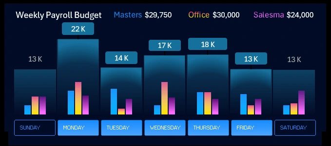
Weekly chart of payroll budget spending
How to Create a Weekly Chart in Excel
This combined weekly bar chart analyzes the pace of hourly wage accrual for employees throughout the workweek. The data is presented as average values. Each workday is segmented into three bars for three employee categories. One main bar summarizes all three values into a single total.
This block also has autonomous buttons for local use. Their control scope does not extend beyond this chart. Multi-selection is also supported. For example, you can select only the workdays’ values – as shown in the image above.
Work time balance
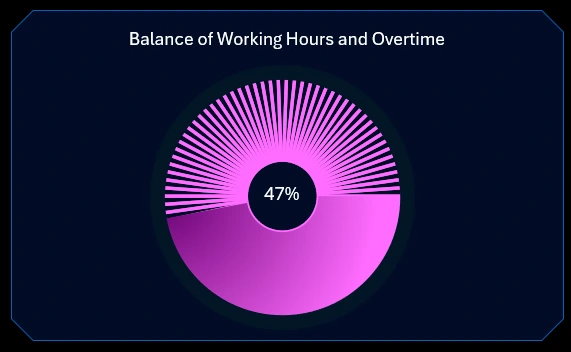
The chart presents the balance between standard scheduled working hours and overtime hours, which require additional funding to maintain motivation.
Interactive heatmap calendar in Excel
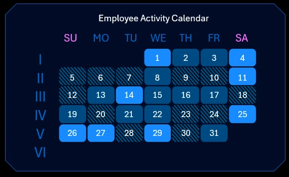
How to Create a Heatmap Calendar in Excel
This chart is a heatmap of daily business activity throughout the month. The brighter the cell color on the heatmap, the higher the recorded activity on that calendar day.
The dashboard’s data processing structure requires a separate sheet for entering source values for this block. These should be entered on a separate Excel worksheet called “heatmap-DATA”:
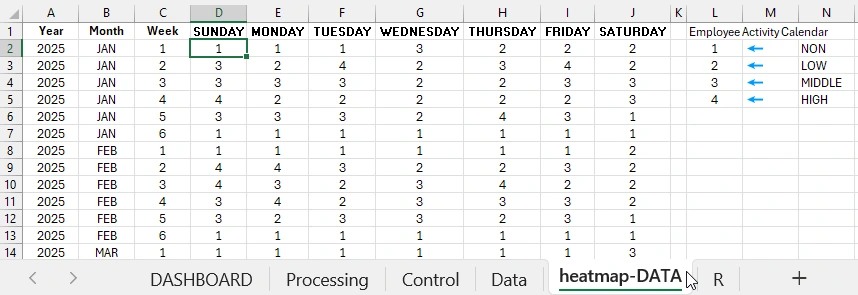
The algorithm for filling in the table is simple. If the value is:
- – An empty cell means it's not a calendar day of the week on the heatmap.
- – Low activity.
- – Medium activity.
- – Maximum activity level.
Each month cannot contain more than 6 weeks. So fill in the table according to the calendar using the 4 parameters of the algorithm:
- year – first column;
- month – second column;
- week number of the month – third column;
- day of the week – all following columns correspond to days of the week.
There should be no empty cells in this table. For example, if there are no calendar dates in the sixth week, the value should be set to 1. In all cells where there can’t be a calendar day or there was no business activity, enter 1. All other cells are filled according to the algorithm.
Interactive report presentation for payroll analysis in Excel
The Excel dashboard is a simple and useful tool for small businesses. It helps visualize payroll data, increase transparency, and simplify decision-making.
Download the Payroll Dashboard for Small Business in Excel 
Use the ready-made template as a base and adapt it to your company's needs. It will help you save time and avoid mistakes in strategic calculations. You'll also be able to respond promptly to potential employee-related issues. Data visualization will help you not only grow but also track your growth at every stage of achieving your small business scaling goals. If you have any questions about this template, feel free to ask them in the comments on the YouTube video.

Data Visualization Charts for Interactive Report Creation in Excel.
Dashboard Templates