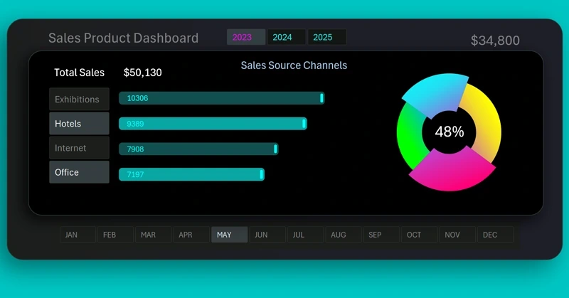
Dynamic Donut Chart with a cursor in Excel
Interactive data visualization helps you understand metric changes faster and respond to them in time. A dynamic donut chart with a cursor in Excel allows you to control values directly on the dashboard and instantly see the result. This approach makes reports more visual and modern.
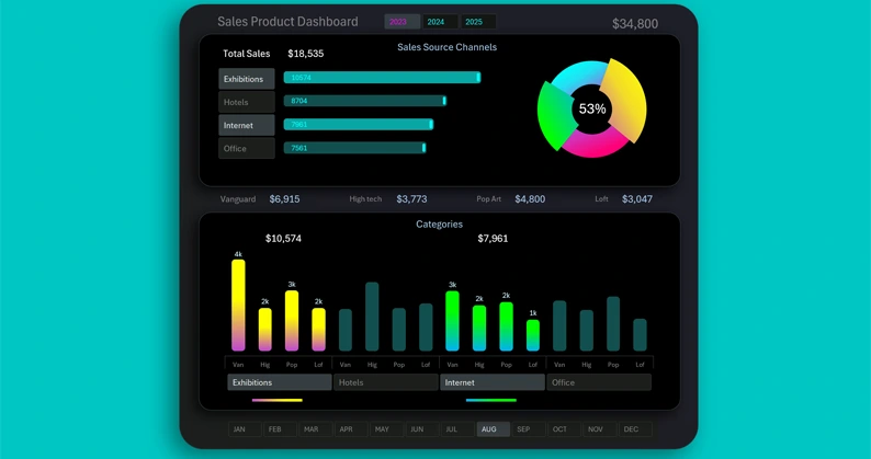
Template for a Visualization Block with a Chart and Histogram in Excel
Download the dynamic donut chart with a cursor in Excel for interactive metric display. The Excel file with the template is available at the end of the article. Real-time value control makes visualization clear and convenient for dashboards. Using the ready-made example, you will quickly understand how interactive data visualization in Excel works.
To learn how to create such templates yourself, watch the short tutorial video that shows the visualization development process in Excel.
After mastering this technique, you will quickly learn how to build full dashboards for report presentation. Example of using a dynamic donut chart:
Dashboard for data segmentation and sales grouping in Excel
Interactive data visualization helps you understand metric changes faster and respond to them in time. A dynamic donut chart with a cursor in Excel allows you to control values directly on the dashboard and instantly see the result. This approach makes reports more visual and modern.


Data Visualization Charts for Interactive Report Creation in Excel.
Dashboard Templates