Simple and useful Excel Sales Dashboard for Small Business
A mini dashboard template for visual analysis of testing sales of a new product assortment across different categories and markets. This Excel dashboard helps identify new insights for developing and scaling a small business by expanding the product lineup. The dashboard’s interactive features allow you to segment and group source data for convenient and effective analysis or presentation.
Excel Dashboard Template for Product Sales Analysis
The main point in business is added value, not profit. Can a business exist without profit but with added value? Yes! Most small businesses operate without profit during the first two years, but the added value they create provides benefits that customers are willing to pay for. A successful entrepreneur should focus on creating added value, while profit becomes a positive side effect.
How can you explain added value in simple terms? Very easily - with an example.
Every book, like any product, has a production cost. For example, the paper itself costs a certain amount of money. But an interesting story or useful information in that book adds value to the paper. That is why a well-written book always costs more than the market value of the paper it is printed on.
A business that creates added value increases the efficiency of using natural resources and human labor. Such a business is always destined for success.
In economics, just like in nature, there is no concept of “right” or “wrong” - only efficient and inefficient. Anything that uses resources inefficiently must be eliminated, and everything that uses resources efficiently must be developed. In business, the key criterion of efficiency is added value. Creativity should always be added into business, rather than relying solely on cold calculations. If cold calculations were the main criterion of success in business or sales, all mathematicians would be the best entrepreneurs or salespeople - but they are not.
To understand where you may be more effective than others in terms of creating added value, answer three simple questions:
- What does the market need?
- What can I do?
- What do I want to do?
Your maximum effectiveness today lies at the intersection of these three paths.
Creating a small business is simple. You need to follow these four steps:
- Build a hypothesis - the expected added value should already be noticeable even at the stage where you play with numbers and imagination in an Excel sheet.
- Test and analyze the hypotheses.
- Create a business plan based on real test results.
- Execute the plan to achieve the first positive sales results.
This way you create a project - your first iteration of executing the business plan. Further iterations become the business process.
Fun fact! All wealthy people focus on processes, not results! Meanwhile, all poor people focus only on results. Of course, processes without results lose meaning, but processes are always the true source of wealth — just like they are the source of results.
You will need to repeat these four steps regularly, not only at the start of a business project. For example, sooner or later you will need to scale your business by expanding your product range. You will again need to build a hypothesis, test it, create a plan, and execute it. Most beginners frequently skip the second step - testing. This is a big mistake!
To help you stay creative and easily play with imagination and numbers in Excel while building hypotheses, and to track test results at the second step, use this simple mini dashboard for sales analysis.
This dashboard template helps evaluate the performance of different product categories across different markets and visually analyze the strongest correlations in results.
The main advantage of this mini dashboard is its segmentation and grouping features using pivot tables. All of this is displayed on an interactive data visualization in Excel.
Excel Dashboard for Product Sales Testing Using the 4x4 Formula
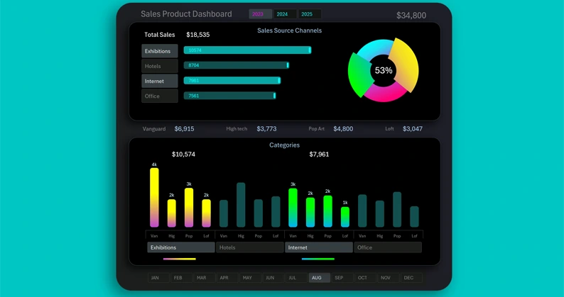
The interactive mini dashboard in Excel consists of three visualization blocks and four blocks of control buttons.
The first visualization block shows the total sales scales across different markets:
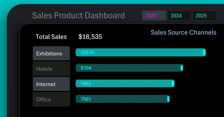
On the left side is a set of buttons for switching between markets on the dashboard. You can select multiple markets at once or all of them simultaneously. The illustration shows how two sales sources were selected: exhibition centers and online platforms.
The top control block allows switching dashboard data by year. You can also select multiple years or the entire period at once.
The value shown in the total result is the sum of sales volumes only for the selected markets.
Market Share Chart
On the right is a chart with a cursor:

Each segment of the chart represents the share of a market in the total sales volume for the selected period. If a market is selected using the button on the left, its segment increases in size. That means the selected market segment is highlighted with a cursor and visually enlarged compared to other segments. If two markets are selected, the chart will display two cursors.
The label in the center of the chart is the percentage share of the selected markets highlighted by cursors in the total volume.
The label in the top-right corner shows the total sales volume for all products across all categories and markets during the selected reporting period.
Bar Chart with Category Grouping by Markets
The bottom part of the dashboard features a bar chart with 16 columns:
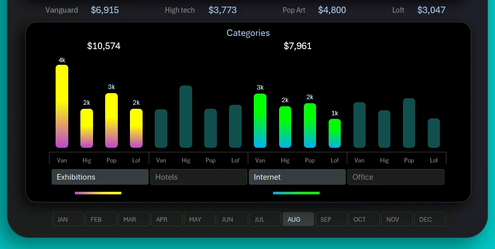
During testing, products from four top categories were sold across four different markets. Each category showed different performance on different markets as a result of testing.
The button panel controls switching between groups. You can select multiple data groups at the same time.
At the very bottom of the dashboard, there is a horizontal button panel for switching between months. You can also select multiple months simultaneously to set other reporting periods such as a quarter, half-year, sales season, and more.
The data labels at the top of the lower visualization block show the total revenue for each category across all markets for the selected reporting period on the dashboard.
Simple and Useful Dashboard for Small Business
Excel is the most accessible tool for data visualization. Accessibility applies not only to cost but also to learning and global availability:
Download the small business sales analysis dashboard in Excel 
This dashboard does not require special skills from modern users to work with or create interactive reports without using macros. All interactive features and automation are implemented through standard tools: formulas and pivot tables with slicers in Excel.
As shown in our examples, Excel is not only a universal analytical and computational tool. It is capable of much more. Moreover, the simplicity of Excel will prevent it from being replaced by artificial intelligence. The human brain will always appreciate the feeling of control at work. The feeling of control creates a sense of power, and the need for power equals the need for human development. For the same reason, artificial intelligence will never replace a simple calculator, as paradoxical as it may sound.

Data Visualization Charts for Interactive Report Creation in Excel.
Dashboard Templates