Epic Agile project management dashboard in Excel
Managing an Agile project requires transparency of workload and execution dynamics. An Excel dashboard with an Epic Burndown chart allows you to track remaining work, team velocity, and alignment with the plan across sprints.
How the Epic Burndown chart works
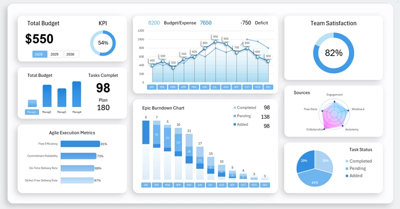
The Burndown chart displays planned and actual task burn lines as sprints progress. In Agile project management methodology, sprints are regularly supplemented with new tasks. This directly affects performance dynamics. To effectively monitor these changes, a specialized Epic Burndown chart was developed. Each project implementation проходит через серию этапов в несколько спринтов. Each bar represents one sprint and consists of three clusters:
- New tasks.
- Tasks in progress.
- Completed tasks.
The dashboard displays the entire project lifecycle over a three-year period. Agile management often requires extended time horizons and can represent a continuous process lasting many years, as projects frequently generate value already during the implementation phase.
Analytical advantages of an Excel dashboard for an Agile team
Every project has a starting point, peak phase, and completion stage. To clearly understand the current stage of an Agile project, data visualization is essential. Each visualization block on the dashboard supports in-depth analysis of project performance indicators. All blocks are described in detail here:
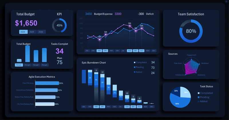
Epic dashboard for Agile project management in Excel
The Excel dashboard with an Epic Burndown chart transforms sprint data into a structured management control system. It helps to:
- Identify deviations from the plan.
- Adjust priorities.
- Maintain a sustainable project execution pace.
The template ensures transparency and predictability of results.
Download the consolidated logistics analysis dashboard in Excel

Data Visualization Charts for Interactive Report Creation in Excel.
Dashboard Templates