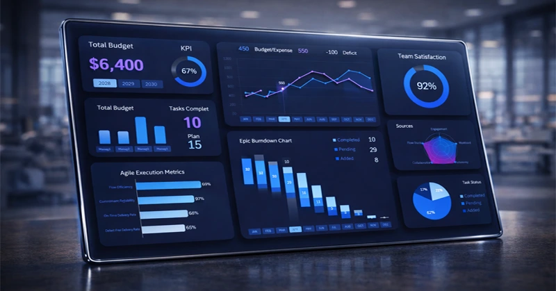
Epic Burndown Chart in Excel Dashboard Project Management
With Excel, you have the ability to create effective dashboards for agile project management. Such dashboards feature specialized charts: epic burn-down charts, sprint cycles, story point charts, and more. You won’t find these in the standard set of Excel chart tools. However, thanks to Excel’s flexible data visualization capabilities, you can assemble your own custom charts like building blocks. Moreover, you can make them interactive with a polished and presentation-ready graphic design. Let’s take a closer look at this template as an example.
Agile Project Management Dashboard Template in Excel
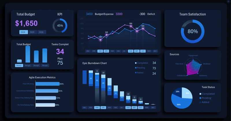
This dashboard presents the current state of a project across multiple metrics, which are well structured and designed with a clean visual style for fast and easy information perception.
Four button blocks allow users to interact with the template. You can filter reports by managers or combine them into groups using multi-select functionality with Excel PivotTable slicers.
The main data visualization is the epic task burn-down chart. This is a clear example of how Excel allows you to build unique charts tailored to specific user needs, add interactivity, and apply a comfortable and visually appealing design. Let’s take a detailed look at all visualization blocks, their purpose, and how the dashboard works as a whole.
Epic Task Burn-Down Chart in Excel
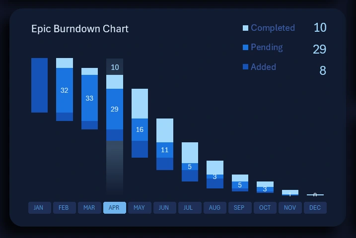
Each bar represents one task sprint and consists of three parts:
- The lower cluster of the bar shows the volume of added tasks.
- The middle cluster represents the number of tasks in progress.
- The upper cluster shows the number of completed tasks.
The quantities of all three task categories are visible not only on the chart itself but also in its legend. The values are also summed when multiple bars are displayed simultaneously on the chart.
The lower clusters do not display value labels on the bars to avoid overloading the user with excessive symbols. The volume of added tasks in absolute values can always be viewed in the legend when selecting a single bar or a group of bars.
When switching the year or manager on the dashboard, the epic task burn-down chart updates automatically.
This type of visualization is widely used in agile project management, where cycles and a steady team work rhythm are critically important.
Monthly Budget Spending Control Chart
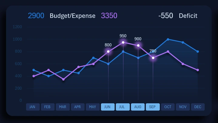
Every project has its own budget and implementation costs. A prominent area of the dashboard displays a chart comparing actual expenses with planned budget amounts for each month of the annual budget.
The chart’s data labels show absolute values for both metrics, which are summed when analyzing multiple months simultaneously.
At the top of this visualization block, there is also a label displaying the total budget deficit value. If the purple expense curve rises above the blue budget curve, a negative budget balance value appears for the selected reporting period on the dashboard.
Each manager is responsible for their allocated share of the budget. Therefore, when switching between managers, the chart curves update automatically and accordingly.
Dashboard Control Panel
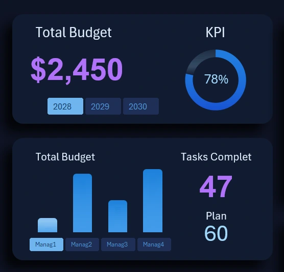
These two blocks should be considered as a single element because they are closely interconnected.
The first value in the upper-left corner represents the remaining budget amount. This budget metric is calculated using a slightly different formula than the previous one. When switching between months, this value continuously decreases, as it represents the remaining budget balance for the current month of the current year for the selected manager or group of managers.
Below is a block of buttons for switching between years on the dashboard. PivotTable slicers allow multi-selection of values in Excel, which is extremely convenient.
Below that, a vertical column chart displays the number of completed tasks in the team for each manager. Instead of traditional value labels on the X-axis, the chart uses labels from interactive buttons to switch between managers on the dashboard. The slicer multi-select feature allows you to analyze managers as groups or all at once. During this interaction, all dashboard data updates automatically and consistently.
On the right side, there are two absolute metrics:
- The planned target number of assigned tasks.
- The actual number of completed tasks for the current month (or another reporting period: quarter, year, or half-year).
The ratio of these two absolute metrics forms a third relative KPI metric for plan completion. It is displayed in the block above, also on the right side, in the form of a doughnut chart. That is why these two blocks are so tightly connected.
It is also worth noting that the KPI plan completion chart is capable of displaying values above 100% when the plan has been exceeded.
Team Satisfaction Metrics for Working on the Project
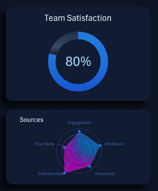
On the right side of the dashboard, at the same level, there is also a pair of interconnected data visualization blocks.
At the top, a large doughnut chart is displayed as a relative total value in percentage terms. The dashboard controller can manage this metric within a range from 0% to 100%.
The lower block shows the structure from which the final value in the upper block is formed. Employee satisfaction is evaluated using points on a 10-point scale across one of five factors:
- Engagement
- Workload
- Autonomy
- Collaboration
- Flow state
The radar chart clearly shows which factor has the greatest influence on team satisfaction and which one significantly lags behind compared to the others.
If the overall satisfaction score at the top is below the desired level, it is worth diving deeper into the radar chart below to analyze key cause-and-effect relationships in more detail. This allows issues to be corrected quickly and their occurrence to be monitored under specific conditions.
Percentage of Completed Project Tasks
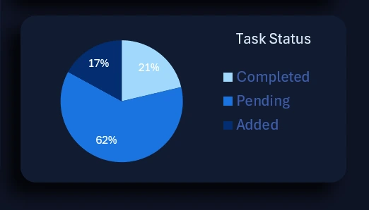
The next visualization block is closely related to the epic task burn-down chart. The pie chart provides a helicopter-view overview of the situation. In other words, it presents the overall task completion progress segmented by task type in percentage terms. The data is selected within the defined range and takes all applied conditions into account. The total volume of tasks is segmented into three core categories:
- Completed.
- In progress.
- Newly added tasks.
As a result, the dashboard provides all essential information about the project’s state in both absolute and relative values.
Additional Agile Project Performance Metrics
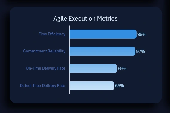
In the lower-left corner is the final block that has not yet been reviewed on the dashboard. It displays a ranking of activity metrics for additional agile project performance indicators:
- Flow efficiency
- Commitment reliability
- On-time delivery rate
- Defect-free delivery rate
The higher the percentage, the better the performance and the higher the metric ranks. When values change, the ranking is automatically sorted in descending order.
Download the Agile Project Management Dashboard Template
All data visualization blocks are harmoniously combined into a cohesive dashboard composition with interactive capabilities in Excel. This template also includes a light version of the classic data visualization design for comfortable use on bright days:
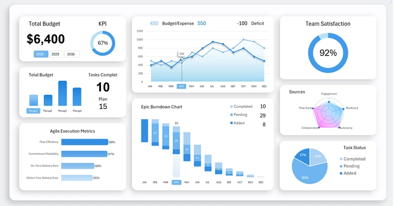
The project manager can now receive timely information about changes in project status in a visual format. Visual perception reduces cognitive load and makes it possible to see more and faster.
Download this template and populate it with your own source data on the Excel worksheet named “Data”. If necessary, freely modify charts and visualizations to fit your specific conditions. Everything is available for efficient work in Excel:
Download the dashboard with an epic task burn-down chart in Excel 
The website also features templates with other useful charts for agile project management:
- sprint cycle chart;
- story point burn-down chart;
- human resource management histogram, and more.
All templates are available for download, and you can combine dashboards yourself to suit your specific needs. To better understand how each chart is built, a dedicated tutorial video is provided under each dashboard.

Data Visualization Charts for Interactive Report Creation in Excel.
Dashboard Templates