Example of a Sales Comparison Dashboard in Excel
Comparing multiple datasets in Excel tables can be tedious without the right tools. Build data visualizations in Excel like in this example template. Simplify the evaluation process. The dashboard helps you identify trends and make informed decisions quickly.
Improve Data Understanding for Strategic Decision Making
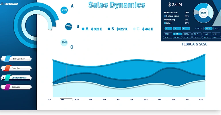
A well-designed dashboard for comparative analysis simplifies data evaluation, helping you identify trends and make informed decisions quickly. Below, you'll find tutorial videos on creating such solutions in Excel. The following aspects are covered:
- Creating and setting up pivot tables.
- Formulas for linking to pivot tables to extract data for chart visualization.
- Example of creating a combined chart template with data selection markers.
- Setting up data labels on the dashboard.
- Testing the interactive capabilities of comparative sales trend analysis on the Excel dashboard.
This content is part of a broader dashboard for ABC analysis:
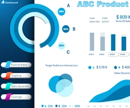
ABC Sales Analysis of Various Product Categories in Excel Dashboard
A well-structured comparative analysis dashboard turns raw data into actionable insights. Master these techniques to optimize reporting and enhance decision-making based on Excel visualizations.


Data Visualization Charts for Interactive Report Creation in Excel.
Dashboard Templates