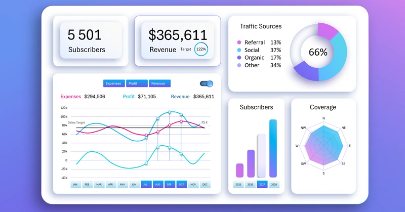
Example of Excel BI Dashboard for sales business planning
An interactive BI dashboard in Excel is a convenient and affordable tool for business planning. It helps quickly gather data, track key metrics, and present information in a visual format. This approach simplifies analysis and makes the business plan more convincing.
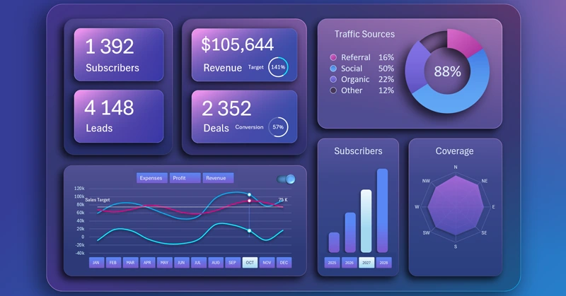
BI dashboard template for SaaS business analysis in Excel
Excel provides you with a simple way to turn numbers into strategic insights. You can learn to create such interactive data visualization templates yourself. For this, we offer you a sample BI dashboard file in Excel format and a training video tutorial with step-by-step template development. Steps of building a BI dashboard in Excel – first part:
- Color scheme for the dashboard background design.
- How to create complex gradients for an impressive design.
- Creating a stylish dashboard grid using shapes.
- Building pivot tables based on source data.
- Source formula table for the first interactive chart.
- Creating interactive controls with pivot table slicers.
- How to build a line chart with a line switching function.
- How to create a custom control with a unique design.
- Adding dynamic data labels using formulas.
- Creating an interactive bar chart with rounded corners.
- How to create a beautiful radar chart in Excel.
- A stylish donut chart with a depth effect.
- Filling and designing KPI cards.
- Developing a subscriber growth analysis screen by pricing plans.
- Market coverage analysis screen with a radar chart.
- Traffic sources panel with an interactive line chart.
- Presentation of BI dashboard analytics in Excel.
Continuation of the video tutorial with the process of creating all sub-screens of the BI dashboard – second part:
- Color palette of complex background gradients for drawing.
- Dashboard base design with a multicolor border line and depth shadows.
- Drawing the base for the first visualization block.
- Creating the dashboard grid in Excel.
- Source data for building pivot tables.
- Source table with dynamic formulas for creating an interactive chart.
- Template for a dynamic line chart.
- Pivot table slicer buttons for interactive dashboard control.
- How to create your own custom control with a unique design.
- Styling the slicer template design.
- Coloring the design of the line chart.
- Creating an interactive bar chart with rounded corners and stylish design.
- How to make a unique 3D effect design for a donut chart.
- Dynamic chart data labels with formulas.
- How to create a beautiful dynamic radar chart.
- Functional design for dashboard KPI cards.
- Presentation of an interactive business plan in Excel BI dashboard style.
The purpose of each screen and each visualization block is described in the instructions for using the BI dashboard in Excel:
How to use the dashboard for SaaS business model planning in Excel
The BI dashboard makes the business plan clearer and visually more convincing. With its help, you can easily track dynamics, find problem areas, and quickly make better decisions based on your source data.


Data Visualization Charts for Interactive Report Creation in Excel.
Dashboard Templates