SaaS Sales Dashboard for Business Planning in Excel
Thanks to the development of modern technologies, more and more types of small businesses are moving to a subscription sales model (SaaS). To shift your business to the new sales model, you will need a new business plan and preliminary analysis to forecast profit scaling potential. A prototype should be modeled for testing subscriber sales under different conditions. Excel Dashboard can handle this task, helping you visually analyze the business plan and effectively present it to employees or investors.
Data visualization for business planning in Excel
Any changes in a small business require caution and careful planning. Even a small mistake can turn into a big problem. The smaller the business, the higher the level of expertise required from its owner or manager. Small businesses do not have inflated budgets to cover failed decisions. They cannot afford staff turnover, risky product experiments, or long-term price dumping. Use the data visualization capabilities of Excel to model different scenarios on the way to achieving desired results with new solutions.
The shift of small businesses to a subscription model for products or services is no longer just a matter of increasing profit but also of business survival. The subscription sales model (SaaS) originally referred to software. The abbreviation itself says it – Software as a Service. But today the subscription model works in any sector where regular access to a product or service is sold – from socks by mail to car wash networks.
10 undeniable advantages of the SaaS business model:
- Predictable revenue. Regular payments create a stable cash flow and simplify budget and investment planning.
- Increase in customer lifetime value (LTV). Customers stay longer in the system, which increases total revenue per user compared to a one-time sale.
- Low entry barrier for customers. Instead of a large one-time payment, the customer pays a small amount regularly, making it easier to attract new users.
- Scalability flexibility. New plans, packages, or additional services can be easily introduced, increasing revenue from the current base.
- Reduced marketing costs. Repeat sales happen automatically through subscription renewals without the need to acquire customers each time.
- Value of data and analytics. Constant interaction with customers allows collecting data, understanding user behavior, and improving the product.
- Customer loyalty. Subscriptions create a habit of using the service or product, increasing attachment and reducing churn.
- Ease of upselling and cross-selling. Premium features or related services can be easily offered based on the existing subscription.
- Higher company valuation. Companies with a subscription model are often valued higher by investors because their revenue is more stable and predictable.
- Increased profit due to a growing share of repeat customers. Regular customers generate 60% on average across all industries.
Technological progress expands new opportunities through process automation aimed at customer relationships. To stay competitive, small businesses must follow market trends in customer service.
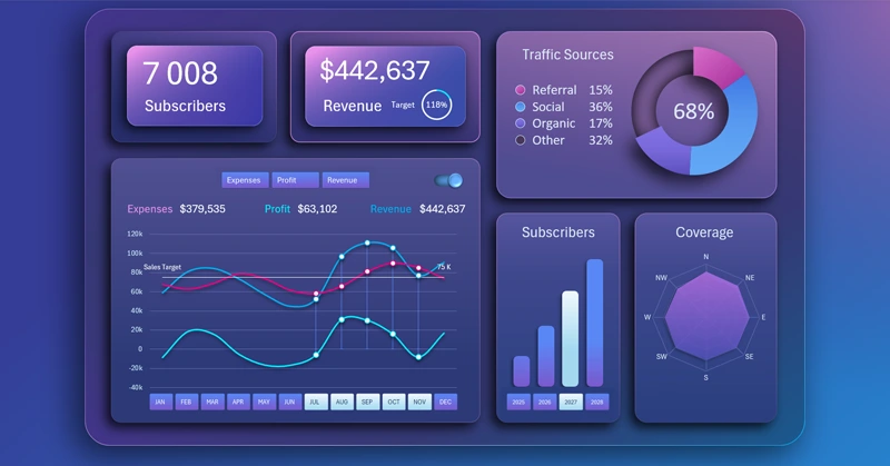
Business planning dashboard template for small business
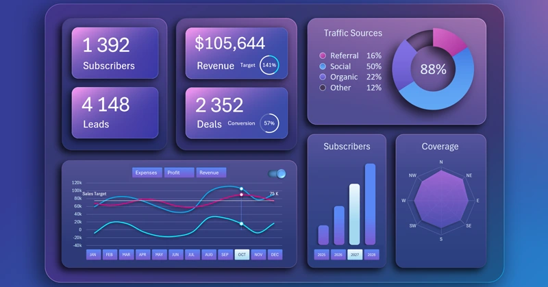
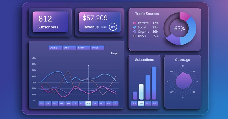
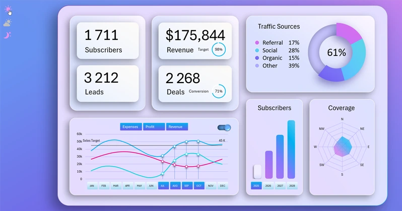
The dashboard structure includes only the most important key indicators. KPI cards with summary results are placed in the most visible location:
- Number of subscribers for products or services.
- Number of orders.
- Revenue and revenue plan.
- Number of closed deals and lead-to-sale conversion rate.
Only one KPI card – revenue – functions as a button to switch to the screen with profit, income, and expense analysis.
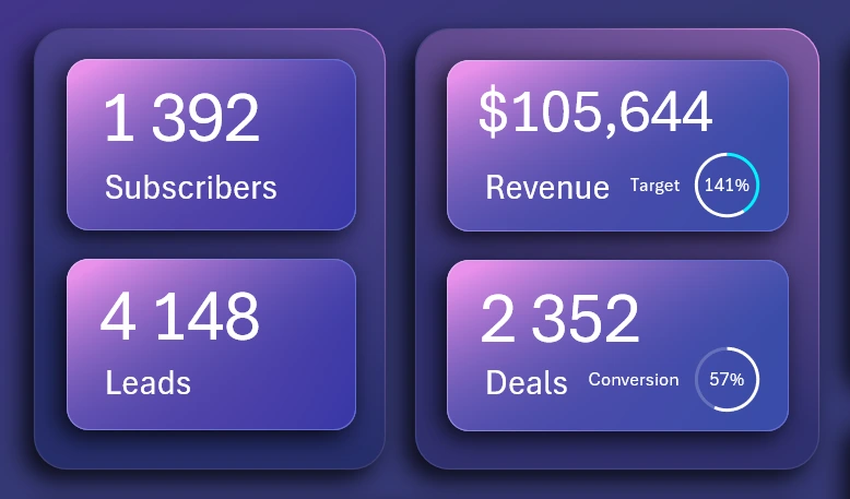
Traffic sources
A visualization block for analyzing the distribution of client traffic sources as a percentage:
Make Interactive Pie Chart in Excel
- Referral system.
- Social media traffic.
- Organic traffic – received without paid advertising.
- Various online and offline channels for attracting customers.
The value in the center of the chart (88%) is the total of the first three main traffic sources.
Revenue and expenses
An interactive visualization block for analyzing the dynamics of monthly revenue, expenses, and profit throughout the year:
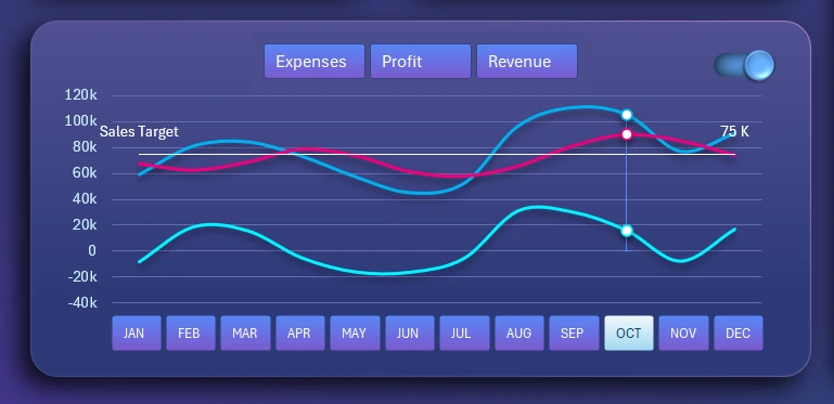
This block contains many buttons for managing the visualization and the entire dashboard.
The top row of buttons is designed to hide curves on the chart for easier analysis. The name of each button corresponds to the curve it hides. This control block operates locally within the visualization and does not affect other dashboard indicators. Multi-selection is supported for pressing 2–3 buttons simultaneously by holding down the CTRL key on the keyboard, or simply holding the left mouse button while selecting buttons.
In the top right corner is a toggle to enable the sales plan line in money. The design of this user control is implemented with shapes and a checkbox button taken from the standard set of Developer tools in Excel. This button also works locally within the visualization block.
On the X-axis of the chart, interactive buttons with labels are used instead of signatures to switch months across the dashboard. The authority of this button block is not limited and applies to the entire dashboard. When a month is selected, all values on the dashboard automatically update to reflect the chosen period. The multi-selection function allows pressing several buttons simultaneously to analyze data for different reporting periods: quarters, half-year, or custom filter conditions, for example, to analyze sales seasonality.
Subscriber Growth Chart
Dynamics of subscriber growth for small business products or services by year:
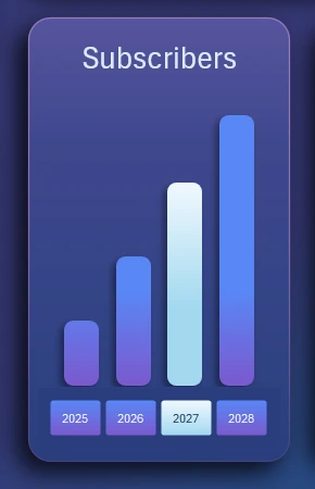
Create Interactive Stacked Bar Chart
The bar chart on the X-axis uses slicer buttons to switch between years. The authority of the button block extends to the entire dashboard and directly affects all metrics when a year is selected. Multi-selection of slicers allows grouping metrics by several years at once or by all of them together.
Market Coverage
Analysis of market geographic coverage by districts:

Create Interactive Radar Chart in Excel
- Northern district.
- Northeastern.
- Eastern.
- Southeastern.
- Southern.
- Southwestern.
- Western district.
- Northwestern.
We track how the market geography coverage fills up over time.
Each visualization block functions as a button to switch to its corresponding screen for detailed analysis of monthly performance dynamics.
Now let’s look at switching between dashboard screens for visual analysis of small business in Excel
Sales Volume Analysis Screen
How to Create an Interactive Line Chart in Excel
We analyze the dynamics of three monthly indicators: revenue, expenses, and profit, on one line chart. As well as the level of the set average annual revenue plan by months.
Subscriber Inflow Dynamics Screen
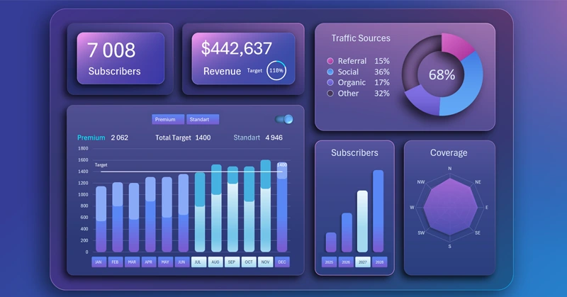
How to Build Interactive Stacked Bar Chart in Excel
On the interactive bar chart, we analyze subscriber growth. The data is segmented by two pricing plans:
- Premium – clients with a high average check.
- Standard – an attractive price offer for maximum target audience coverage with a small average check.
At the early stages, most profit comes from premium plan clients. The standard plan exists to attract new premium clients by expanding audience coverage and increasing market competitiveness at the same time.
Later, the mass market will generate the main income as the primary source of profit through sales volume.
Market Coverage Analysis Screen
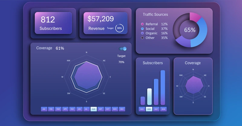
How to Make Interactive Radar Chart in Excel
The radar chart effectively and clearly visualizes coverage across all world directions. Here you can also display the desired market share coverage plan for the current year, which should be filled by attracting new clients from neighboring regions.
The essence of small business is expansion. Only this way can it scale, and this is the main condition to survive. After all, every business by its nature tends toward market monopoly. This is a natural economic process. If you don’t own 100% of the market, you still have room to grow.
Traffic Flow Dynamics Analysis by Sources
How to Create Interactive Spaghetti Line Chart for Excel
To prevent the line chart from turning into spaghetti, a filter button block is provided at the top of the visualization. This makes it convenient for the user to analyze data by exclusion. A cursor is also offered to increase the efficiency of visual analysis on the line chart with multiple metrics. Using filter buttons, we locally disable or group data without affecting other dashboard metrics.
Dashboard Presentation for Subscription Sales Business Planning
For usability, the dashboard design supports 3 display modes:
- Day mode.
- Mode for cloudy weather or morning and evening work.
- Night mode.
To switch between modes, use the corresponding buttons on the dashboard as shown in the picture below:
Download the SaaS sales business plan dashboard in Excel 
It is always useful to attach an interactive presentation with data visualization to a business plan. 80% of investments were approved using data visualization in reports and business plans. Excel’s capabilities offer a very accessible and effective solution for this task.

Data Visualization Charts for Interactive Report Creation in Excel.
Dashboard Templates