Excel radar chart for visualizing sales by products
Analyzing the distribution of sales by product categories helps understand which business areas are developing faster and which require attention. A radar chart in Excel allows you to display multiple categories in a single visualization, clearly comparing their performance. This is a convenient tool for strategic planning and identifying the strengths and weaknesses of the product mix.
Example of sales distribution visualization by products in Excel
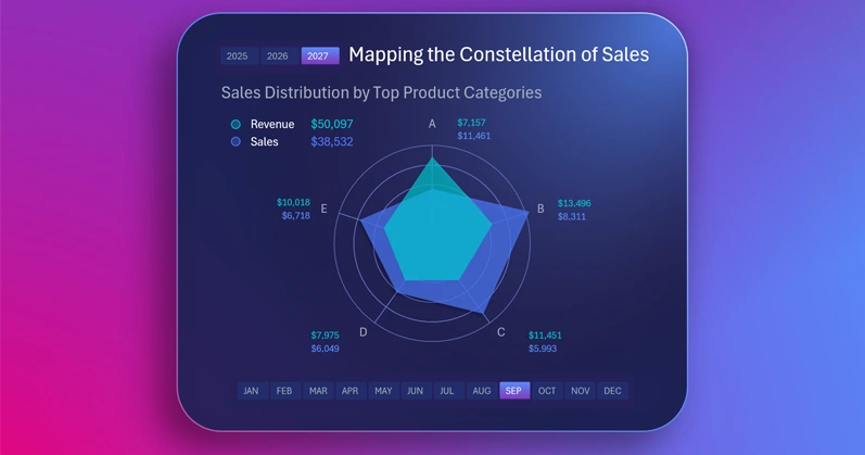
It is very effective to present a large amount of different data in one visualization block using a radar chart. This example shows how to make it interactive and style it with a sleek design in Excel. You can easily learn to create such beautiful and useful visualizations in Excel by using the video tutorial on building an interactive radar chart:
- Background image from a complex gradient shape fill.
- Creating the visualization block panel.
- Processing the source data.
- Creating a pivot table.
- Formulas to connect the dynamic radar chart to the pivot table.
- How to create a beautiful interactive radar chart in Excel.
- How to create a circular grid for a radar chart in Excel.
- Adding button blocks to control the chart.
- Using formulas instead of value labels for automatic updates.
This Excel chart is part of a dashboard and demonstrates key performance metrics:

Excel dashboard for evaluating product investment profitability
By using a radar chart in Excel, you get a clear way to compare sales by categories and determine business development priorities. This approach makes decision-making easier and increases efficiency in managing the product assortment.
Download Excel radar chart for visualizing sales by products

Data Visualization Charts for Interactive Report Creation in Excel.
Dashboard Templates