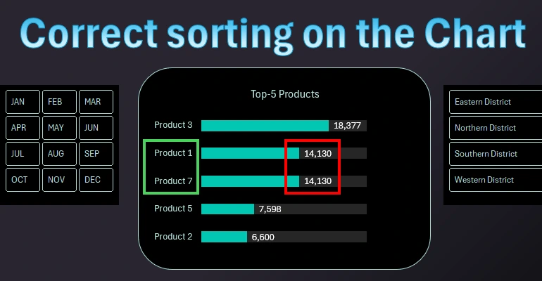
Handling duplicate values during sorting on Chart in Excel
In the process of sorting using Excel formulas, a problem often arises when there are duplicate values. Let's look at an example of how to correctly create a smart sort with duplicate handling using Excel formulas.
How to Find Duplicate Values in Excel Source Data
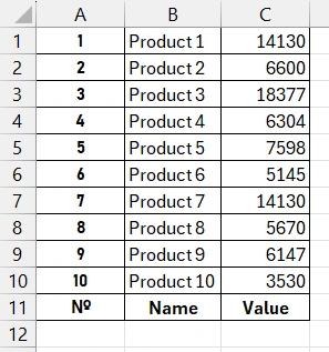
There is a table of source data about products and their quantities. It is necessary to use formulas to select the Top 5 largest values from the last column each time the data is updated. The logic is simple for the following steps towards solving the problem. We sort the values using the LARGE function in descending order and select data from the top 5 rows. But there is a small nuance in the Technical Task! Some values contain duplicates for different product names. Such coincidences are very common in product nomenclature databases, especially in quantities.
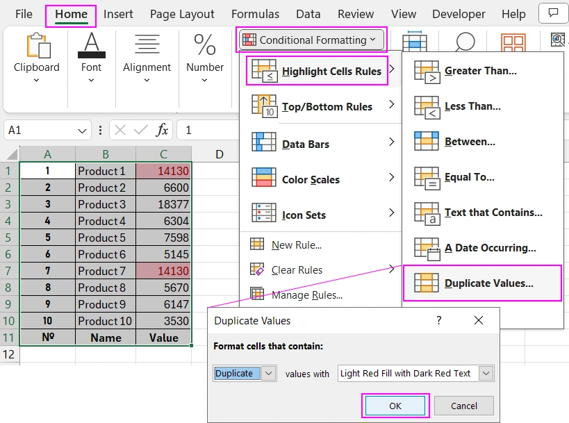
First, check the source table for duplicate values using conditional formatting. To do this, first select the entire range of cells in the source table A1:C11 and choose the tool: "Home" - "Conditional Formatting" - "Highlight Cells Rules" - "Duplicate Values". In the "Duplicate Values" dialog box that appears, simply click OK.
As you can see, the table contains identical values in the last column. This means that some products, specifically "Product1" and "Product7", have the same quantity in the database.
Formula Issue When Sorting Identical Values in Excel
If we sort the source data using traditional formulas, due to the presence of duplicates in different names, problems will arise after sorting.
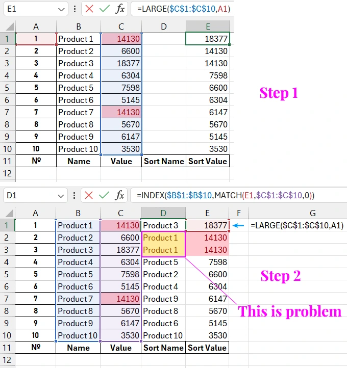
As you can see, this approach will be incorrect, as the product names are now duplicated, which is unacceptable in the Top 5 report.
How to Correctly Sort Duplicates Using a Formula in Excel
To solve this problem, you should use more complex but effective formulas. In the first step, we will also use the LARGE function:
=LARGE($C$1:$C$10,A1)
But to substitute product names with corresponding values, we will use a fully modified formula:
=INDEX($B$1:$B$10,SMALL(IF($C$1:$C$10=E3,ROW($C$1:$C$10)),COUNTIF($E$1:E3,E3)))
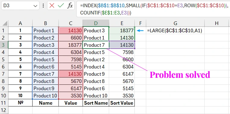
As shown in the picture, the formulas now sort the source values without errors, regardless of the number of duplicates.
Useful Tip! The modified formula uses the ROW function. Therefore, always fill the column from the first row of the Excel worksheet to simplify and maintain the functionality of the functions. Therefore, the table header with column header names is initially located below the values to not disrupt the construction of the complex formula with the ROW function. This avoids complicating the formula, keeping it as simple as possible for perception and understanding.
Sorting Ranking in Descending Order on an Excel Chart
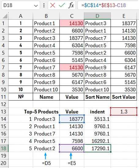
Now prepare the data for the chart. In the "Top-5 Products" and "Value" columns, we refer to the top 5 cells from the sorted last two columns in the source table "Sort Name" and "Sort Value". The third column contains the formula for calculating the correct bar chart line indentation relative to the specified control value in cell E13.
=$C$14*$E$13-C14
The values in the indentation column will allow us to build a horizontal bar chart and place data labels outside the bar lines. To better understand this, it is better to show it visually. Select the range of chart table cells B13:D18 and choose the tool: "Insert" - "Charts" - "2-D Bar" - "100% Stacked Bar".
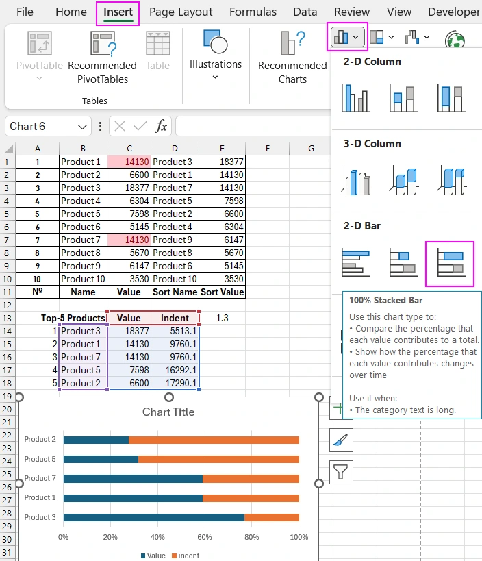
As shown, thanks to the last "Indent" column, our largest value does not occupy the entire width of the visualization field. There is room for creative design and data labels outside the bar.
Perform several preparatory settings for the top-5 rating chart. Select the vertical Y-axis on the chart and press the keyboard shortcut CTRL+1 (the one should be pressed not on the additional numeric keyboard but the main keyboard key located above the Q key) to call the additional settings window "Format Axis". In the "Axis Options" settings section, check the "Categories in reverse order" option, and as a result, the axis will sort its values in descending order. Accordingly, all chart bars will also be displayed in descending order, as the Top-5 Rating should be presented.
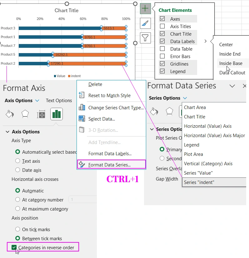
Next, select the "Indent" data series and press CTRL+1 again to call the "Format Data Series" settings window. In the "Series Options" section, "Series Indent" should be selected.
Then click the plus sign next to the chart to call the context menu, where you should check the "Data Labels" - "Inside Base" option.
We have added labels to the outside of the bars, now you need to correctly specify the data source. To do this, click once with the left mouse button on the data labels and press the keyboard shortcut CTRL+1 to call the additional "Format Data Labels" window. In the "Labels Options" section, check the "Value From Cells" option and click the "Select Range" button to specify the correct source for displaying the bar labels in the appearing "Data Label Range" window. That is, the reference to the second column: =Sheet1!$C$14:$C$18. Then do not forget to uncheck the "Value" option as shown below in the picture.
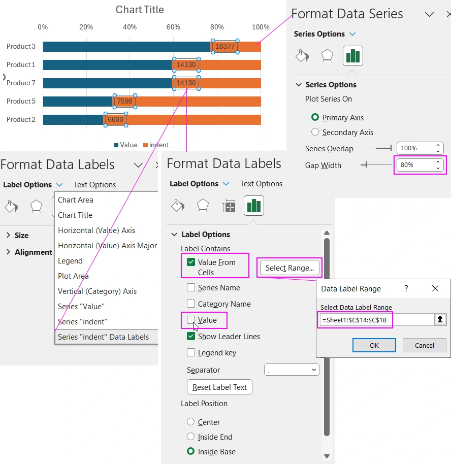
To improve the appearance of the bars and better readability of the labels, widen the bars. To do this, select any data series on the chart, press CTRL+1 to call the "Format Data Series" window. In the "Series Options" section, change the "Gap Width" parameter to 80%.
Color Scheme to Complete the Visualization Design of Sorted Data
Now all that remains is to color all the visualization elements with beautiful colors. One possible color scheme might be.
Thanks to the sorting being implemented with formulas, the chart data can automatically update and maintain the descending ranking structure without issues with duplicates. An example of practical use of sorting charts on a dashboard template in Excel:
 Dashboard for managing KPI plans in Excel.


Data Visualization Charts for Interactive Report Creation in Excel.
Dashboard Templates