Download a dashboard for managing KPI plans in Excel
KPI metrics enable us to effectively manage key business processes that have the maximum impact on results. For visualizing data on key KPI indicators, we use an Excel dashboard. Its template is detailed and illustrated in the article. You can download the dashboard via the link provided at the end of the article.
Using the KPI Dashboard to Enhance Mastery
To effectively increase business profits, it's necessary to approach tasks with mastery. Mastery involves improving results while reducing efforts. To easily understand, let's consider a practical example.
Task: Increase profits twofold. If we attempt to achieve this task by:
- Increasing working hours,
- Increasing the number of employees,
- Increasing production volume, etc.
We won't achieve mastery because to double the results, we would need to double the efforts. A master in business acts differently. They focus their efforts on key points of growth.
Masterful task setting: How to increase sales with less effort?
Checklist of key actions:
- Raise prices.
- Reduce expenses.
- Attract more repeat customers.
To track the effectiveness of our mastery and the costs of our efforts, data visualization should be used. For example, a free Excel dashboard for tracking KPI plans.
KPIs are key actions that have the most impact on results. There shouldn't be many of these indicators, but they should be the best!
Considering the technical task described above, dashboard developers should include 4 KPI plans. It is these plans that will direct the key actions.
- Sales plan (overall goal).
- New customer acquisition plan (more repeat customers).
- Expense reduction plan (corresponds to the reduce expenses item).
- Average check increase plan (raise prices).
As a result, we will create an Excel dashboard to enhance mastery in business, aiming to achieve big results with less effort and enjoying creativity in the process. Perhaps therein lies the main purpose of understanding existence.
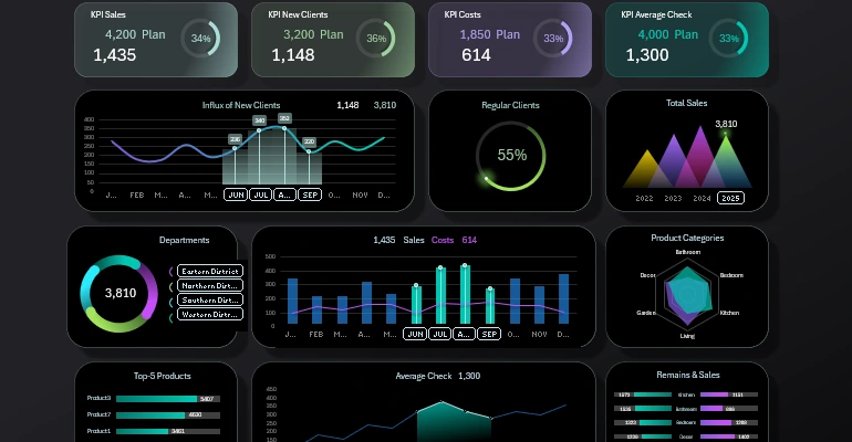
Structure of the KPI Management Dashboard
The top block contains summary values for four KPI plan performance indicators:
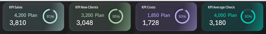
Here everything is intuitively clear:
- Thematic name of the KPI indicator.
- Value of the set plan.
- Actual value of plan execution.
- Diagram to visualize the difference between actual and planned.
Below are charts for analyzing the impact of KPI management on the final result.
New Customer Acquisition
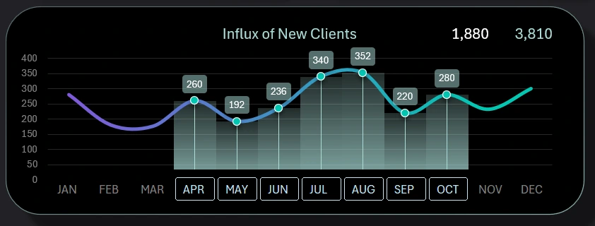
How to make a Combination Chart in Excel step by step.
A combined chart with a histogram for visual analysis of the dynamics of new customer acquisition over the year. The visualization block contains a control element for data sampling using a panel of pivot table slice buttons. The control element's authority extends to the entire Excel dashboard. Linked to the new customer acquisition plan.
Repeat Customers

How to make Dynamic Doughnut Chart in Excel for Dashboard.
A stylish diagram for tracking the share of repeat customers in transaction history. Repeat customers usually bring about 60% of profits. This visual also relates to the customer plan.
Total Sales Volume
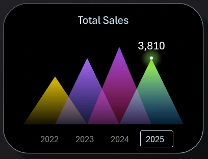
How to make Dynamic Rating Chart in Excel for Dashboard.
An original histogram in the form of triangles. Intended for tracking the overall annual sales volume compared to other years. The values for the X-axis are derived from a pivot table slice as a control element for switching between years on the chart and throughout the Excel dashboard. Related to the sales plan indicator.
Departments and Branches
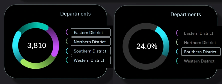
How to make Design Doughnut Chart in Excel for Dashboard.
A creative and dynamic chart with an original design. Allows segmentation into shares of sales volume by departments. To achieve this, use the data control element located on the right as a vertical menu block.
You can sample data simultaneously for several departments (e.g., eastern and southern). The authority of the control element extends to the entire Excel dashboard. This means that when using a slice, the data on all dashboard charts update according to the selected department. This block simultaneously relates to all KPI plans, as each department shows its plan execution result, affecting the overall indicators.
Sales and Expenses Ratio
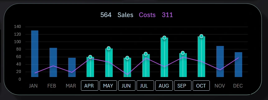
How to Create a Custom Combo Bar Chart in Excel step by step.
A combined histogram with a chart in one visualization block. Designed for comparative analysis of the dynamics of monthly expenses and sales volumes. Data can be sampled for different periods of the year, such as seasonal halves or quarters, etc. Intended simultaneously for two plan values: sales plan and expense reduction plan.
Distribution of Stock and Sales by Product Categories
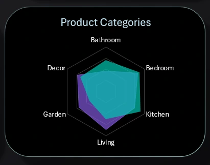
Create Interactive Charts with Animated Buttons in Excel.
A Radar-style chart - effective for analyzing data distribution. Here, 6 popular home product categories are presented. Each category has its sales-to-unsold stock ratio. The purple area represents stock, and the turquoise area represents sales. To increase sales, it's important to efficiently plan assortments and timely deliveries to ensure the necessary quantity of goods. The values of this block correlate with the indicators of two plans - sales and expenses.
Top 5 Best-Selling Products Ranking
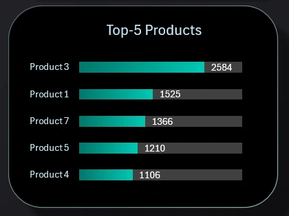
Handling duplicate values during sorting on Chart in Excel.
To monitor the execution of KPI plans for average check level and sales, it's necessary to analyze the best-selling products to better shape the SKU assortment basket. This is a standard horizontal histogram, but its raw values are sorted in descending order using formulas on the "Processing" sheet.
Dynamics of Average Check Level Change
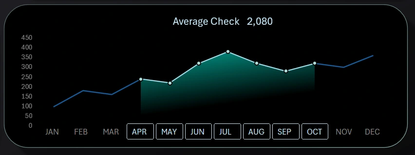
How to Make a Line Graph for data comparison in Excel.
A combined curve chart with filled areas shows how the business works on increasing the average check level. Instead of X-axis values, a control element - a slice for data sampling from pivot tables - is also used. All this is for comfortable visual analysis. This block relates to the average check level increase plan.
Comparison of Quantitative Levels of Stock and Sold Items in Pieces
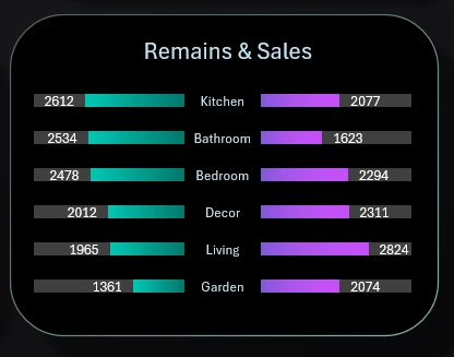
How to Create a sorted Butterfly Chart in Excel by descending.
Another visualization block is dedicated to sales and stock analysis. In any business, sales are the main goal, and unsold stock items are the main problem. They need to be regularly monitored and kept in check.
The chart is designed in a butterfly style. The left wing is for sales indicators sorted in descending order, and the right wing represents the stock of corresponding categories.
Dashboard Design for Analyzing KPI Plan Execution
In the versatile analytical computational application MS Excel, you can create complex data visualization designs as good as specialized business intelligence dashboard development tools like Power BI or Tableau. Here's another design template:
Download the Excel KPI Management Dashboard 
ERP and CRM systems accumulate statistical data and help develop the microeconomics of business. At the same time, data visualization allows for quickly presenting, forecasting, and implementing business with maximum profit. Essentially, the dashboard sells your own business to you every day and motivates you to develop it enthusiastically with great pleasure.

Data Visualization Charts for Interactive Report Creation in Excel.
Dashboard Templates