DOWNLOAD 3D Infographics for Reports in Excel
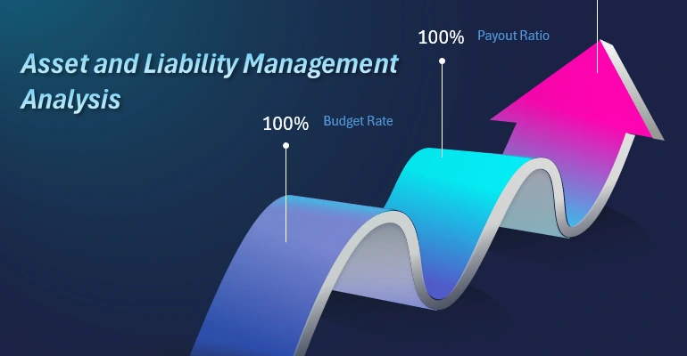
Asset and liability management is fundamental to financial stability and business growth. Using standard data visualization tools and formulas with Excel pivot tables, you can create impressive interactive dashboards. By adding some useful features from PowerPoint's shape editor, the visualization design becomes volumetric and dynamic.
Asset and Liability Balance Analysis Report in Excel

This video tutorial focuses on leveraging the synergy of MS PowerPoint and MS Excel to present an analysis of asset and liability balance. Create opportunities to ensure efficient allocation of financial resources. 3D infographics enable the creation of impactful reports in a clear, visually appealing format.
In this video lesson, you will learn:
- Create 3D vector graphics in PowerPoint for Excel bar charts as a design tool.
- Use shapes as guides to create complex curved lines in PowerPoint.
- Draw a wave with accurate 3D perspective.
- How to close a shape outline in PowerPoint's editor.
- How to convert a curve into a straight line in PowerPoint.
- How to transform an angular point into a curve.
- Design and align all elements from shapes using guides as a construction tool.
- How to merge multiple shapes into one cohesive figure using the Union tool in PowerPoint.
- How to create a hole in a shape in the form of another complex shape.
- Transfer all complex wavy arrow shapes from PowerPoint to Excel.
- Create ferrules for bar charts.
- Design and configure a chart template for the first bar.
- Set the color palette for all color and shade combinations in the presentation.
- Enhance chart segments using shapes.
- Add an interactive control element – a counter tool from the Developer menu.
- Correctly distribute all shapes and charts across layers.
- Add decorative elements and data labels to match the infographic's thematic context.
- It’s ready! The first presentation: "Asset and Liability Management Analysis."
- Create a second presentation based on an Excel sheet template.
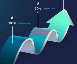
- The second presentation is ready: ABC Analysis of Strategic Financial Indicators.
- Create a third presentation based on an Excel infographic template.
- Set up source data and create a pivot table.
- Add a new control element – a slicer button block for the pivot table filter.
- The third presentation is ready: Budget vs. Actual Expenses Analysis.
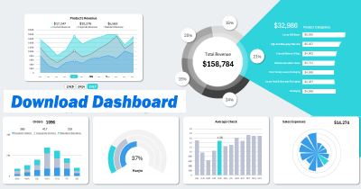
- Review all three report presentations across three Excel dashboard screens.
This template enables the creation of various similar reports. A bar chart with three bars is often used in comparative analyses of three key interconnected financial indicators. For example:
- ABC analysis to review a company’s KPI metrics with a focus on growth strategy development;
- ABC Analysis to evaluate key financial metrics;
- ABC Analysis of Strategic Financial Indicators;
- Asset and Liability Balance Analysis;
- Efficiency Assessment of Top-3 Ranked Investment Projects.
To change the type of report, simply update the source values on the "Data" sheet in this template. How? – Read more here:

What is ABC Analysis and How to Present It Effectively in Excel
Learn from video lessons and don’t forget to download the ready-made example to consolidate the material. Take your financial KPI report presentations to the next level. Use Excel tools to visualize assets and liabilities. This infographic simplifies complex financial concepts.
Download 3D Infographics Template for Asset and Liability Balance Analysis in Excel 
