3 Examples ABC Analysis with 3D Infographic Charts in Excel
Sometimes, a developer working on interactive infographics in Excel gets an idea to create a striking data visualization for a presentation. In this example, we’ll explore 3 examples of ABC analysis and 3 different financial performance reports using the same complex 3D infographic template in the shape of a wavy arrow.
What Is ABC Analysis and How to Present It Effectively in Excel
ABC analysis is a method of categorizing inventory, clients, or other business elements based on their importance, value, or impact. This method is rooted in the Pareto Principle, which states that 80% of outcomes often come from 20% of causes.
To effectively present ABC analyses in Excel, we’ll use 3D infographics in the form of a wavy arrow. The 3D arrow will point upwards or forward and incorporate interactive dashboard controls for user interaction.
Each wave symbolizes a single bar in the chart. The last value can serve as a summary and is represented by an upward-pointing arrow. Let’s examine three presentation examples for this infographic template. Each report will have its own data set and unique interactive elements for dynamic data visualization.
ABC Analysis for KPI Metrics with a Focus on Growth Strategy Development
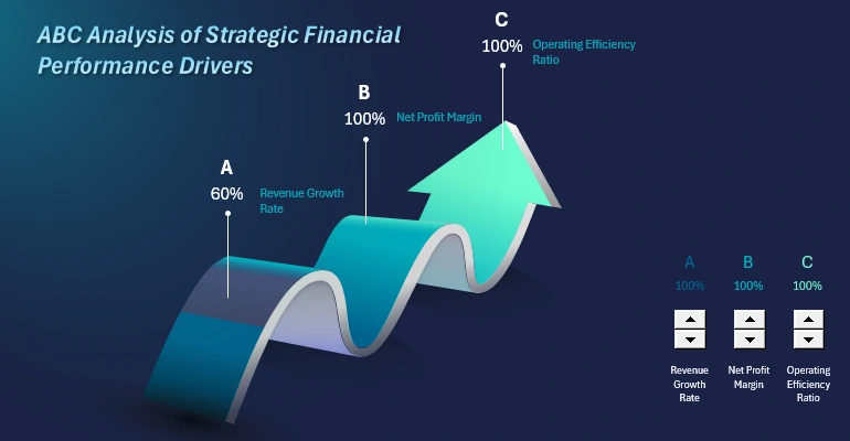
This is a highly popular and important type of analysis! The results of ABC analyses often require interactive presentation. This template allows for visually compelling representation of final values. The scenario is as follows:
ABC Corp, a company in the consumer goods industry, uses ABC analysis to evaluate three key financial metrics. The primary goal is to identify the strengths and weaknesses of financial management in order to:
- maintain sustainable growth;
- increase net profit;
- reduce excessive operational expenses.
The chart consists of three columns, making it easy to visualize the company’s current achievements against predefined target levels:
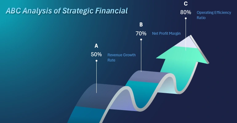
- A: Revenue growth rate. Management wants to assess how quickly the company is expanding through increased sales and market entry.
- B: Profitability of sales. The financial director aims to understand how effectively the company converts revenue into net profit. This is critical for adjusting pricing strategies and controlling costs.
- C: Operational efficiency ratio. The operations manager monitors how efficiently resources are utilized. This helps identify areas to reduce excessive expenses.
Who Needs ABC Analysis and Why:
- Executives and investors: gain insights into how effectively the company achieves its strategic goals.
- Middle managers: get data for decision-making (e.g., focus on increasing sales, optimizing expenses, or improving profitability).
- Financial analysts: easily track key performance indicators in a single view.
How to Use This Infographic Template in Excel for Various ABC Analyses:
- On the “Data” worksheet in the Excel visualization template, simply change the source data values.
- Then press the shortcut: CTRL + Alt + F5 to automatically refresh all data in the pivot table on the “Control” sheet.
- Adjust the labels for the corresponding values on the “Processing” sheet.
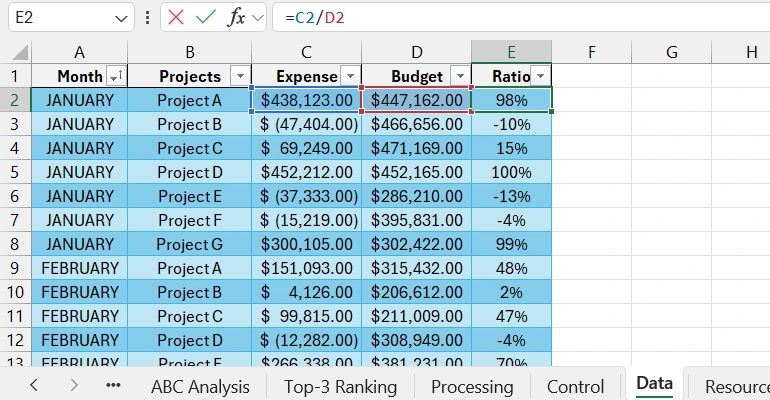
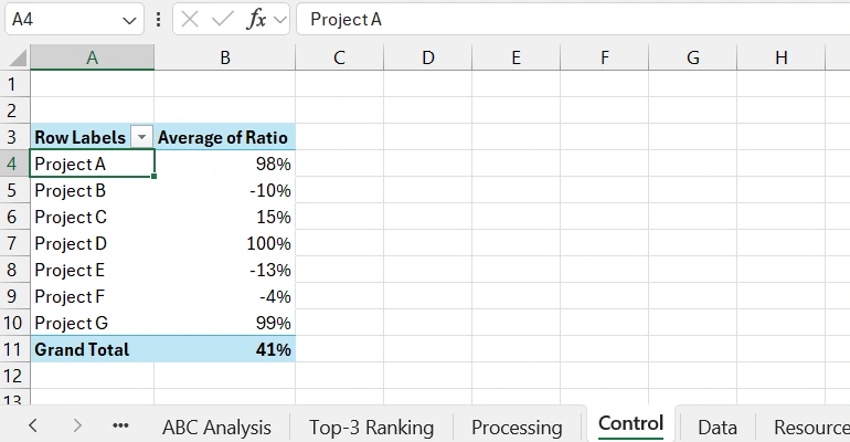
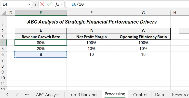
The result is a new report for a new ABC analysis. To grasp the material, download the ready-to-use Excel infographic template at the end of the article. For practical training, let’s model another situation showcasing the data visualization features of Excel.
ABC Analysis for Evaluating Key Financial Metrics
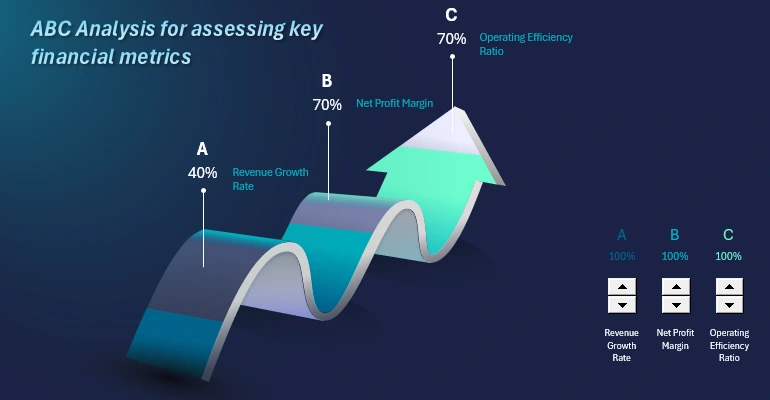
Presenting ABC analysis in interactive reports for Excel users of beginner and intermediate levels—no programming or macro skills required!
Let’s consider the scenario. ABC Corp conducts financial activity analysis using ABC analysis to identify and optimize critical aspects. Visualization is represented with three columns (A, B, C), each filled based on achieving target metrics:
- Category A: Revenue growth rate. This metric shows how quickly the company’s revenue grows compared to the previous period. Formula:
- Category B: Net profit margin. The percentage of net profit from revenue. Formula:
- Category C: Operational efficiency. Formula:
Target Audience for the Presentation:
- Owners and investors: assess the current financial stability and growth prospects.
- Operations managers: analyze resource utilization efficiency.
- Finance department: balance profitability and costs.
To demonstrate the interactive capabilities of the report visualization for ABC analysis on a static image, let’s review another example.
ABC Analysis of Strategic Financial Indicators
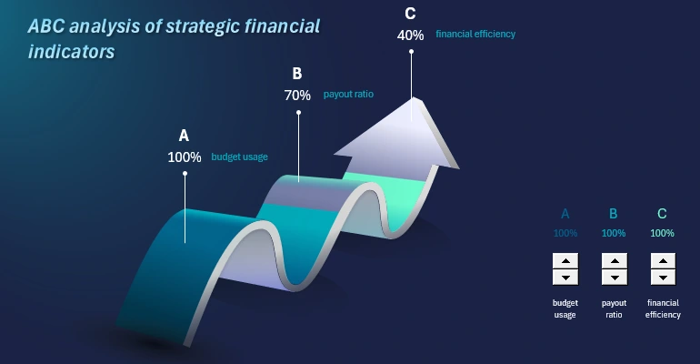
Let’s consider another scenario: an ABC analysis for managing a company's financial flows.
The company uses the ABC Analysis method to evaluate the efficiency of managing key aspects of financial flows. Each wave of the arrow symbolizes a column in a vertical bar chart:
- Budget (Category A).
- Dividend Payouts (Category B).
- Financial Stability (Category C).
Management analyzes how effectively each aspect is being implemented to optimize resource allocation and maintain balance between them.
Description of each column’s category:
- Column A: Budget utilization. This measures how effectively the company's budget is utilized. A critical indicator, as it reflects the company’s financial management efficiency.
- Column B: Shareholder payout ratio. Shows the percentage of the total budget allocated to dividends, ideally reaching 100% if all profits are distributed. This is significant for maintaining shareholder trust.
- Column C: Financial efficiency. A combined metric assessing financial policy efficiency, based on the relationship between assets and liabilities (budget utilization and dividend policy). It provides a comprehensive perspective.
Target audience for this report:
- Finance Department: for analyzing key management areas.
- Top Management: for resource optimization aligned with priorities.
- Investors: to understand how the company is handling capital allocation.
Now you know how and to whom to effectively present ABC analysis results reports.
Asset and Liability Balance Analysis
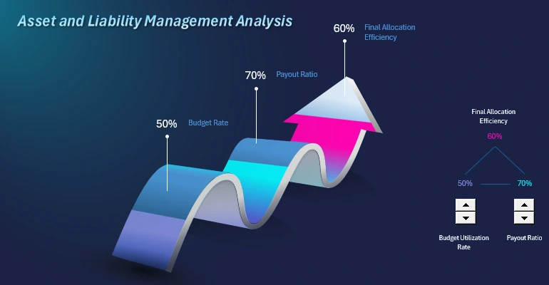
To create a technical assignment for developers, we model the following situation. The company’s managers evaluate the efficiency of budget usage, ROI for shareholders, and revenue stability from core activities. This is important for:
- budget planning;
- adjusting financial strategies;
- strengthening investor confidence.
Assume the company "ABC Corp" operates in the manufacturing sector. Management must present data to shareholders at the board meeting. To effectively present financial metrics, a three-column chart in the form of a wavy 3D arrow is used:
- Budget utilization. Managers aim to show investors that expenses strictly follow the planned budget, demonstrating excellent financial management.
- 100% payout ratio. Such a ratio indicates company stability to shareholders and attracts more investments.
- Final resource distribution efficiency. Reflects how efficiently the company uses the budget and allocates profits. In this report, it is a final metric calculated using the formula:
Final Efficiency = (Budget Utilization + Payout Ratio) / 2
Who is the target audience for this interactive report visualization? The most popular categories of users include:
- Top Management: for data presentation during meetings.
- Shareholders and Investors: for confidence in company reliability.
- Financial Analysts: for evaluating the company's strategy.
Notice how the interaction of dynamic elements and bars in the chart is structured. Only the first two metrics are managed, while the third is derived based on the final value and correlates according to the formula.
Evaluating the Effectiveness of Top 3 Investment Projects
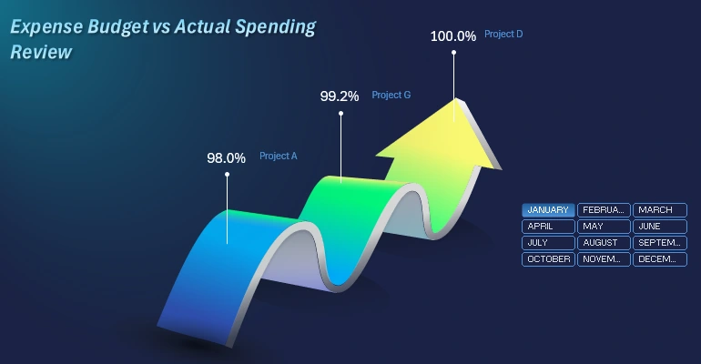
The scenario is as follows: it is necessary to evaluate and visualize the top 3 best investment initiatives within companies that provide maximum efficiency in using allocated financial resources. The evaluation formula uses two indicators:
- Budget size.
- Budget spending share.
The calculation formula is simple:
Efficiency = Expense / Budget * 100%
Examples of analyzed candidate projects:
- Project A: Expansion of production facilities.
- Project B: Marketing campaign to enter a new market.
- Project C: Development of a new product.
Identify the top 3 projects that required the least financial resources, as planned in the budget for the selected month, quarter, year, or another accounting period.
This report will help investors evaluate how effectively their financial resources are used, enabling them to reallocate investment portfolios in time. It will also assist company managers in making quick but effective decisions to maintain their company’s investment attractiveness. The financial department can use this report to monitor the profitability of financial resources used.
Download Data Visualizations for ABC Analysis in Excel
To learn how to create such impactful infographics, you will need a ready-made example where you can experiment with different input values.
Download Examples of ABC Analysis with 3D Infographics in Excel 
Master the principles of building 3D charts from vector shapes in Excel. You will gain the ability to create your new, complex figures for impactful infographic presentations. All you need is a ready-made template and a video tutorial with step-by-step instructions.
