How to create a burndown chart in Excel for Agile Scrum
The burndown chart helps visually track project progress in Agile and Scrum methodologies. In Excel, you can easily create a clear tool that shows remaining tasks, speeds up sprint planning, and improves team communication.
Example of a burndown chart template in Excel
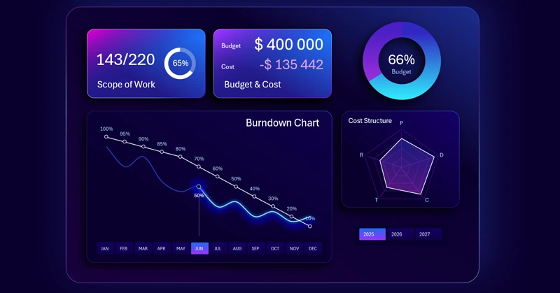
An example of a burndown chart in Excel shows how remaining tasks decrease as the sprint progresses, allowing you to quickly assess the team's progress. To learn how to create such interactive burndown charts yourself, we recommend watching the tutorial video, which demonstrates:
- Beautiful base design for the mini dashboard visualization block.
- How to create a glass-style neon design for KPI cards.
- 3D block design for placing interactive charts.
- Processing source data with PivotTables.
- Creating PivotTable slicers to add interactive buttons.
- Building a formula table connected to PivotTables.
- Creating a Burndown Chart template in Excel based on the formula table.
- How to make an interactive Burndown Chart with a beautiful design.
- Button design templates for PivotTable slicers.
- Formula tables for building an interactive budget consumption chart.
- How to make a stylish budget progress chart in Excel.
- Adding a Radar Chart to show the budget structure by category.
- How to create an additional elegant visualization for the mini dashboard in Excel.
- Decorating KPI cards with dynamic labels, formulas, and data visualization.
- Presentation of Burndown Chart visualization capabilities in Excel.
This useful infographic is effectively used in Excel dashboards for project management:
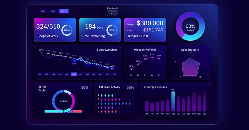
Excel dashboard for agile project management in application development
Using a burndown chart in Excel makes managing Agile and Scrum projects more transparent and efficient. It helps teams adjust plans on time, forecast deadlines, and improve productivity.


Data Visualization Charts for Interactive Report Creation in Excel.
Dashboard Templates