Agile Project Management Excel Dashboard for Personal Finance App
An Agile report helps manage projects effectively, especially for application development. In today’s IT market, application development never stops, even after release. Constant updates with new versions and features help continuously promote the app. Therefore, Agile project management should be applied in app development.
To understand the Agile project management framework, let’s look at an example of developing personal finance management apps. The best way to present data visualization is by building an interactive dashboard in Excel. Let’s review it in detail for effective learning.
Agile project management dashboard in Excel
What is a project? Success begins with asking the right question!
A project is a product development plan. There are two basic project management models:
- Waterfall – a model designed for stable projects where the outcome is clear and predictable.
- Agile – a model for projects where outcomes are minimally defined at the start but become clearer during product development.
User-focused product development is managed through the Agile project model.
Each project management model has an “iron triangle” – at least three key constraints:
- Time – project deadlines.
- Budget – available financial resources.
- Scope – the technical requirements (specifications) for product development.
The Agile project management dashboard for developing personal finance apps uses three visualization tools to analyze each constraint:
- Burndown Chart – Time.
- Radar Chart – Budget.
- Sprint Cycle Chart – Scope.
Let’s review the structure of the interactive dashboard to understand its principles and practical application in personal finance app development.
Specifications for developing an Agile project management dashboard in Excel
First, as usual, we model a situation. This helps define the key tasks that the interactive Excel dashboard should solve.
A young app development studio for family budget management released three products over three years. Each product builds on the abstractions of the previous one but expands them with new features and capabilities. In the process of the studio’s growth through new products, the following factors are considered:
- user needs and feedback,
- new market competition conditions,
- new technologies and developer tools.
The Agile project management model explains how to adapt when conditions change.
The first app had modest capabilities, while the latest one is the most advanced. At the development level, each new product is an improved version of the previous one. Developing and promoting one product takes about one year. After that, the focus shifts entirely to the new app. Throughout the year, the development process goes through five cyclical and sequential stages:
- Planning.
- Design.
- Programming.
- Testing.
- Release.
Considering this model, the dashboard user should be able to monitor both intermediate and final results of project progress, even if the overall completion date is undefined. However, deadlines for intermediate and cyclical stages must always be set. This is the strength of the Agile model.
Structure and principle of managing an interactive dashboard
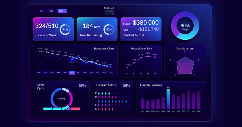
At the very top is the dashboard header made of KPI cards, which serve as a menu for switching between themed screens.
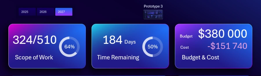
Also at the top left is a block of buttons for switching between years. At the top center of the main screen is a button for navigating to the prototype of the current application in development. Each year corresponds to its own prototype of the software product.
KPI cards contain summary information about the project management “iron triangle”: scope, time, and budget. Clicking a card takes you to the corresponding screen.
Controlling financial budget expenses
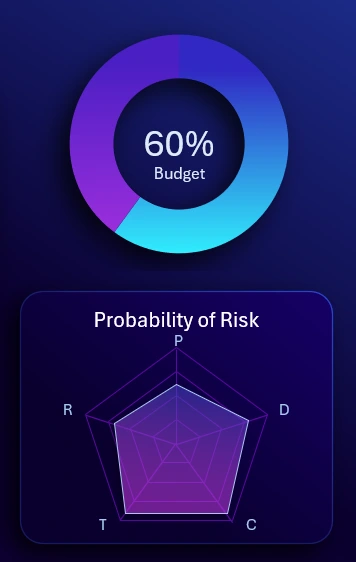
In the upper right corner is a chart showing the share of the annual budget used for project implementation. Below is a radar chart for analyzing the structure of budget spending across five categories:
- P – Planning.
- D – Design.
- C – Coding.
- T – Testing.
- R – Release.
For a more detailed analysis of budget spending, go to the corresponding visual report screen.
Example of a Burndown Chart in Excel
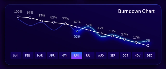
Burndown Chart in Excel for Agile Scrum
This is a very popular chart in the Agile project management model. It shows how much work remains to complete a group of tasks. The white line represents the planned or forecasted progress. The blue line represents actual performance with fluctuations caused by unexpected obstacles that arise during the work process. For example:
- a new feature needs to be added,
- the interface needs to be changed,
- corrections after testing,
- urgent updates requested by the majority of users, etc.
Unexpected development obstacles may add new tasks and affect deadlines. In the Agile model, this is normal and not a reason for panic or loss of control.
Controlling probability indicators for risk management
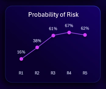
This block shows the top 5 likely systematic risks that occur regularly and can be anticipated. The values are coefficients of risk occurrence probability. It is an auxiliary but also important visualization block on the dashboard.
Example of creating a nice sprint visualization in Excel
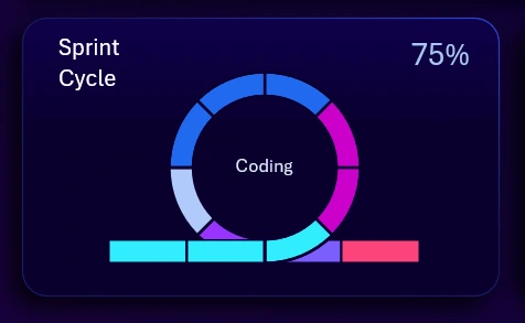
Sprint Cycle Chart in Excel for Scrum and Agile Teams
Sprints in project management are cyclical, systematically repeated tasks that must be performed during product development. In the Agile model, sprint indicators are widely used in practice. The chart includes a cursor that shows the current stage within a sprint, not the entire project. The picture shows the first cluster of the third stage – Coding. In this example, one sprint contains only 5 stages of development and/or version updates of the application:
- Planning.
- Design.
- Coding.
- Testing.
- Release.
You can view sprint internal processes in more detail on the corresponding dashboard screen.
Controlling human resource management
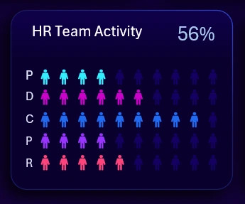
The HR metric is important in every project. This indicator can inform about team workload for specific tasks at different sprint stages, or about the number of people involved and their activity level.
Monthly expenses
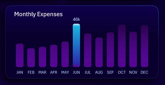
Expense control is the main principle of achieving a successful outcome. That’s why it deserves so much attention. Expenses have already been segmented by category, and here they are segmented by time intervals (months). Multi-selection of values using pivot table slicers allows grouping months into other time intervals, such as quarters, half-years, etc.
Dashboard for analyzing task completion dynamics in development
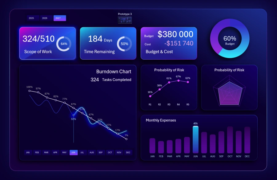
On this screen, you can analyze in detail how many tasks have been completed and how many still need to be finished by the end of the year.
A Burndown chart is used – a very popular data visualization tool in Agile models.
Absolute and percentage values are shown. When selecting multiple months at the same time, the dashboard always takes the maximum month number. When selecting multiple years, the total number of tasks and the average completion rate for a given month are considered.
Dashboard for Agile sprint analysis
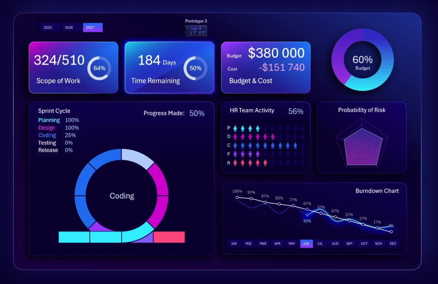
Here you can analyze the percentage of completion for each sprint stage, not just overall progress. As the cursor moves across the sprint, the data updates automatically, including percentage values.
It is very convenient to analyze this against auxiliary blocks, especially with the HR indicator.
Dashboard for analyzing project implementation expenses
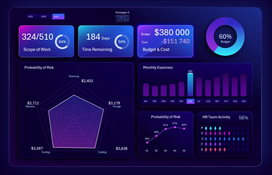
This screen shows the structure of expenses in more detail for better understanding. Analysis is available in both absolute and relative values. Each category corresponds to a sprint task stage.
The dashboard also presents monthly expenses, HR involvement, risks, and the final share of annual budget usage.
Dashboard for managing weekly personal finance expenses
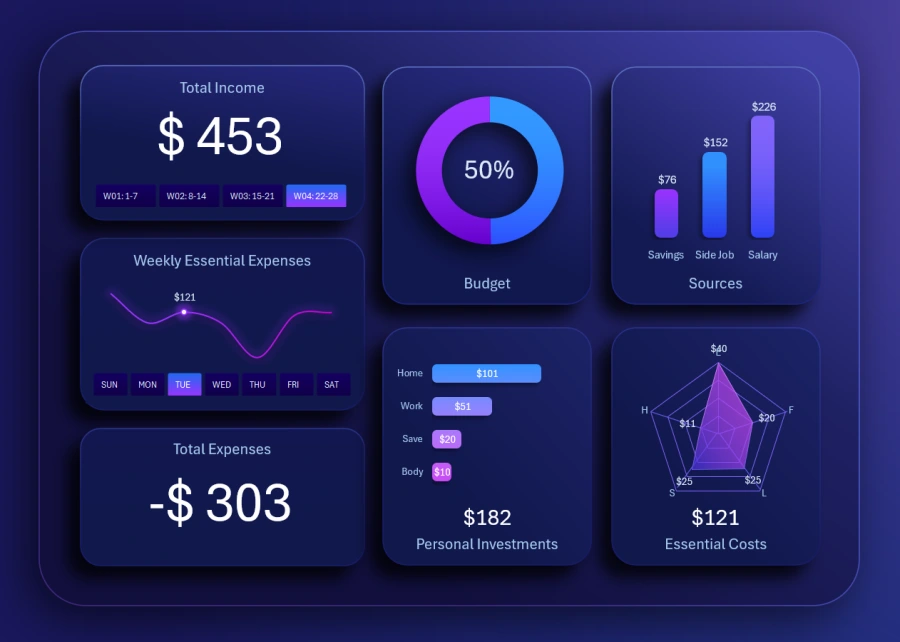
Excel Dashboard for Weekly Personal Finance Expense Tracking
The first prototype of a simple personal finance management app from a young studio (2025). These are the first steps in developing a continuous Agile project that will evolve in future versions.
At this stage, the app has limited functionality. It solves narrowly focused tasks in a small niche – weekly personal expenses. The personal finance app market is highly competitive due to a low entry barrier. Therefore, a young studio should focus as much as possible on a small niche and secure a leading position there to grow further.
Dashboard for long-term personal finance management
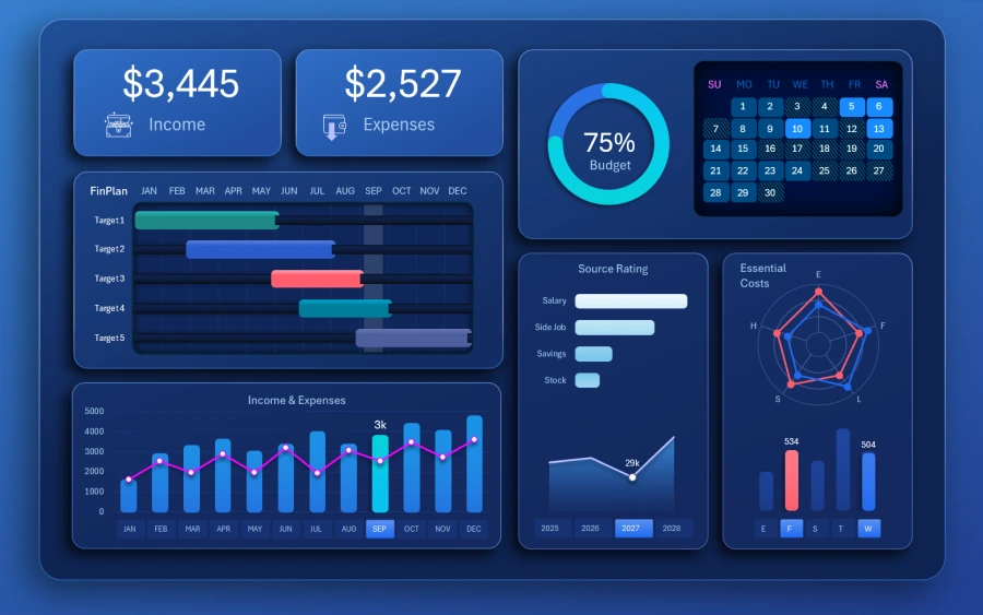
Master Personal Finance with an Interactive Excel Dashboard
The second prototype of the app developed under the Agile project (2026). This time, the team aimed at an app covering 4 years of personal finance management. Functionality was significantly expanded with new features.
You can also notice the use of a “Waterfall” style chart. This style is often applied in projects using the cascade management model with strict deadlines and predictable results.
Dashboard for personal investment management
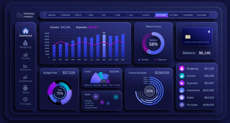
The third prototype of an app for managing personal investments (2027). New functionality, new UI design, and new features. The now-experienced development studio team is growing and achieving new results in their field.
Dashboard presentation for Agile project management in development
Excel provides enough features to create interactive dashboards as impressive presentations with modern UI design. Data visualization allows you to view the project execution process in a “helicopter look” mode:
Download Dashboard for Agile Project Management in Excel 
The Agile report helps control project progress and quickly make the right decisions despite constant changes. It is the best model when a development studio must continuously adapt to dynamic markets. If your industry lacks stability and projects often face uncertainty, you need to choose the Agile model path. Unstable markets have undeniable advantages—you just need to learn how to manage them, and the market will reward your skills with high profit margins.

Data Visualization Charts for Interactive Report Creation in Excel.
Dashboard Templates