How to Create a Custom Combo Bar Chart in Excel step by step
Let's consider a practical example of creating and effectively using a combination chart in Excel. An interactive data visualization presentation using a combination chart allows for effective comparative analysis of similar values. It also provides feedback to dashboard users by informatively visualizing the data sample boundaries from the accounting period. It’s better to see once than to read 100 times.
How to Make an Interactive Combination Chart in Excel

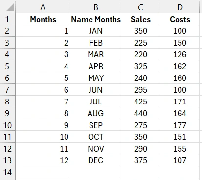
We have a table of initial data on monthly sales and expenses throughout the year:
We need to create a combination chart with a data sample on sales and a function to visualize the comparison of selected periods with the overall picture.
Creating a Pivot Table from Initial Data
First, let's create a pivot table. Place the Excel cursor on any cell of the initial values table and select the tool: Insert – Tables – PivotTable.
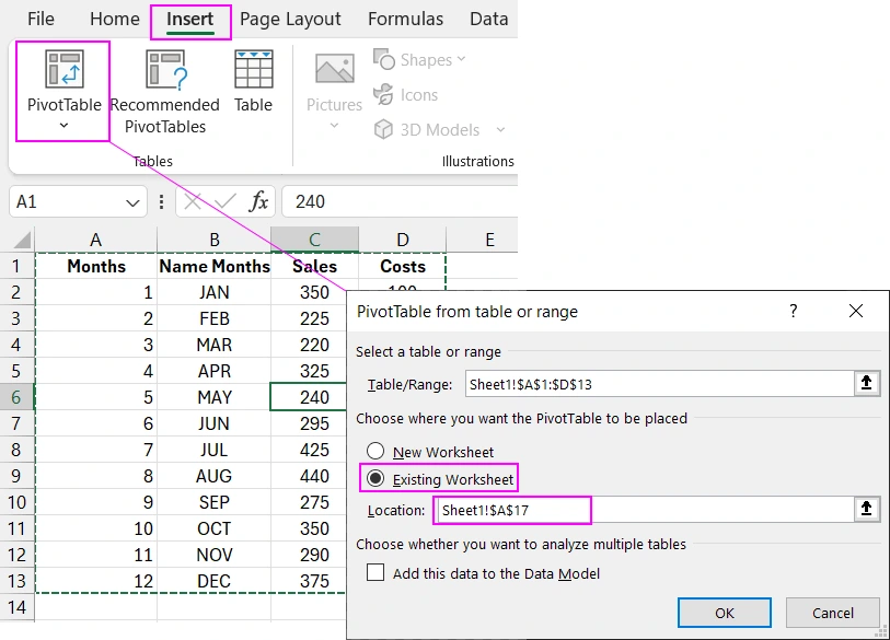
In the "PivotTable from table or range" window that appears, under the "Choose where you want the PivotTable to be placed" settings section, switch to the "Existing Worksheet" option and in the "Location:" input field, specify the reference to the current worksheet cell: Sheet1!$A$17.
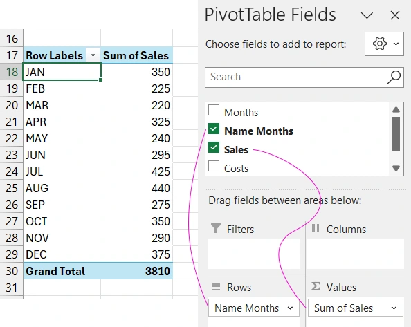
As a result, we added a pivot table to the current sheet. Now we need to set up its data fields.
Let's add another column to the initial table and name it "Sales Level 2". This column should be filled with the formula:
=IFERROR(GETPIVOTDATA("Sales",$A$17,"Name Months",B2),NA())
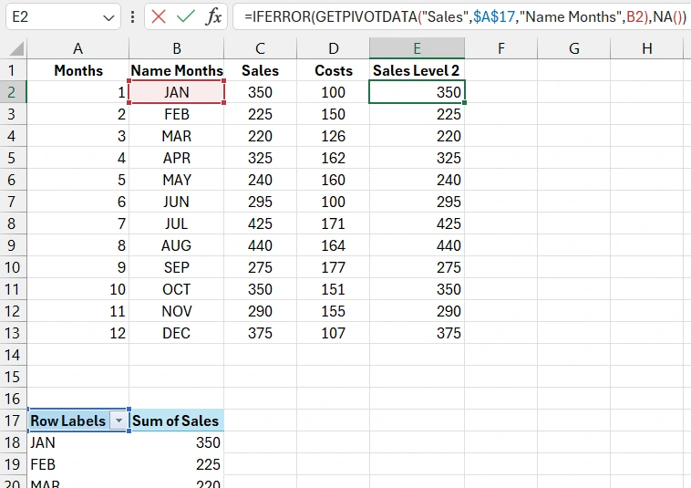
With the formula, we fill the column only with values contained in the pivot table. If there is no value, it returns #N/A. Currently, the pivot table does not use data sample filters, and all its values correspond to the initial ones.
Creating an Interactive Chart Control Element
Let's create a data sample control element using value filtering in the pivot table with the Slicer tool. To do this, place the Excel cursor on any cell of the pivot table and select the tool: Insert – Filters – Slicer.
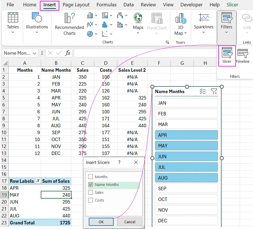
Now we have the ability to control the data sample in the pivot table using the slicer. Notice how the formula in the initial table column "Sales Level 2" behaves.
Creating a Combination Chart Template
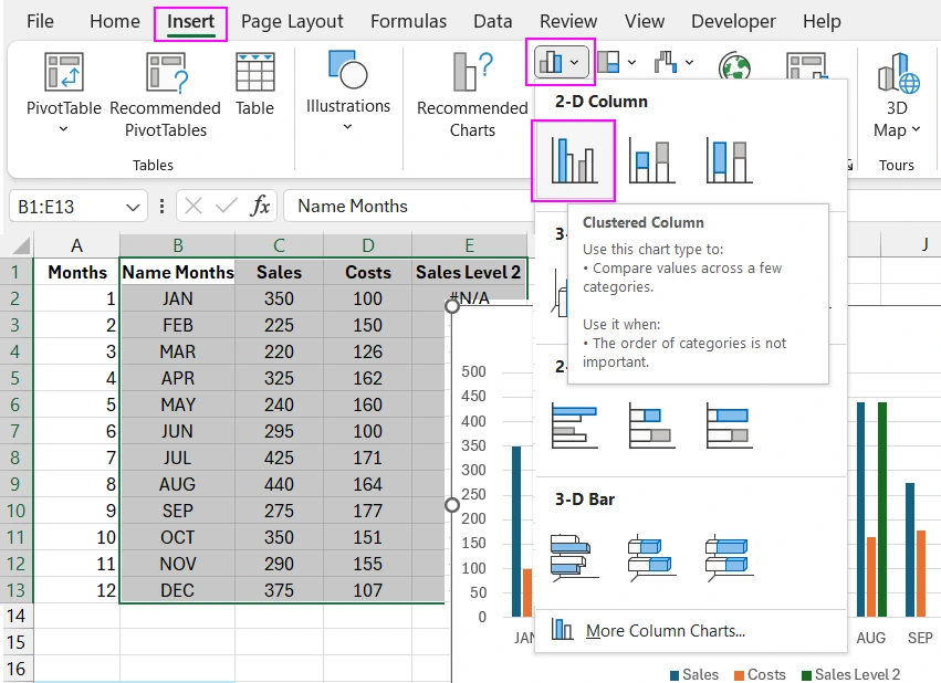
Let's move on to creating a combination chart template in Excel. Select the cell range in the initial table B1:E13 and choose the tool: Insert – Charts – 2-D Column.
Now select the "Costs" data series on the chart and assign it a new type using the tool: Insert – Charts – 2-D Line.
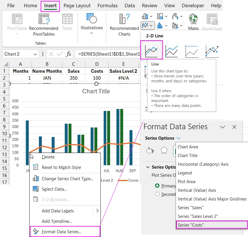
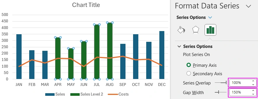
As a result, we obtained a combination of two chart types. Let's proceed with further visualization settings. Select any data series from the column chart ("Sales" or "Sales Level 2") and press the keyboard shortcut CTRL+1 to call the additional chart parameters window "Format Data Series". In the "Plot Series On" section, fill in the two input fields with the following values:
- Series Overlap: 100%.
- Gap Width: 150%.
Let's add another data series to the combination chart for another type. Click the chart with the left mouse button to call up additional tabs in the main Excel menu and select the tool: Chart Design – Data – Select Data.
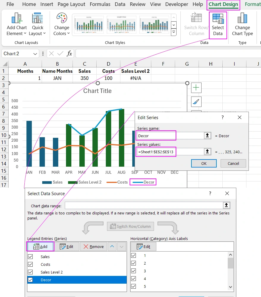
In the "Select Data Source" window that appears, under the "Legend Entries (Series)" section, click the "Add" button to call up the additional "Edit Series" window and fill in the two input fields:
- Series name: Decor.
- Series values: =Sheet1!$E$2:$E$13.
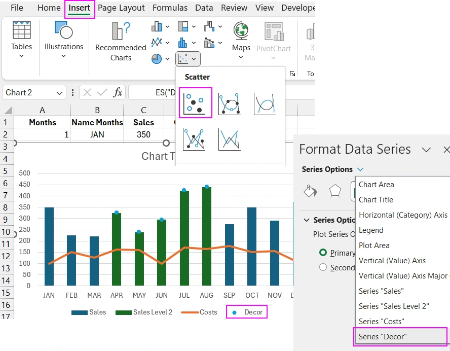
Now the combination chart will use 4 data series and 3 types of visualizations. Select the last data series "Decor" and assign it a new chart type by choosing the tool: Insert – Charts – Scatter.
Let's add some decorative and functional settings for the last chart type. First, select the "Decor" data series and click the plus sign near the chart area to open the context menu of options. Then check the "Data Labels - Above" option.
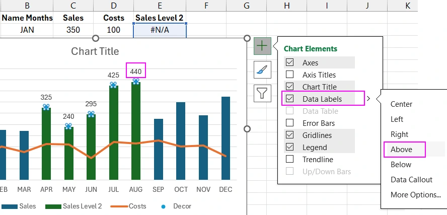
As a result, labels were added only for the selected data.
Let's add the final decorative element. To do this, follow a series of steps:
- Check the "Error Bars" box and select the "More Options" option from the drop-down menu.
- In the "Format Error Bars" window that appears, click on "Error Bar Options" and from the drop-down list, select the "Series Decor Y Error Bars" option.
- In the "Error Amount" section, check the "Custom" option and click the "Specify Value" button.
- In the additional "Custom Error Bars" parameter window that appears, in the "Negative Error Value" input field, enter the reference address to the cell range: =Sheet1!$E$2:$E$13 and click OK.
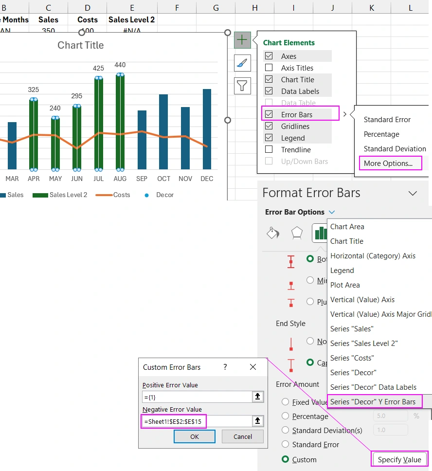
As a result, decorative lines were added, which can enhance the style of the combination chart.
Interactive Design for Data Visualization
Next, color all the elements of the entire data visualization block as shown in the video above.
By using color style settings for data slicers in Excel pivot tables, you can create beautiful buttons. It is important to note their functionality, designed for comfortable data selection from the database. Multiple buttons can be pressed simultaneously and also work in toggle mode. This is very helpful in the process of visual data analysis for dashboards, presentations, or interactive reports. All interactivity of automatic value filtering is implemented without the use of macros.
For example, like on such a beautiful dashboard:
 Dashboard for managing KPI plans in Excel.
Download the combination chart in Excel with interactive design 

Data Visualization Charts for Interactive Report Creation in Excel.
Dashboard Templates