DOWNLOAD a KPI Dashboard for a CRM System in Excel
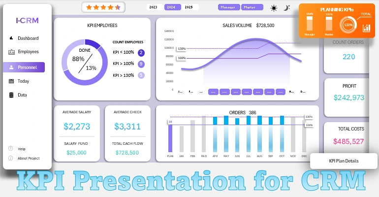
The skill of creating a KPI dashboard in Excel empowers you to analyze CRM system data effectively. In this video tutorial, you will learn how to design an interactive dashboard with dynamic design and use it in Excel spreadsheets. This template will help you analyze and visualize key employee performance metrics.
Practical Guide to Creating a KPI Dashboard in Excel for CRM

Follow a step-by-step process to build a dashboard template model in Excel. For certain specific data visualization tasks, you may need to use additional features in the MS PowerPoint shapes editor. Let’s take it one step at a time.
Complete Content of the Two-Hour Video Lesson:
- 3D grid template for dashboard data visualization.
- Preparing source data and setting up pivot tables.
- Formulas for extracting data based on KPI metrics.
- Example of how to use the DSUM function in Excel.
- Using the VSTACK function in Excel formulas.
- Filling the basic data processing table with formulas.
- Excel formula example for working with an associative array "Key → Value".
- Formula table for creating an interactive line chart for sales volumes.
- Creating interactive dashboard controls using data slicers.
- How to create a dynamic combo chart with interactive capabilities in Excel.
- Designing the dashboard with supplementary summary metrics.
- Formula table for creating a chart of order completion metrics by employees.
- Building an interactive dynamic bar chart for completed orders by employees.
- Adding a new button block to switch between dynamic employee roles, "Manager and Technician".
- Formula table for creating a distribution chart of final KPI metrics by employee roles.
- Creating a chart to segment KPI data by employee categories.
- Filling cell ranges with formulas to calculate a summary KPI rating for the accounting period.
- How to create a star rating chart in Excel.
- Using MS PowerPoint’s shape editor for features unavailable in Excel.
- Formulas for building a chart with the ability to display overachievement.
- How to create a chart to show metrics exceeding 100%.
- Finalizing the design of the KPI summary information.
- How to use the HSTACK function to sort non-contiguous ranges with the SORT formula.
- Formula table for building a detailed employee ranking by KPI metrics.
- Building a descending performance ranking chart for employees on a separate Excel sheet.
- Summary information on employee salaries and total sales results.
- Developing a dark mode version of the KPI dashboard screen with dynamic visualization design for CRM systems.
- Showcasing the data visualization capabilities for KPI metrics in Excel.
This video lesson is part of the main CRM dashboard template created in MS Excel as a prototype.

By mastering the skill of creating interactive data visualizations in Excel, you will not only analyze key metrics effectively but also present results clearly, automate reports, and boost productivity. Remember, over 80% of investments were attracted through presentations!

