How to Make a Line Graph for data comparison in Excel
Combined charts are the best solution for comparative analysis of similar data in a single visualization block in Excel. Their usefulness cannot be overstated. A combined line chart can be used both independently and in combination with other charts on an interactive Excel dashboard.
How to Create an Interactive Combined Line Chart in Excel
The main task of combined charts is to provide the user with a data visualization tool that allows for the comparison of values within the same viewing area. This avoids the need to look at two or more charts simultaneously when performing visual comparative data analysis.
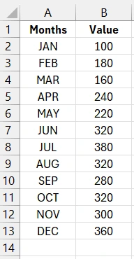
As an example, let's take a simple table with source data containing a single data series:
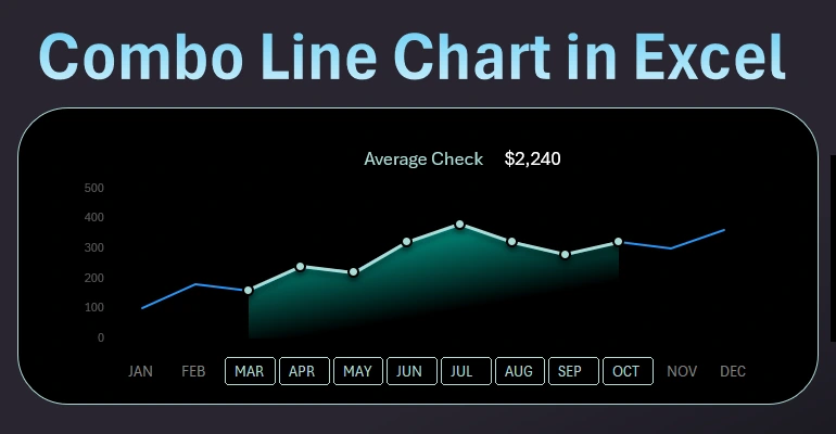
We need to present a data visualization that compares a selected group of values with overall similar indicators. For example, we need to compare the second quarter to the entire current year. What percentage of sales occurred in the second quarter? What portion of expenses was covered in the second quarter? This means selecting data for the accounting period – the second quarter – and visually comparing it to the current year.
This is very convenient to do on the same chart. However, to implement this capability, we need to extend the chart’s functionality by creating interactive features.
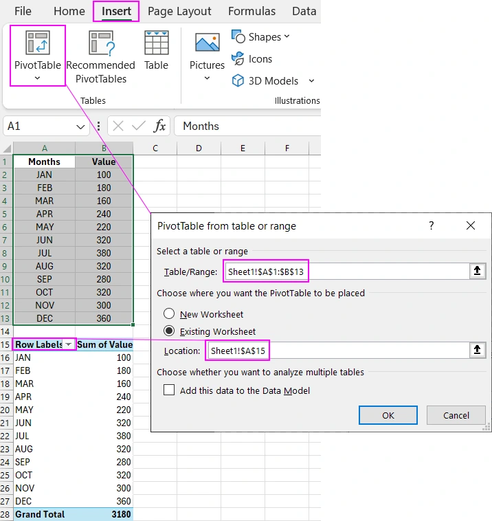
In this example, we will use source value filtering for selection and slicer buttons for chart control. To implement this in Excel in a rational way (without using macros), we need a pivot table. Select the range of the entire source table A1:B13 or simply place the Excel cursor on any cell in this range and choose the tool: “Insert” - “Tables” - “PivotTable”.
Next, we will create a control panel for filtering the pivot table using an Excel slicer element. Essentially, we will control the data selection for any desired accounting period within the current year.
Creating a Button Panel for Interactive Chart Control in Excel
To do this, place the Excel cursor on any cell within the pivot table range A15:B28 and choose the tool: “Insert” - “Filters” - “Slicer”. In the “Insert Slicer” window that appears, check the “Months” option and click OK.
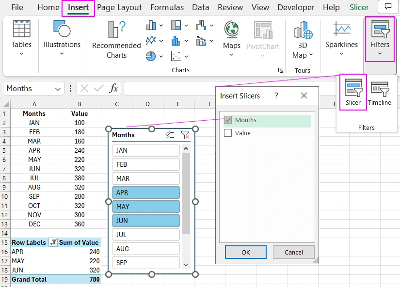
This shows the selection for the second quarter. To make the slicer element blend harmoniously with the chart design, make it horizontal, as we will use it ergonomically in the area of the horizontal axis labels (months). To do this, make a few settings for the slicer. Select the slicer with a left mouse click and go to the newly appeared additional tab in the main menu “Slicer”. In the “Buttons” section, change the “Columns” parameter to 12, since there are twelve months in a year. And in the “Size” section, adjust the width and height of the panel.
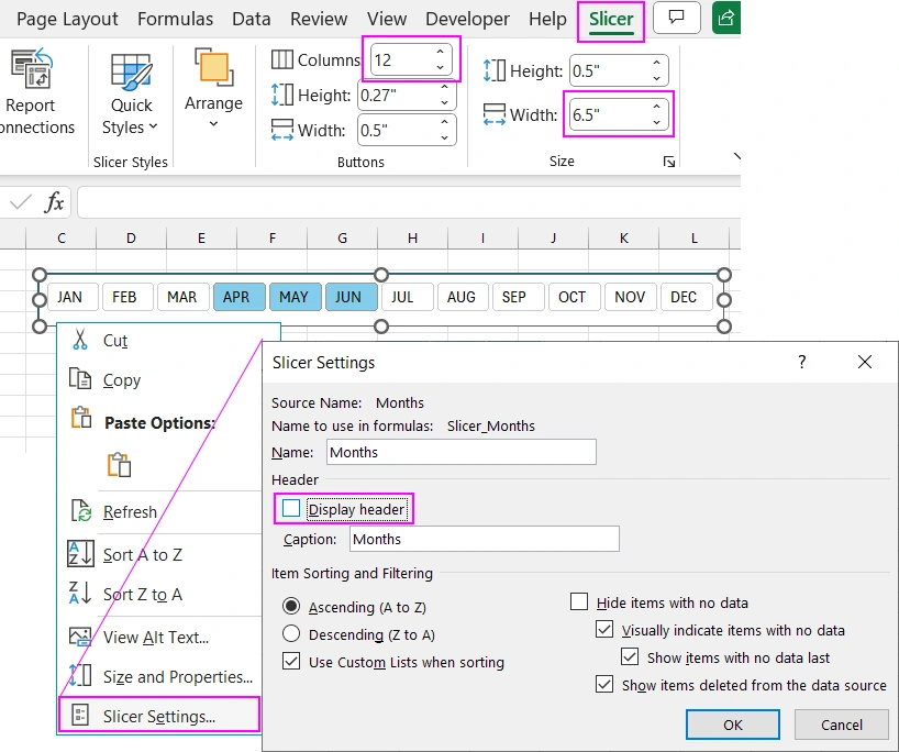
To hide the panel title and give it a more minimalist look, perform two steps:
- Right-click on the slicer and select “Slicer Settings” from the context menu.
- In the window that appears, uncheck the “Display header” option in the “Header” section and click OK.
Return to the source table to prepare it for the line chart.
Add another column “Val Level 2” to the source table and fill it with formulas referencing the pivot table:
=IFERROR(GETPIVOTDATA("Value",$A$15,"Months",A2),NA())
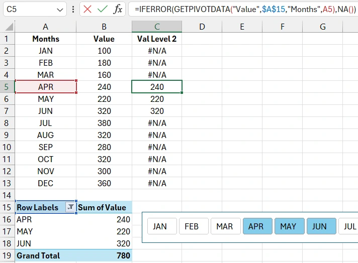
This column will be used for the second data series of the combined chart. We need one more column for the third data series. Add the last column “Cursor” and fill it with formulas:
=IF(COUNTIF($C$2:$C$13,">0")=1,C2,NA())
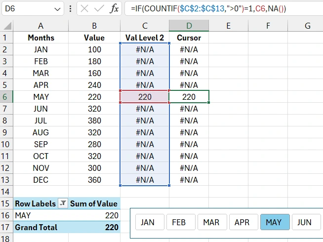
The task of the logical formula in this column is to display the value if only one month is selected, otherwise #N/A.
The table is set up, so we can proceed to create and configure the template for the combined chart.
Creating a Combined Line Chart Template in Excel
Place the Excel cursor on any cell within the source table range A1:D13 and press the hotkey combination CTRL+A (only once) – this will select all the cells within the source table. Next, choose the tool: “Insert” - “Charts” - “2-D Line”.
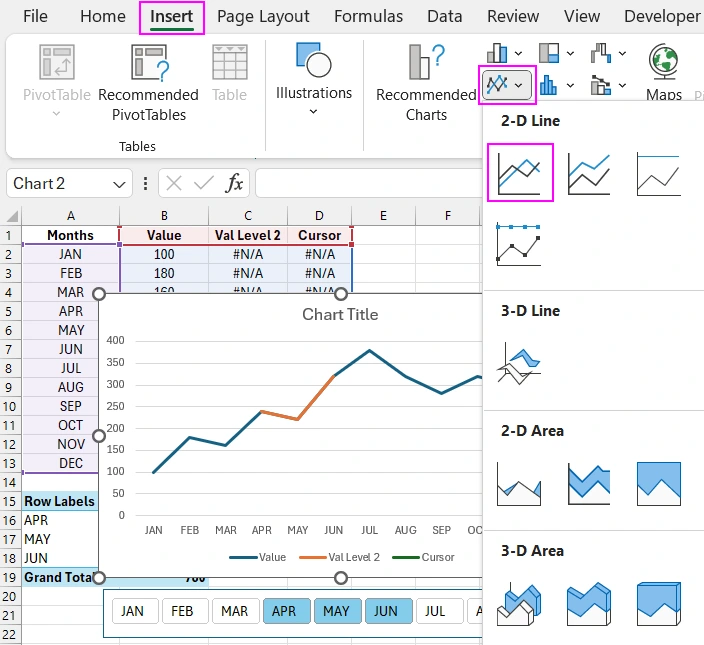
As shown in the image above, even at this stage, the advantage of a combined line chart is already noticeable. All that remains is to configure and display all the data series.
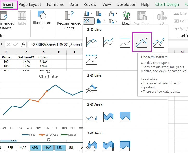
Adding a Line with Markers Chart Type to the Visualization Combination
Single-click the curve related to the "Val Level 2" column on the chart. Assign this data series a new chart type without deselecting it by choosing the tool: "Insert" - "Charts" - "Line with Markers".
Next, we do not have the ability to select the third data series by clicking on the line chart. When selecting more than one month, the data in the last column is not displayed.
Adding and Configuring a Scatter Chart Type in the Visualization Composition
We will access the third series using other options in the Excel interface. For example, you can click on any visible series on the chart and press the hotkey combination CTRL+1 or right-click to bring up the context menu and select the "Format Data Series" option. In any case, we will get access to an additional window where you can select the desired data series from the dropdown options in the "Series Option" section.
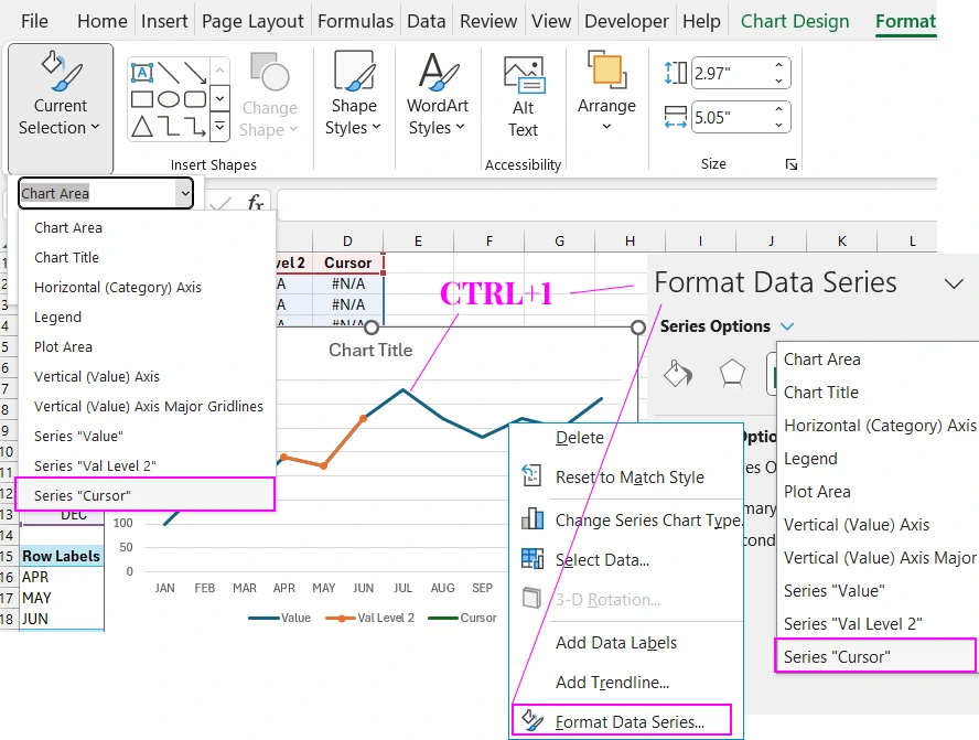
Alternatively, you can simply select the chart itself with one click and go to the "Format" tab in the main menu, then select the desired data series from the dropdown list in the "Current Selection" section.
For the selected necessary third data series "Cursor", specify a different chart type by choosing the tool: "Insert" - "Charts" - "Scatter".
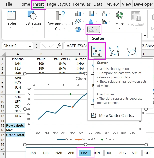
The first thing we need to do to display the third data series is to specify only one month for data selection on the slicer panel. In this case, the formula will display values in the "Cursor" column, otherwise #N/A - according to the formula conditions.
The third chart type needs to be configured. A scatter chart has two input fields for specifying Y and X-axis values. Let’s go to the settings. To do this, select the chart area with one click and in the additional tabs of the main menu, choose the tool: "Chart Design" - "Data" - "Select Data".
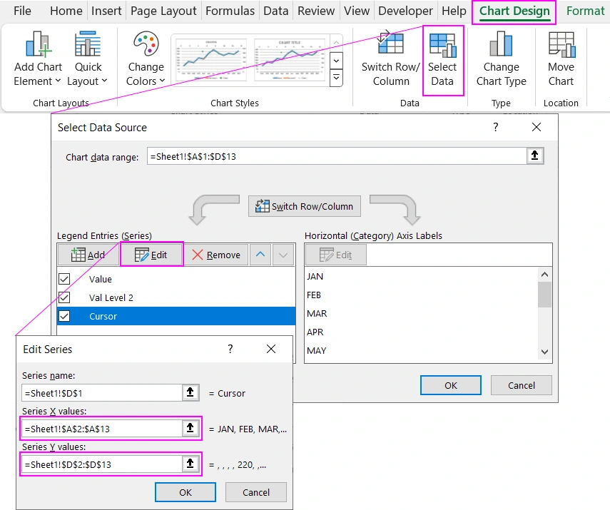
In the "Select Data Source" window that appears, in the "Legend Entries (Series)" section, click the "Edit" button and in the "Edit Series" window, fill in the parameter fields with the appropriate references to the cell ranges of the source table:
- Series X values:
- Series Y values:
=Sheet1!$A$2:$A$13
=Sheet1!$D$2:$D$13
Next, we need to remove the auxiliary coordinate axes. Click the large plus sign next to the selected chart and uncheck the following options in the dropdown context menu:
- "Chart Elements" - "Axes" - "Secondary Horizontal";
- "Chart Elements" - "Axes" - "Secondary Vertical".
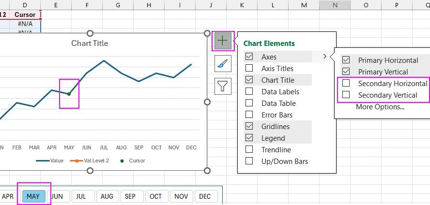
In this same menu, we will configure the decorative style of the cursor. But first, we need to select it by clicking the left mouse button on the chart.
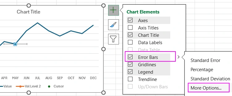
Creating an Interactive Cursor on an Excel Line Chart
Click the plus sign and check the option: "Chart Elements" - "Error Bars" and then select the "More Options" from the dropdown menu.
This will bring up the "Format Error Bars" settings window. From the dropdown list in the "Error Bar Options" section, select the "Series Cursor Y Error Bars" option. This way we will configure vertical lines, and we need to remove the horizontal ones by selecting them with a mouse click and pressing the Delete key on the keyboard.
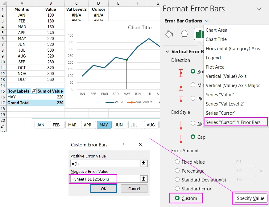
Next, in the "Vertical Error Bars" parameters section, check the "Custom" option in the "Error Amount" section and click the "Specify Value" button to bring up the "Custom Error Bars" window. In the "Negative Error Value" input field, specify the reference to the cell range of the last column of the source table: =Sheet1!$D$2:$D$13.
Design for Presenting a Combined Line Chart in Excel
All the template functionality is configured; now we just need to color it with stylish colors for presentation. An example of a dynamic design for interactive visualization for data comparison.
As they say in Japan: "Half the work is done – sell the deal!" We should not only create effective functionality but also give it an attractive appearance. The user must be captivated by the spiritual energy of the visualization design's beauty. As a result, your line chart will harmoniously blend with any dashboard. For example, as shown in this template:
 Dashboard for managing KPI plans in Excel.


Data Visualization Charts for Interactive Report Creation in Excel.
Dashboard Templates