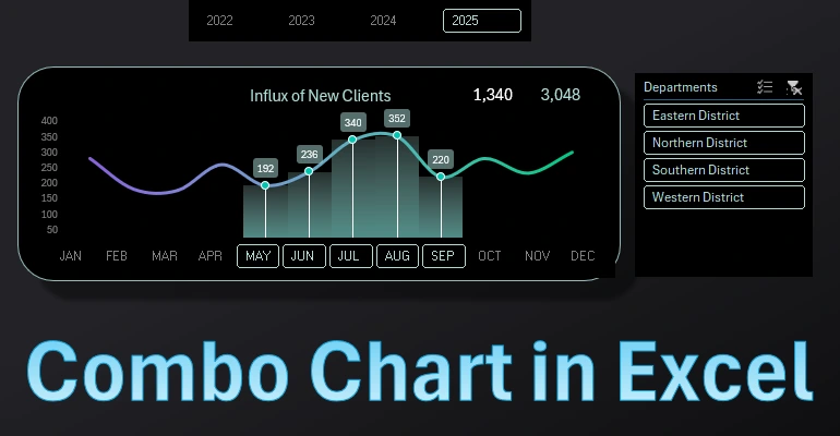
How to make a Combination Chart in Excel step by step
The combined chart allows for significantly expanding the possibilities of data visualization in Excel. In this example, a chart will be created for visual analysis of the dynamics of new customer influx throughout the year. This combines data informativeness and graphic design beauty with interactive data selection capabilities for presentations in Excel. A visual example for inspiring an information designer.
Creating an Informative Combo Chart in Excel
The main task is to achieve a harmonious integration of different elements: columns, lines, and points of similar values in one chart. MS Excel offers a variety of tools to effectively accomplish this task. Moreover, it provides the ability to stylize the design with fine color adjustments:
- Different types of gradient fills;
- Transparency;
- Brightness;
- Positioning;
- Shadow settings;
- Glow effects, and more.
Let's explore all these features in one example step by step.
Step One: Preparing the Source Data
According to the technical specifications, our chart should be interactive and capable of segmenting data based on several conditions:
- By years.
- By months.
- By departments.
Therefore, we need to initially structure the source data table correctly:
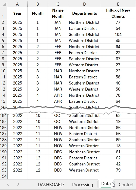
You can download the complete version of the source data table at the end of the article.
Data grouping on the visualization will be implemented with interactive control elements – slicer buttons from the pivot table. Therefore, based on the source data, we need to create a pivot table on the "Control" sheet. But first, we will create a named range, which we will use as the data source. To do this:
- On the "Data" sheet, select all the source data (simply place the Excel cursor on any cell of the table and press the CTRL+A hotkey combination).
- In the NameBox field, enter a name for the future named range – "mydata" and press Enter to confirm.
- Verify the result. In the main menu, select the options: Formulas – Defined Names – Name Manager:
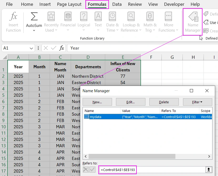
Now, when creating the pivot table, we will specify the named range "mydata" as the source. This way, it will be easier to update the data in the pivot table if necessary.
Creating a Pivot Table for the Interactive Combo Chart
Create the pivot table on a separate "Control" sheet to organize data separation and ease of working in the Excel document. To do this, place the Excel cursor on any cell of the table and select the tool: Insert – Tables – Pivot Table:
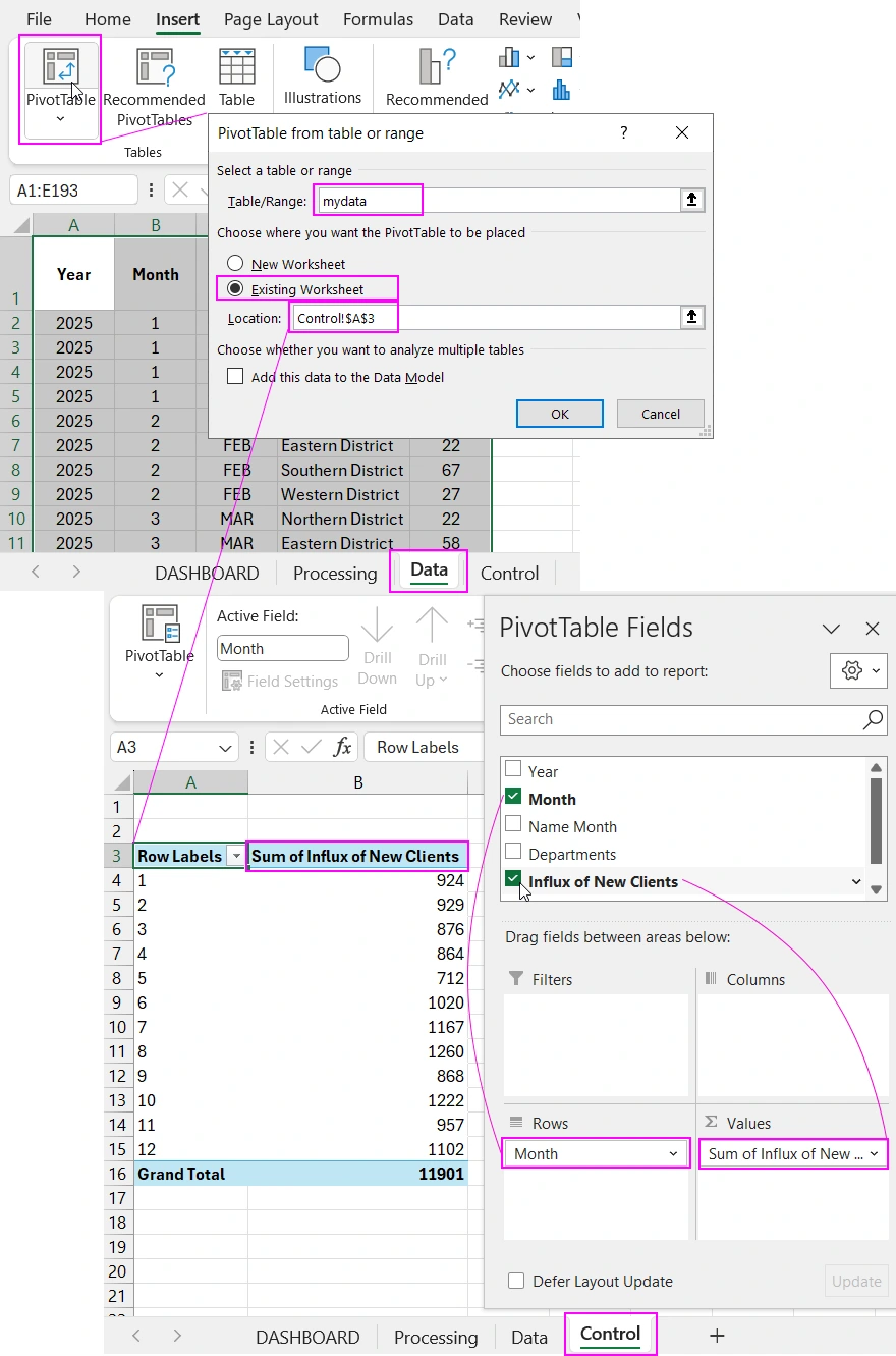
In the "PivotTable from table or range" dialog box, fill in the two input fields as shown in the image above:
- Table/Range: – specify "mydata" – this is the named range we created earlier for the named range of cells A1:E193 of the table on the "Data" sheet used as the data source.
- Location: – specify an external reference to another sheet Control!$A$3 – this reference indicates the place in the Excel document where the created pivot table will be located.
To specify the location for inserting the table on another "Control" sheet, you should first select the "Existing Worksheet" option.
Next, configure the pivot table fields as shown in the image above. Move the "Month" column header to the "Rows" field, and move the "Influx of New Clients" column header to the "Values" field. Done!
Creating a Formula Table for a Dynamic Chart
Creating an Informative Combo Chart in Excel
The main task is to achieve a harmonious integration of different elements: columns, lines, and points of similar values in one chart. MS Excel offers a variety of tools to effectively accomplish this task. Moreover, it provides the ability to stylize the design with fine color adjustments:
- Different types of gradient fills;
- Transparency;
- Brightness;
- Positioning;
- Shadow settings;
- Glow effects, and more.
Let's explore all these features in one example step by step.
Step One: Preparing the Source Data
According to the technical specifications, our chart should be interactive and capable of segmenting data based on several conditions:
- By years.
- By months.
- By departments.
Therefore, we need to initially structure the source data table correctly:
You can download the complete version of the source data table at the end of the article.
Data grouping on the visualization will be implemented with interactive control elements – slicer buttons from the pivot table. Therefore, based on the source data, we need to create a pivot table on the "Control" sheet. But first, we will create a named range, which we will use as the data source. To do this:
- On the "Data" sheet, select all the source data (simply place the Excel cursor on any cell of the table and press the CTRL+A hotkey combination).
- In the NameBox field, enter a name for the future named range – "mydata" and press Enter to confirm.
- Verify the result. In the main menu, select the options: Formulas – Defined Names – Name Manager:
Now, when creating the pivot table, we will specify the named range "mydata" as the source. This way, it will be easier to update the data in the pivot table if necessary.
Creating a Pivot Table for the Interactive Combo Chart
Create the pivot table on a separate "Control" sheet to organize data separation and ease of working in the Excel document. To do this, place the Excel cursor on any cell of the table and select the tool: Insert – Tables – Pivot Table:
In the "PivotTable from table or range" dialog box, fill in the two input fields as shown in the image above:
- Table/Range: – specify "mydata" – this is the named range we created earlier for the named range of cells A1:E193 of the table on the "Data" sheet used as the data source.
- Location: – specify an external reference to another sheet Control!$A$3 – this reference indicates the place in the Excel document where the created pivot table will be located.
To specify the location for inserting the table on another "Control" sheet, you should first select the "Existing Worksheet" option.
Next, configure the pivot table fields as shown in the image above. Move the "Month" column header to the "Rows" field, and move the "Influx of New Clients" column header to the "Values" field. Done!
Creating a Formula Table for a Dynamic Chart
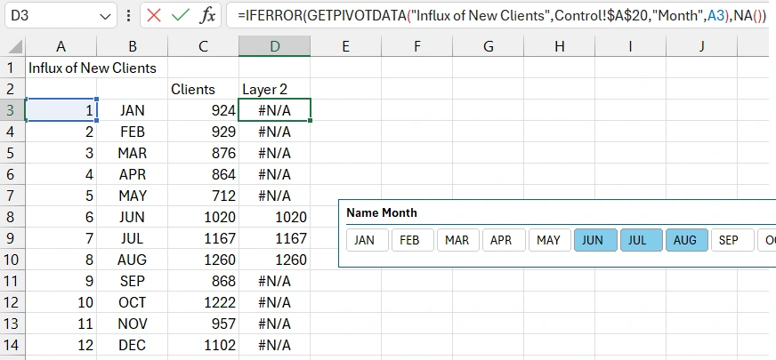
Fill in the data on the "Processing" sheet. Create a table as shown in the image below. However, the "Clients" column should be filled with formulas with internal and external references to the pivot table. Fill the entire range of column C3:C14 with the formula.
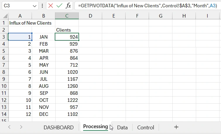
Thus, with the formula, we reference the month number (internal reference A3) and the address of the pivot table (external reference Control!$A$3) with the specified column header name "Influx of New Clients". As a result, we get the corresponding values.
The "Clients" column will use the values of cells C3:C14 for the lower layer of the chart. This lower layer will not change when filtering data by months. But the next layer will be dynamically changeable when interacting with the user. We will call it "Layer 2" and prepare the source values.
To make the combo chart dynamic and able to present the comparison of static and dynamically changing values, we need to create another pivot table. It will be almost identical to the previous one, so we will simply copy it and label it for dynamically changing monthly data. Let's return to the "Control" sheet.
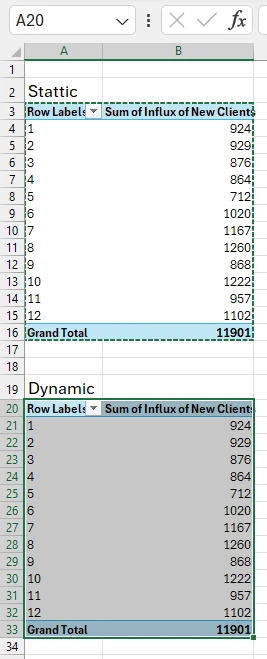
Select the range of the existing pivot table A3:B16, copy and paste its copy into cell A20.
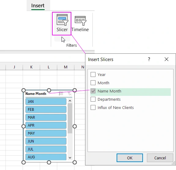
Next, we need to create a control element. Without deselecting the cells of the second newly created pivot table, choose the tool: Insert – Filters – Slicer.
If you hold down the left mouse button and drag over some slicer buttons, the content of the second (dynamic) pivot table will change according to the data selection control element.
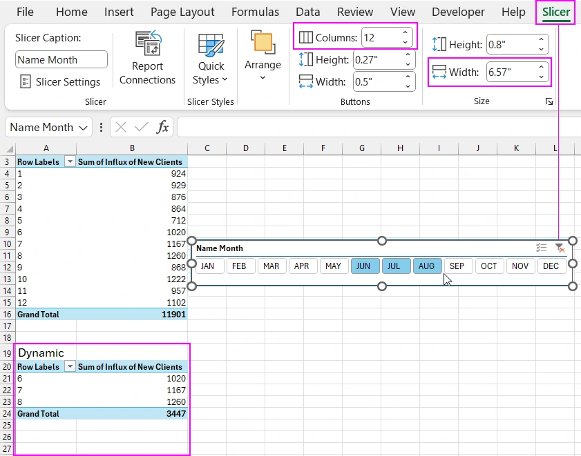
To arrange the slicer buttons horizontally instead of vertically, select the slicer element, and an additional "Slicer" tab will appear in the menu. In the "Buttons" section, set the value to 12 in the "Columns:" field. And accordingly, change the width of the element to 6.57 in the "Width" field in the "Size" section.
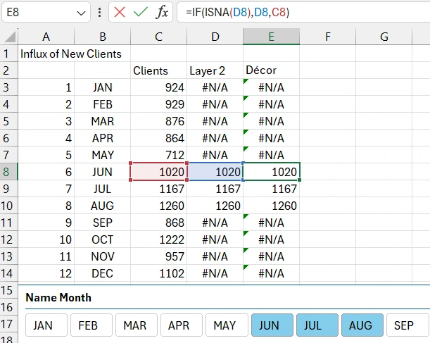
Now copy the slicer panel and move it to the "Processing" sheet. Then fill the next "Layer 2" column with the formula across all its cells in the range D3:D14.
We will need one more dynamic data layer in the chart for decorative formatting with additional auxiliary information and styles. Therefore, create the last column "Decor" and fill its range E3:E14 with the formula:
Creating a Template for the Chart with Abstractions
Now let's proceed to create the chart itself. First, create a rounded rectangle shape. Use it as the base design of the data visualization block.
Choose the tool: Insert – Illustrations – Shapes – Rectangle Rounded Corners.
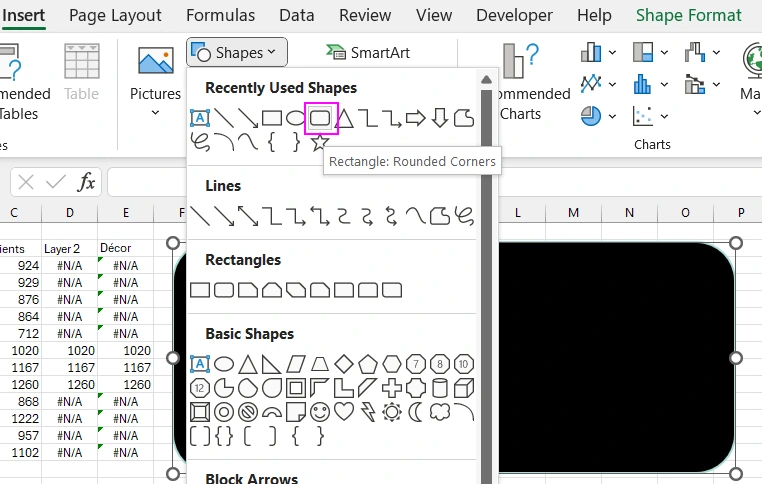
Select the rectangle with the left mouse button and press the CTRL+1 hotkey combination to bring up the additional "Format Shape" panel. Set the background color to black #000000 and the line color to light blue #AADCD7.
Create a dynamic combo chart in Excel. Select the cell range B2:E14 on the "Processing" sheet and choose the tool: Insert – Charts - Insert Line or Area Chart – 2D Line.
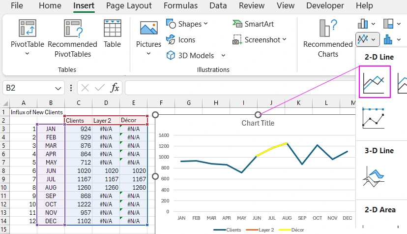
Now select the chart and press the CTRL+1 hotkey combination to bring up the additional "Format Chart Area" panel.
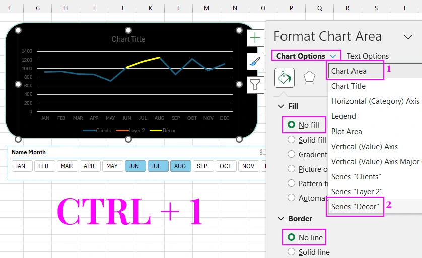
- First, for the "Chart Area" object, remove the background and the border line.
- We need to switch to the data series of the "Decor" column.
Setting Chart Types to Create a Combined Visualization Composition
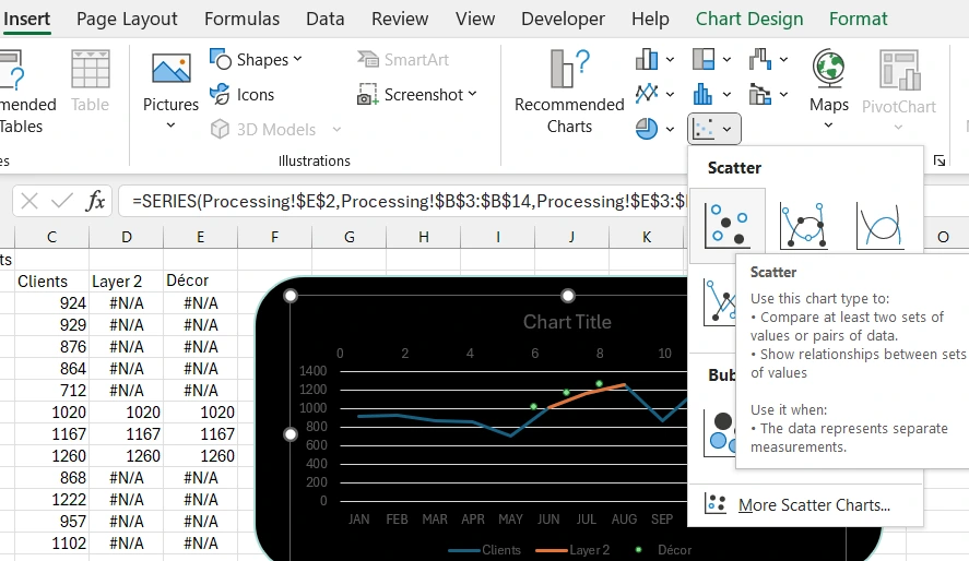
Change the chart type for the "Decor" data series. To do this, when the required series is already selected on the chart, simply specify the new chart type in the Excel menu tab: Insert – Charts – Scatter.
Additional X and Y axes have appeared. This needs to be corrected. Select the chart itself to bring up the additional "Chart Design" menu tab. Choose the tool: Chart Design – Type – Change Chart Type. Uncheck the "Secondary Axis" option as shown in the image below.
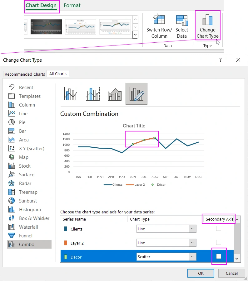
As a result, the Scatter markers are positioned in their corresponding places.
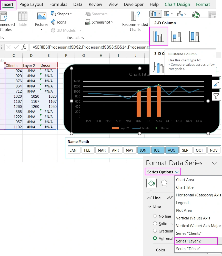
Now you need to select the second "Layer 2" data series. On the additional "Format Chart" panel (CTRL+1), choose the second column data series and specify a new chart type by selecting the tool: Insert – Charts – Clustered Column.
Step-by-Step Design Construction of the Visualization Block
Now all chart types are set. Let's design the appearance.
Select the chart area and use the plus button on the right to expand the drop-down options menu to uncheck and remove elements: Gridlines, Legend.
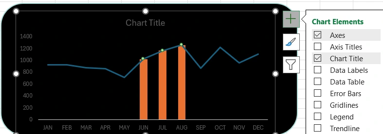
Select the first "Clients" data series by clicking the left mouse button on the line and press CTRL+1 to bring up the additional "Format Data Series" panel. Make the following settings as shown in the image below:
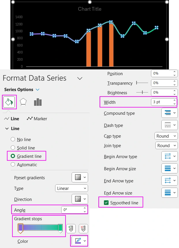
Gradient color settings for the curve:
- Angle 0.
- First color code #8760DC.
- Second color code #02C582.
Now decorate the second "Layer 2" data series:
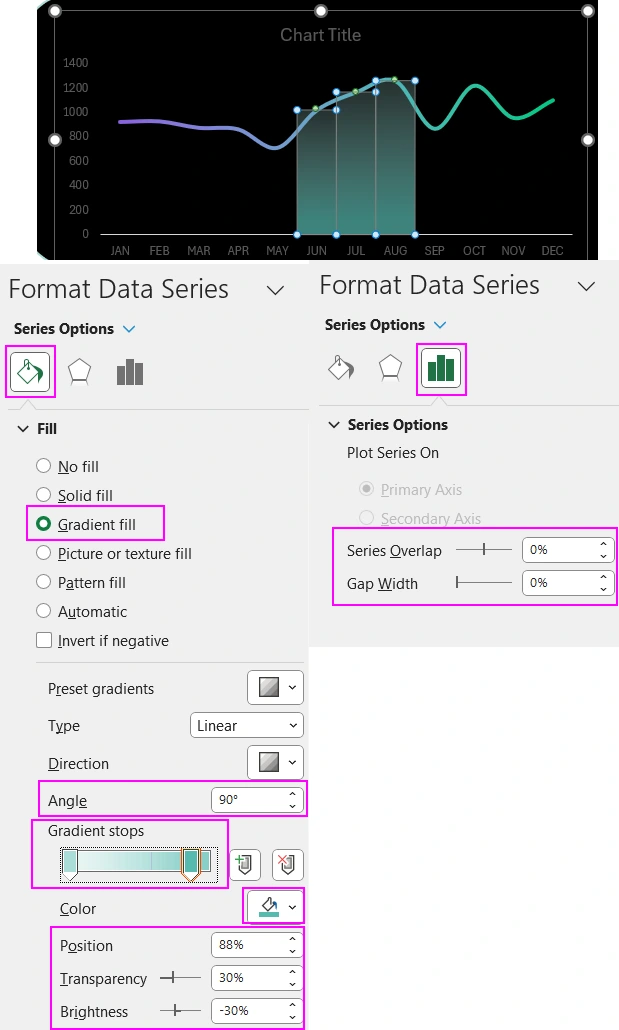
Gradient color settings for the column chart:
- Angle 90.
- First color settings: code #AADCD7, Position – 0%, Transparency – 78%, Brightness – 0%.
- First color settings: code #AADCD7, Position – 88%, Transparency – 30%, Brightness – -30%.
Now decorate the third "Decor" data series:
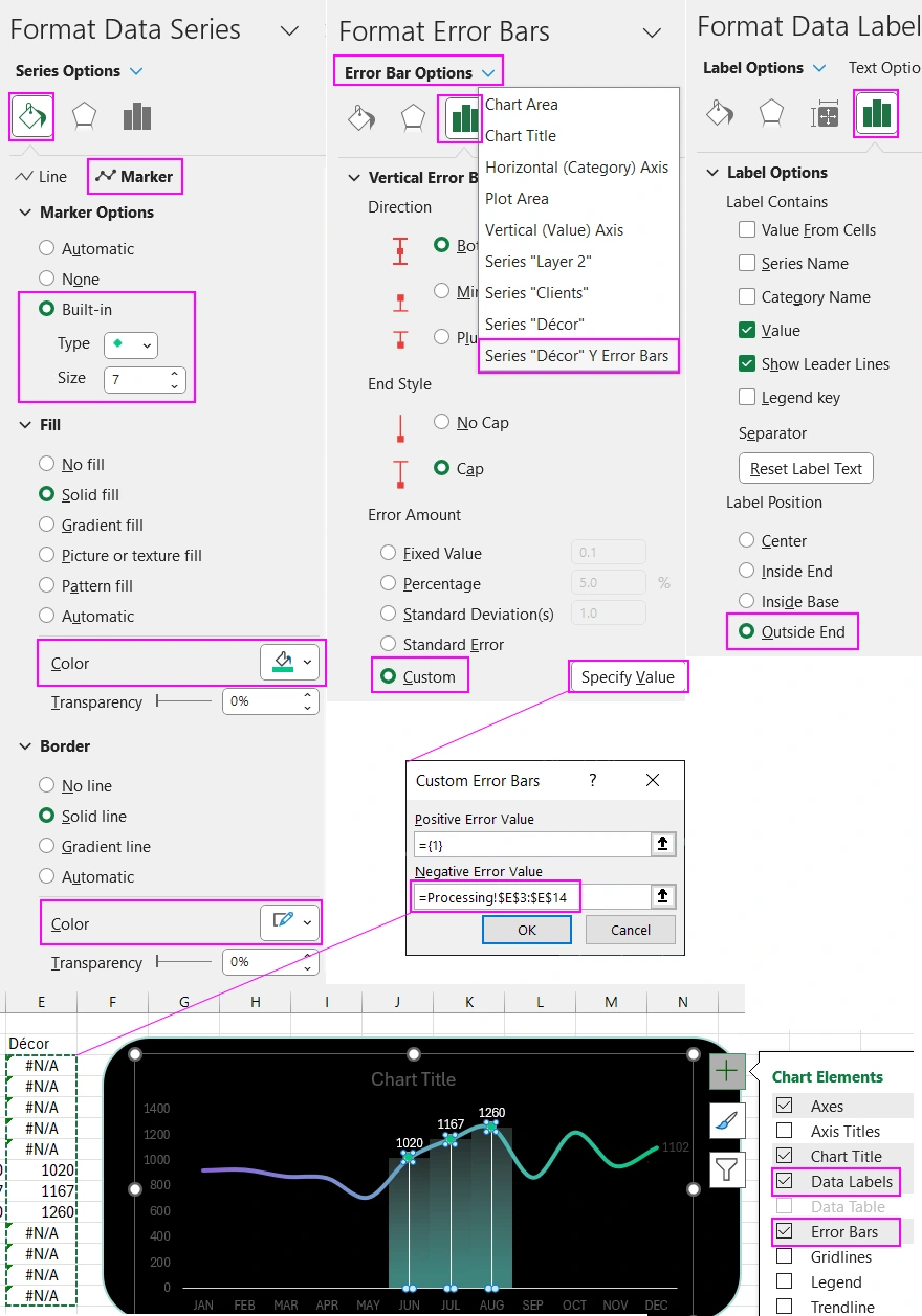
As a result, we get a stylish design for the dynamic Excel combo chart.
There is no limit to perfection and no masterpiece that cannot be improved. Watch the video tutorial at the beginning of the article, where an example of improving the design for this data visualization block is shown.
This combo chart is just one of the ten data visualization elements of the dashboard. You can download its template in this article:

Dashboard for managing KPI plans in Excel.
Video tutorial:


Data Visualization Charts for Interactive Report Creation in Excel.
Dashboard Templates