How to make Design Doughnut Chart in Excel for Dashboard
The dynamic chart will have its original design style. We will enhance it with large markers. Such possibilities are opened to us by combined charts in Excel. It is important to correctly position them on the XY coordinate axes. To do this, special formulas should be prepared for the initial values.
Dynamic design in Excel starts with numbers and calculation formulas
We fill in the source data table with formulas in each corresponding column.
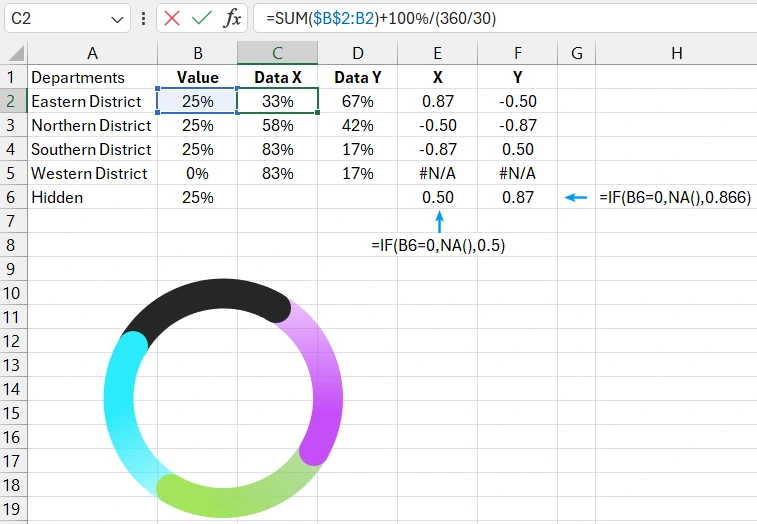
The pie chart will consist of 4 segments (+1 hidden). In the source table, there are 4+1 rows with data for each segment.
Data structure by columns in the source table:
- In the first column "Value" are the initial values for each segment. For simplicity of the tutorial material, first fill all 4 rows of this column with the same values of 25%. After completing the construction of the pie chart, you can change the initial values in this column and enjoy the finished result.
- In the second column "Data X" - preparation of data for calculating the coordinates of marker positions on the X-axis using a formula. Note that two types of references are used simultaneously in the arguments of the formula: absolute $B$2 and relative B2.
- In the third column "Data Y" formulas for preparing data before calculating the coordinates of marker positions on the Y-axis.
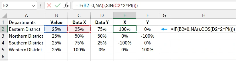
- In the fourth column "X" the position of the markers on the X-axis will be calculated directly, taking into account the circumference. Therefore, a formula with sine functions and the value of Pi will be applied there, based on the previously prepared data in the "Data X" column.
- In the fifth column "Y" the final calculation of the marker positions, taking into account the circumference on the Y-axis. There, a formula with cosine functions and the value of Pi will be applied, based on the prepared data in the "Data Y" column.
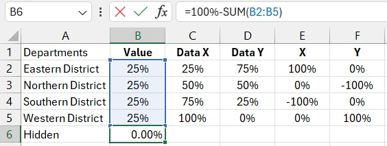
- In the fifth row of the source table, there will be formulas for calculating the hidden segment and the hidden marker of the chart.
The hidden segment serves to fill empty space when excluding values from visualization. It will be displayed only if one or more segments are excluded from the initial values of the dynamic chart.
Preparing source data for a doughnut chart with dynamic design
Let's start preparing data for positioning the decorative chart markers on the XY coordinate axes. At this stage of constructing a dynamically designed chart, the second column "Data X" in the source table contains a formula with absolute and relative types of references in the function arguments: =SUM($B$2:B2)
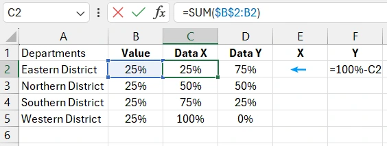
This approach allows us to dynamically cover the necessary part of the B2:B5 cell range. As a result, in column C, first, only one cell with the initial value of column B (25%) is summed, then two (25%+25%=50%), three (75%), and four (100%).
At the same time, the third column "Data Y" contains a formula for calculating the residual share of 100% after subtracting the initial value: =100%-C2.
Fill the fourth and fifth columns with formulas for calculating the coordinates for the markers on the X and Y axes using almost the same formula, but in the first we use the sine function, and in the second – the cosine function, referring to the corresponding columns with the prepared data:
- X:
- Y:
=IF(B2=0,NA(),SIN(C2*2*PI()))
=IF(B2=0,NA(),COS(D2*2*PI()))
Now fill another row in the source table for the hidden segment of the chart. It will be displayed only when any of the segments are excluded to fill the empty space and display the remaining share of 100%:
=100%-SUM(B2:B5)
Also, take care of the hidden marker for the hidden segment of the chart. It will be displayed under the condition of displaying its segment. Therefore, we will use logical formulas to specify coordinate values under the condition:
- E6:
- F6:
=IF(B6=0,NA(),0)
=IF(B6=0,NA(),1)
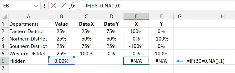
The values in the arguments 0 and 1 are constants. They do not change as this is the last marker in the last segment, and it is stationary for any changes in the pie chart data. They should be changed if the chart tilt angle parameter is changed, for example, at 30 degrees the argument values will be 0.5 and 0.866.
Example of how to create a doughnut chart template in Excel step by step
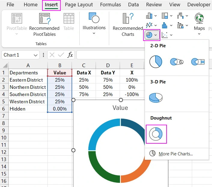
Now let's move on to creating the pie chart template. First, select the range of initial value cells B2:B6 and choose the tool: Insert – Charts – Doughnut.
Next, we add a series to combine the pie chart with another chart type for decoration with markers. Click on the chart and choose the tool from the additional menu tabs: Chart Design – Select Data.
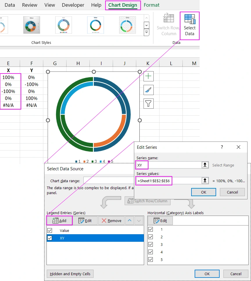
In the "Select Data Source" settings window under "Legend Entries (Series)", click the "Add" button. In the "Series values" input field, specify the reference to the range =Sheet1!$E$2:$E$6.
After adding the data series, we need to change the chart type and set it up. First, select the chart and press the keyboard shortcut CTRL+1 to open the additional "Format Data Series" window to select the second data series named XY.
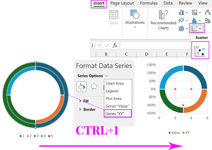
Then simply specify the new chart type by selecting the tool: Insert – Charts – Scatter.
As a result, markers appeared for stylish decoration of the pie chart.
Now we need to set up the new Scatter chart type. To do this, reopen the settings window: Chart Design – Select Data. In the "Legend Entries (Series)" section, select the data series named "XY" and click the "Edit" button.
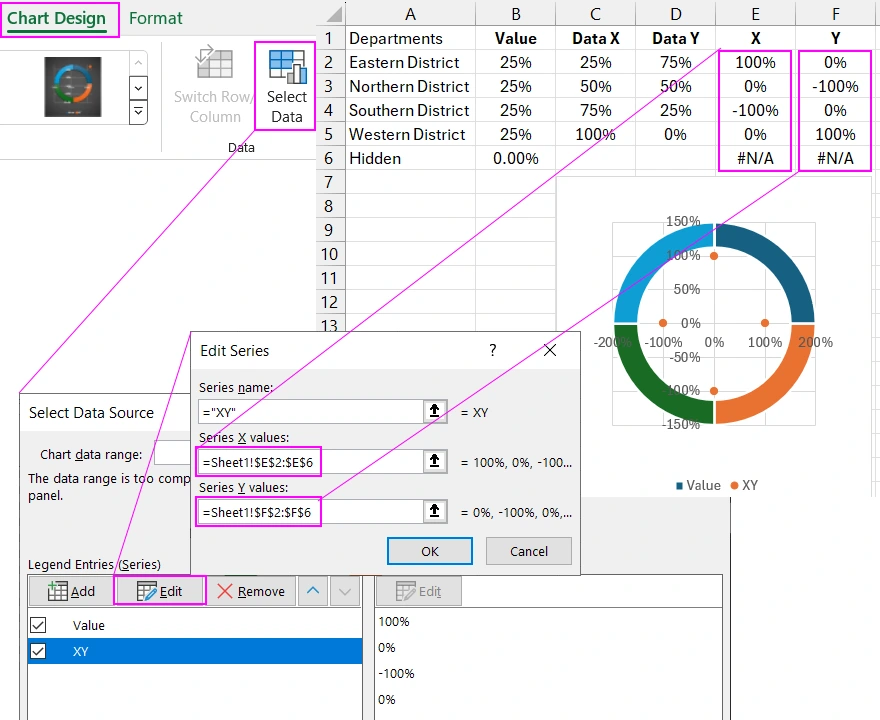
Now there are three input fields instead of two. Fill them in accordingly, as shown in the picture. In the "Series X values" input field, reference the cell range: =Sheet1!$E$2:$E$6, and in the "Series Y values" input field, reference =Sheet1!$F$2:$F$6.
To position the markers correctly, we need to calibrate the coordinate axis with fixed values. To do this, click the vertical Y-axis with the left mouse button and press the keyboard shortcut CTRL+1 to open the additional axis settings window and specify the fixed minimum value of -1.14 and the maximum value of +1.15.
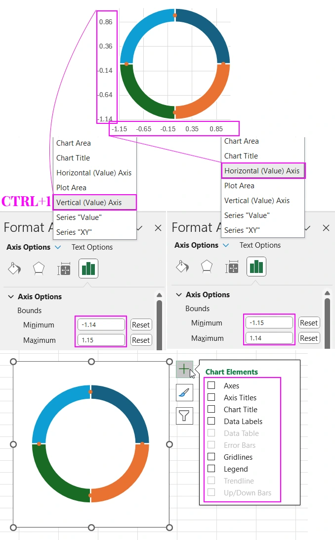
Note! For the X-axis, we specify a different fixed minimum value of -1.15 and a maximum value of +1.14.
After setting the axes, click the plus button next to the chart and uncheck all the options in the drop-down context menu to clear the template of unnecessary elements as shown in the picture above.
As a result, all decorative markers are positioned correctly on the pie chart.
The template is ready for color scheme decoration with gradient fills for the markers and segments as shown in the picture below.
First, we increase the marker size to the width of the segments.
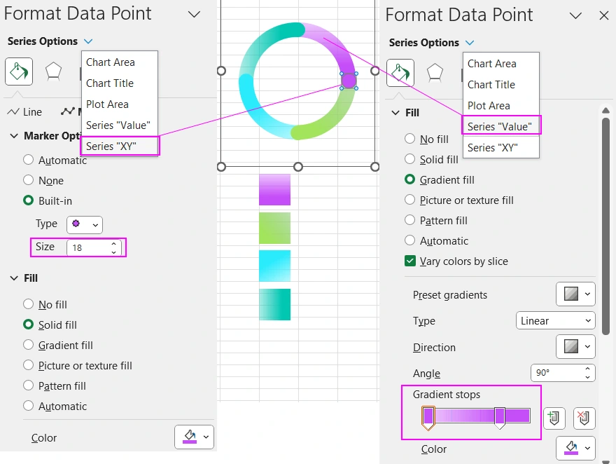
Then we set the colors on the markers and gradient fills on the segments. Also, don't forget to set the colors for the hidden marker and segment. First, you need to display them, for this, change one of the initial values to 0% to exclude it.
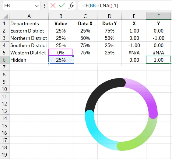
After which we color the hidden segment along with its hidden marker.
You can also rotate the pie chart by setting the appropriate tilt angle value in its parameters.
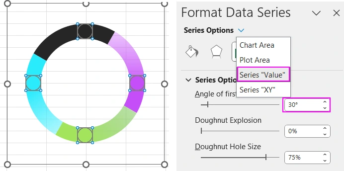
Now we need to rewrite the formulas for the new distribution of decorative marker positions on the pie chart. Change the formulas in the "Data X" column and cells E6 and F6:
- Data X:
- Cell E6:
- Cell F6:
=SUM($B$2:B2)+100%/(360/30)
=IF(B6=0,NA(),0.5)
=IF(B6=0,NA(),0.866)
Next, decorate the data visualization design using shapes, slicer buttons, and other standard MS Excel tools:
A beautiful design adds an element of play to the work process. As a result, work efficiency increases. Use Excel's capabilities for creative expression in new data visualization masterpieces. Your work process will be more enjoyable. Beauty is an unconditional and natural source of pleasure without side effects.
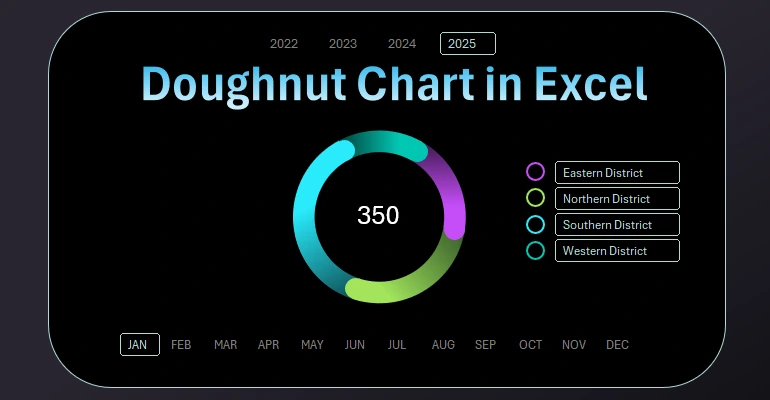
The practical application of a dynamically designed doughnut chart on a dashboard can be viewed and downloaded here:
 Dashboard for managing KPI plans in Excel.


Data Visualization Charts for Interactive Report Creation in Excel.
Dashboard Templates