How to make Dynamic Doughnut Chart in Excel for Dashboard
Recently, it has become fashionable to criticize pie charts among analysts, data visualizers, information designers, and dashboard developers. However, it is difficult to imagine a complete data visualization presentation without using a pie chart. Let's look at an interesting design solution in Excel that might provide a new perspective on doughnut charts in dashboards.
Preparing Formulas and Source Data
The structure of the formulas for the doughnut chart consists of three ranges:
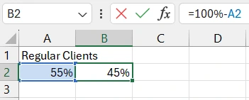
- A2:B2 – Here are the data for the basic Excel doughnut chart. In cell A2 – the source data, and the cell is highlighted for clarity. A2 does not contain formulas, and its values can be changed. In cell B2 – the formula calculates the free share from the source value in percentage: =100%-A2.
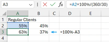
- Range A3:B3 – Intermediate formulas for converting values, considering the 30-degree tilt of the doughnut chart. To create an attractive design, it was decided to tilt the pie chart clockwise by 30 degrees. This will affect the marker's position coordinates on the chart. If you do not tilt the chart by 30 degrees but leave it in the initial base position, these formulas are unnecessary. However, in this case, the source values need to be adjusted. Therefore, enter the formula =A2+100%/(360/30) in cell A3, and in cell B3, the formula: =100%-A3.
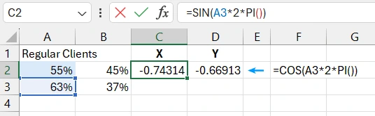
- C2-D2 – To create a stylish design for the doughnut chart, we will use a combination of two chart types. Thus, there will be two data series. In range C2-D2, the data for the second series, i.e., for the scatter chart, are located. These will be the coordinates for the decorative marker's position on the chart. Since the coordinates should consider the circle formula, trigonometric functions will be used. In cell C2, the formula: =SIN(A3*2*PI()), and in cell D2, the formula: =COS(A3*2*PI()).
All source data is ready, and we can proceed to create the doughnut chart template.
Creating a Template for a Dynamic Doughnut Chart in Excel
First, create a template from the basic Excel doughnut chart. Select the first range of source data A2:B2 and choose the tool: Insert – Charts – Doughnut.
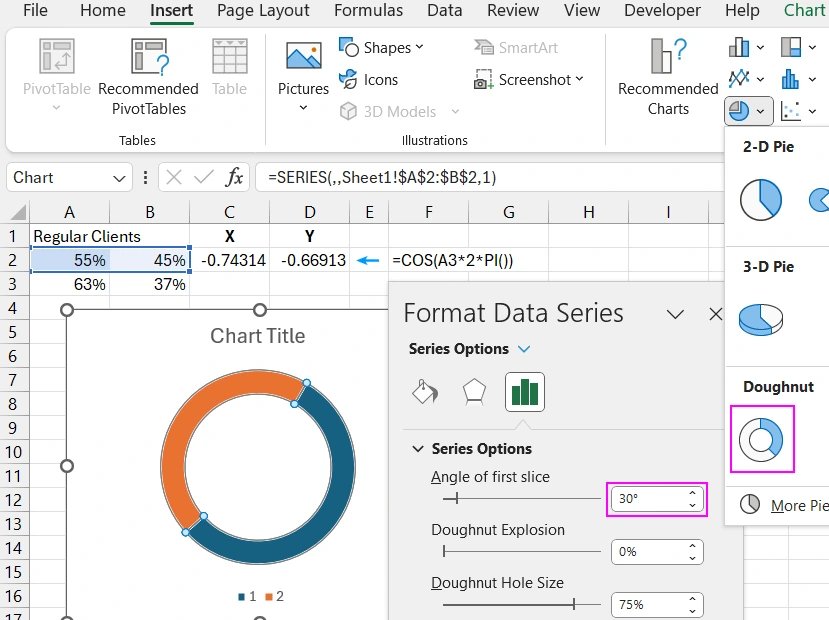
Press the keyboard shortcut CTRL+1 to open the "Format Data Series" settings window. In the "Series Options" section, change the "Angle of first slice" to 30 degrees.
Next, without deselecting the chart, select the "Chart Design" tab from the additional menu, and then the "Select Data" tool to open the "Select Data Source" settings dialog box.
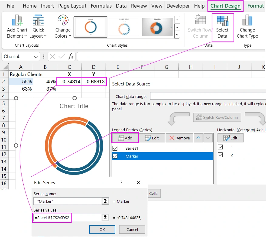
In the "Legend Entries (Series)" section, click the "Add" button, and in the "New (Edit) Series" dialog box that appears, enter the address of the third range of cells C2-D2 in the "Series Values:" field.
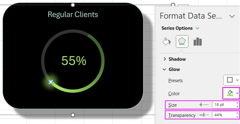
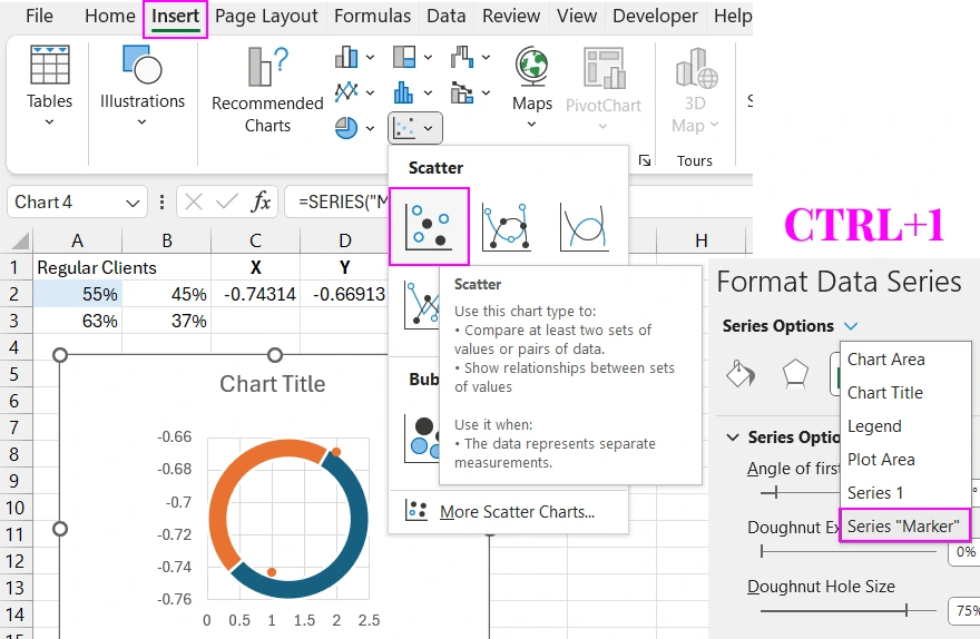
Select the second data series on the chart. Click on it with the left mouse button or use the settings menu by pressing the CTRL+1 keyboard shortcut, as shown in the image below. Then, set a different chart type for this data series using the tool: Insert – Charts – Scatter.
Next, configure the marker parameters. Without deselecting the second data series "Marker," go to the "Chart Design" tab in the additional menu and select the "Select Data" tool.
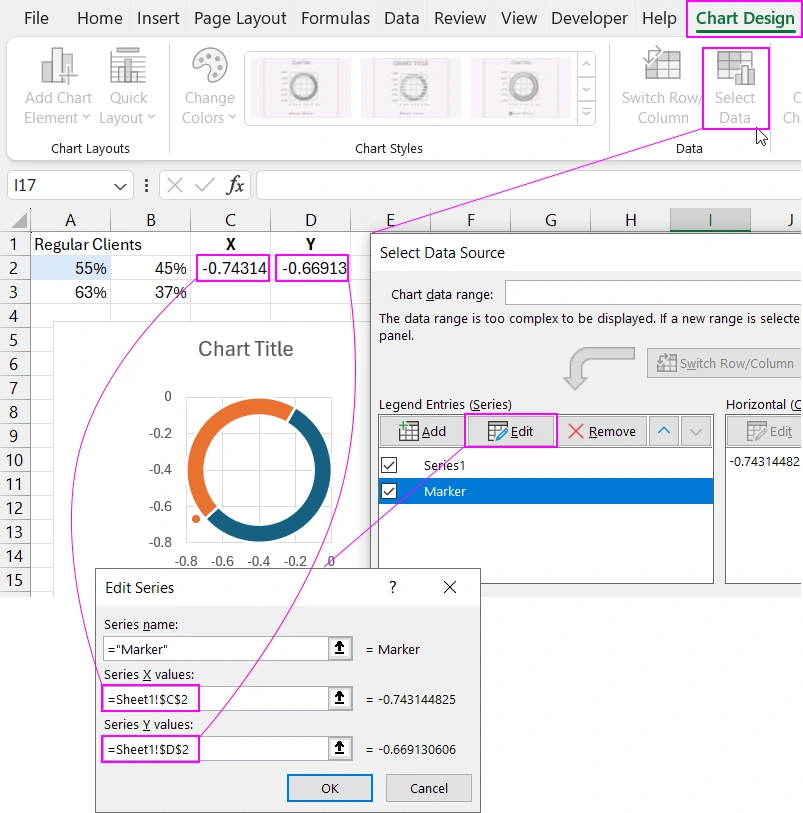
Edit the cell references for the Series X value: C2 and Series Y value: D2 fields, as shown in the image above.
Now we need to calibrate the marker's position on the XY coordinate axis. To do this, we will set fixed maximum and minimum values for the vertical and horizontal axes of the scatter chart. Select one of the axes (e.g., the vertical Y-axis) and press the CTRL+1 keyboard shortcut (or right-click on the element and select the Format Axis option from the context menu) to open the additional settings window. In the Axis Options section, change the values in the Minimum (-1.05) and Maximum (+1.05) fields.
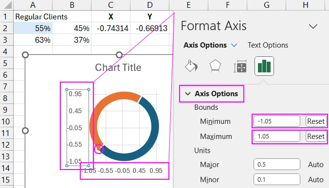
To confirm the changes after entering the values in each field, press the Enter key so that the Auto label changes to Reset. This indicates that the automatically adjusted values have been changed to fixed, non-adjustable values.
Clean up the template by removing unnecessary elements. Use the plus button to bring up the context menu, where you can uncheck the unnecessary options.
Change the thickness of the doughnut chart. Select the first data series and set the maximum Doughnut Hole Size value to 90% in the settings window.
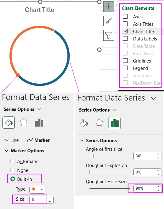
Also, change the marker size in the second data series (click on it). In the additional window, in the Marker Options section, enter 8 in the "Size" field.
Designing the Dynamic Doughnut Chart in Excel
Now, let's customize the design as shown in the video tutorial at the beginning of the article.
As seen from the ready example file, MS Excel's capabilities for enhancing data visualization allow for the creation of very stylish chart templates for dashboards. You can download an example of using a dynamic doughnut chart on a dashboard from the next article:


Data Visualization Charts for Interactive Report Creation in Excel.
Dashboard Templates