How to make Dynamic Rating Chart in Excel for Dashboard
In this example, we will look at the step-by-step process of creating a dynamic Rating Chart for use on Excel dashboards. The goal of this visualization is to show the rating of final values by year on the chart. When switching between years, it is intended to select data for a specific accounting period. When a particular year is selected, the chart should highlight the selected value with a cursor. Every interaction with the visualization should provide informative feedback to the user.
Creating the Structure of Dynamic Control from Source Data
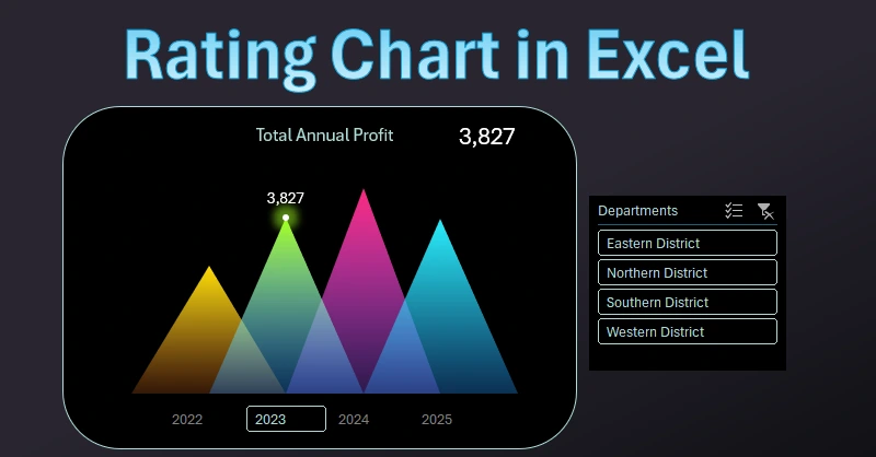
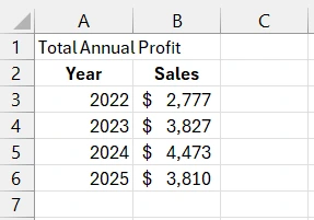
There is a table of final data by year. We need to create a beautiful chart for the dashboard with informative animation when switching between years.
As the basis for solving this task, we will use a pivot table. Its slices will serve as control elements of the dashboard when selecting data by year.
Step 1. Select the range of cells A2:B6 and choose the tool: Insert – Tables – Pivot Table. In the dialog box that appears, in the "Existing Worksheet" field, enter the reference Sheet1!$A$10 to insert it into the current sheet. Next, configure the pivot table fields in the additional "PivotTable Fields" settings window as shown in the image (in the bottom right corner of the image):
- Rows – Year;
- Values – Sales.
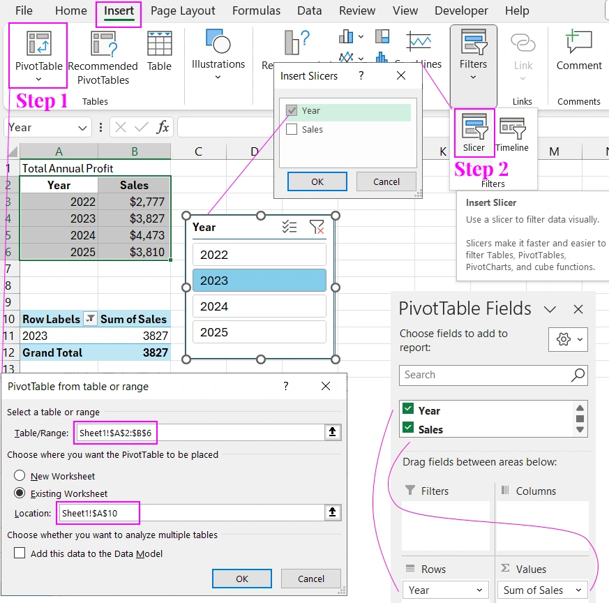
Step 2. Place the Excel cursor on any cell in the pivot table area and choose the tool: Insert – Filters – Slicer. In the "Insert Slicers" window that appears, check the "Year" option and click "Ok". This way, we have created a pivot table control element. When you click on the corresponding slicer button, the data is filtered automatically.
Preparing Source Data for the Chart
Continue filling the table with new values. Create 6 columns and fill in the header names in the range C1:H1. Fill the last two columns with formulas:
- Cursor:
- Labels:
=IFERROR(INDEX($B$13:$B$16,MATCH(A2,$A$13:$A$16,0)),0)
=IF(G2=0,NA(),G2)
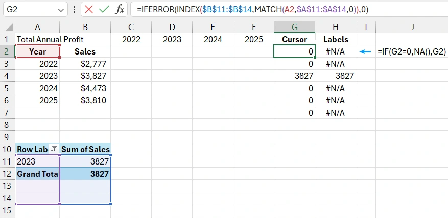
The first formula is created to indicate which values on the chart should be highlighted by the cursor. For example, if the year 2023 is selected, the cursor will be on the chart opposite this year. The formula fills the cells in the range G2:G7 with values from the pivot table corresponding to the selected years using the data filter slicer.
The second formula is for labeling the cursor with corresponding values on the chart. The formula's principle is simple – it checks the cursor cell range G2:G7. If the value is 0, the NA() function returns in the range H2:H7; otherwise, the cursor value is returned.
Next, fill the range C2:F7 with the formula: =IF(AND($A2=C$1,$G2=0),$B2,0)
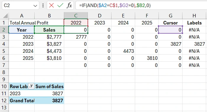
This formula checks the presence of values for the cursor according to the value in the range B2:B7. If the cursor data is present, 0 is returned, and the triangle will not be displayed in the visualization. Instead, the cursor triangle will be displayed (to avoid overlapping elements with a partially transparent background). Each year is assigned the value of a separate triangle, so the data is divided into columns. The formula checks the year in the column headers and fills only with the corresponding value for that year; otherwise, it returns 0.
Building a Dynamic Chart Based on the Source Data Table
First, select the range C2:G7 and choose the tool: Insert – Charts – 2-D Area.
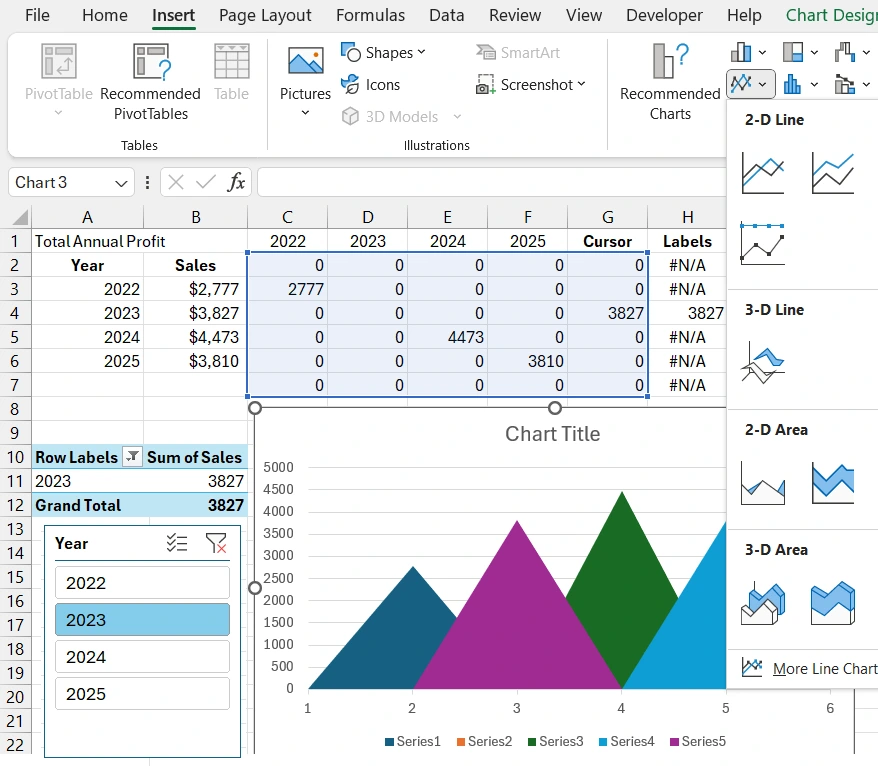
Note! The cell range of the second data series for the second triangle D2:D7 (year 2023) contains no values except 0. But the chart draws a triangle in the second position – this is the cursor triangle (purple color). This is because the year 2023 is selected on the slicer, and the formula automatically redraws the chart. The logic of displaying all triangles with the current data selection from the pivot table is easy to understand by looking at the legend at the bottom of the chart.
We need to hide the triangles in cursor positions because we will use fill transparency elements when designing a stylish visualization. To avoid overlaps and color translucency.
Adding Data Labels to the Cursor on the Chart
To have a label with the corresponding value above each cursor triangle, first, add another data series to the chart. To do this, first, select the chart with one click to bring up the additional menu tabs and choose the tool: Chart Design – Data – Select Data.
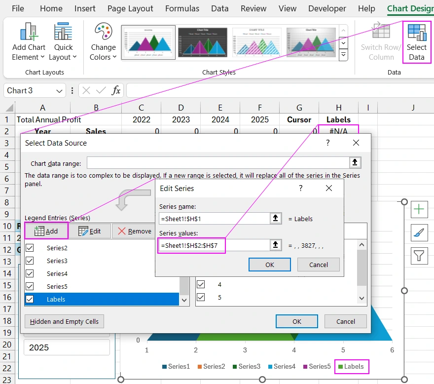
In the "Select Data Source" chart settings window that appears, in the Legend Entries (Series) section, click the Add button to open the "Add (Edit) Series" window. In the first field, "Series name:", reference the last column's header with the link: =Sheet1!$H$1. This will make it easier to identify the necessary data series for selection in further actions.
The second field, "Series Values:", is filled with the link to the range of the last column of the source table: =Sheet1!$H$2:$H$7.
Now we have added another triangle. This data series should be assigned a different chart type. Click the chart once with the left mouse button and choose the tool: Insert – Charts – Scatter.
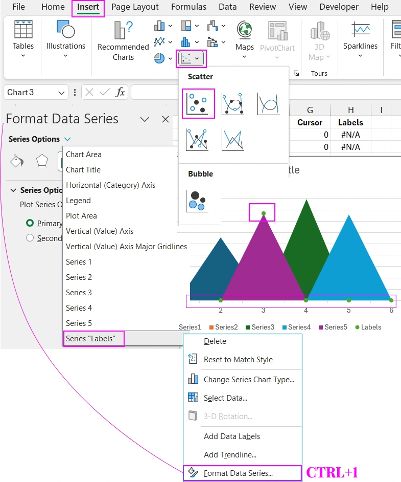
Now we need to position the Scatter Chart points only above the cursor. To do this, we will use a hidden option for setting the display of empty or zero values on the chart. Follow a series of steps according to the following step-by-step instructions:
- Click the chart again and from the additional menu tabs, select the tool: Chart Design – Data – Select Data.
- In the "Select Data Source" chart settings window that appears, use the "Hidden and Empty Cells" button.
- In the "Hidden and Empty Cells Settings" window that appears, in the "Show empty cells as:" section, switch to the "Zero" option.
- Uncheck the "Show #N/A as an empty cell" option.
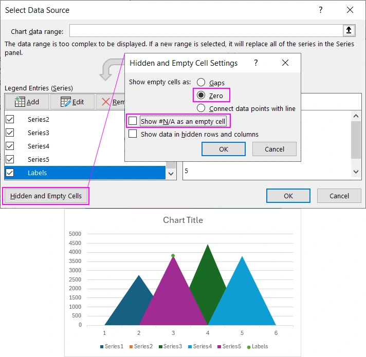
As a result, the Scatter Chart points will be displayed only above the cursor triangles. The working template for interactive visualization is ready! It only remains to decorate it with a stylish design.
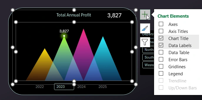
Styling the Data Visualization Design
To create a dynamic chart design, use gradient fills with color transparency elements.
This is a less critical task. Do everything as shown in the video tutorial at the beginning of this article. You will succeed! But even if you encounter difficulties, download the ready-made Rating Chart template for free at the end of the article and study the principles of building visualization design in detail on a ready-made example.
The MS Excel application offers its users a wide range of chart design settings. An attractive appearance of data visualization significantly enhances the effectiveness of the presentation. Moreover, pay attention to the interactive capabilities! All of them are implemented without using macros. Only standard tools: formulas, pivot tables, data slicers.
These skills can be applied to develop more complex dashboard templates. An example of using the interactive capabilities of this chart to switch data by year on the dashboard can be viewed and downloaded in this article:
 Dashboard for managing KPI plans in Excel.


Data Visualization Charts for Interactive Report Creation in Excel.
Dashboard Templates