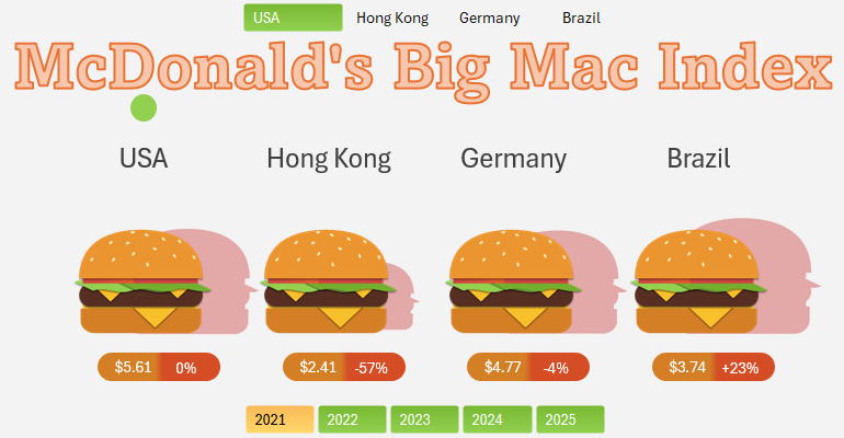
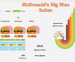
DOWNLOAD Interactive Excel Presentation for Big Mac Index
The Big Mac Index is a popular tool for comparing purchasing power of currencies worldwide. Using Excel, you can create dynamic infographics to bring these comparisons to life and explore new variations of economic indices. This video tutorial shows you how.
Steps to Create Big Mac Index Infographics in Excel

This video guide demonstrates how to use Excel for analyzing and visualizing the Big Mac Index, enabling data-driven insights. Creating interactive infographics in Excel is straightforward. Leverage a combination of shapes, charts, and pivot tables controlled by slicers as illustrated in the tutorial.
Key Steps Outlined in the Tutorial:
- How to draw a burger using vector shapes in Excel.
- Setting up base data for smart and pivot tables.
- Filling tables with formulas for dynamic charts.
- Creating interactive infographics in Excel.
- Utilizing advanced shape editor features in MS PowerPoint for MS Excel.
- Adding interactive buttons for infographic control.
- Configuring formulas for the burger price structure chart.
- Creating an infographic to present McDonald's Big Mac Price Index across different countries.
- Enhancing chart interactivity using Developer menu toggles in Excel.
- Designing stylish icons for data labels directly on the dashboard.
- Testing the interactive Big Mac Index Price Chart presentation in Excel.
The key idea is that unofficial economic indices can be incredibly effective, yet they often go unnoticed. For example, the Big Mac Index can be recalculated using the formula for the Borscht Index. The method and content of this infographic are explained in detail in the article:

Big Mac Index Infographic in Excel as a Borscht Index
Learn with us to visualize product pricing trends. Create interactive, user-friendly reports using step-by-step Excel video tutorials.

