How to make Progress Circle Chart in Excel for Dahboard
We present to your attention another data visualization block for dashboards – made in Microsoft Excel. Two charts for visual comparative analysis of two final key indicators.
Lesson on Creating a Progressive Design for a Doughnut Chart
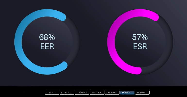
We create tables for input, setup, and processing of the initial data. For example, let's take key HR indicators - employee engagement rate (EER) and employee satisfaction rate (ESR).
Preparing Initial Data and Formulas
The initial value for the first EER indicator will be entered in cell B3 as a percentage of 55%. Highlight this cell with a light blue fill color for clarity. Accordingly, in cell A3, use a formula to calculate the remainder of 100%.
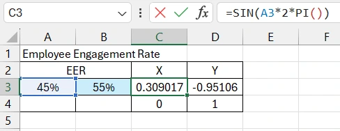
We will also need formulas to calculate the position on the XY axes of the decorative chart rounding. Their position will change accordingly with changes in the chart around the circle. Therefore, we use sine and cosine calculation functions in the formulas.
There will be a total of 2 rounding elements - one dynamic (changes position along with changes in the chart), and the other circle is static (does not change its position on the XY axes under any conditions). Therefore, the coordinates for the second circle do not require formulas. Let them be static values for X - 0, and for Y - 1 for now.
Creating the Doughnut Chart Template
We create a Circle Chart based on the values in cells A3:B3.
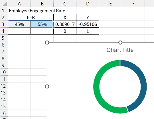
Add another data series to decorate the chart.
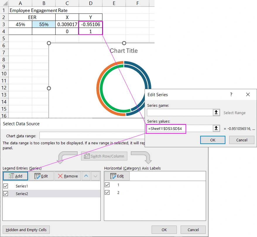
Creating and Setting Up the Combo Chart
Now we should highlight the second data series and change its chart type to Scatter.
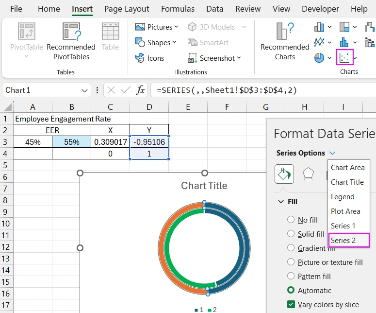
Change the sector color to avoid blending of similar colors.
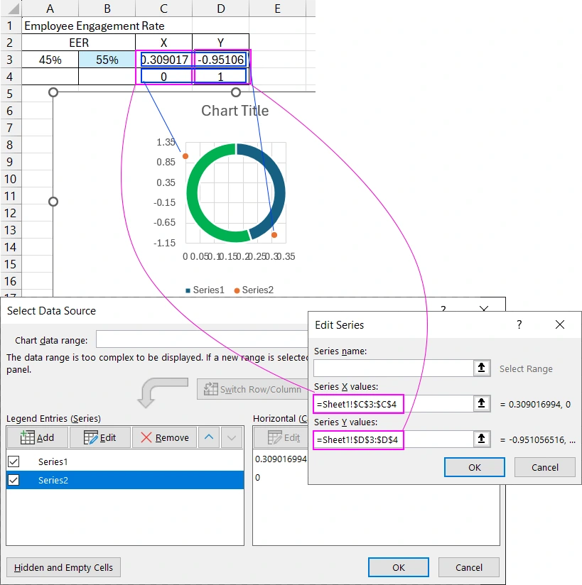
Correct the source value references for the second chart of the combo chart. Now we need to specify the coordinates for the X-axis and links to the coordinate values for the Y-axis.
Set the minimum and maximum values for the horizontal and vertical axes of the Scatter chart.
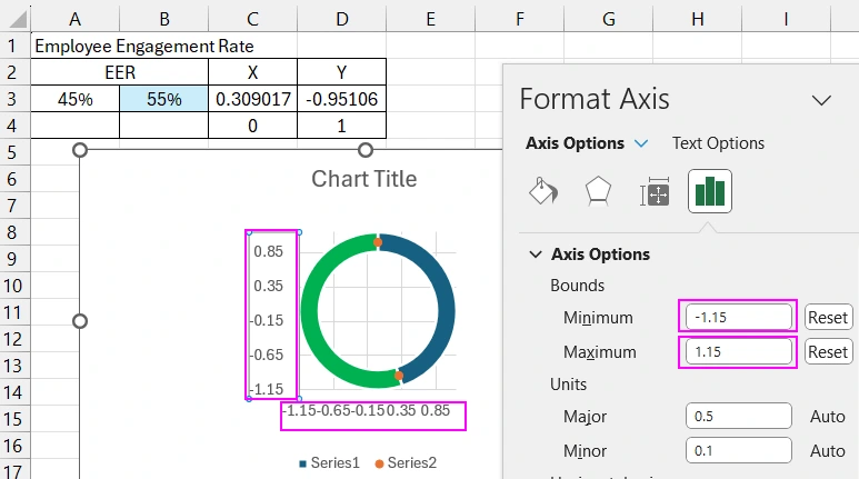
Now the roundings have found their corresponding positions on the coordinate grid of the combo chart. Remove all unnecessary elements.
Progressive Chart Design Against Competitors
To make your visualizations stand out against your competitors, make them special. For example, you can slightly tilt the chart clockwise, about 30 degrees.
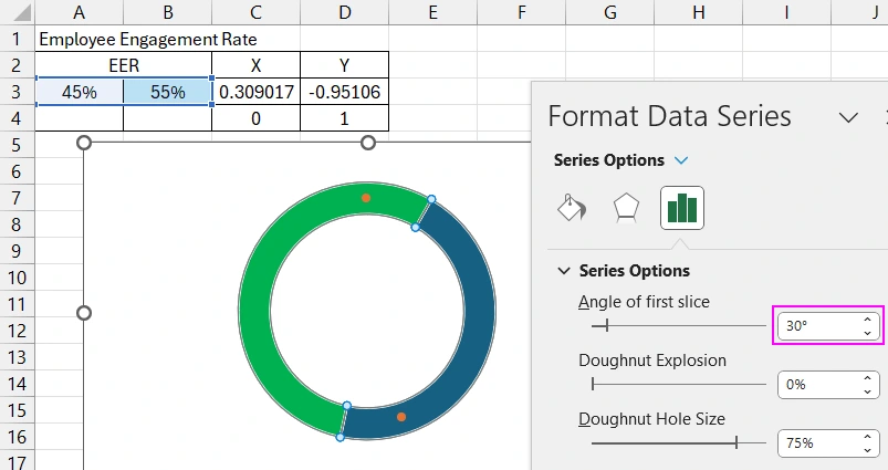
As you can see, we now need to optimize the position of the circles, as under such conditions they have lost their corresponding location on the doughnut chart.
To do this, add 1/12 of the 100% value from cell A3 in cell A4. After all, 30 degrees is 1/12 of 360. Accordingly, the sine and cosine formulas will now refer to cells A4 and B4.
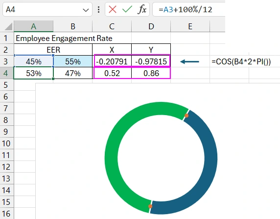
We also adjust the static coordinate values.
Increase the circle sizes to match the sector strip size of the doughnut chart.
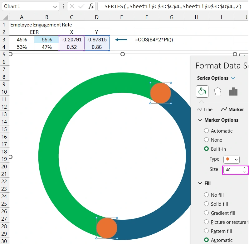
Change the colors and customize the appearance of the chart.
On a separate "DASHBOARD" sheet, create a panel from Excel vector shapes. All gradient colors are shown on the screen, as well as their direction and position parameters.
Move the combined chart to a new sheet, on the panel for further design of the data visualization block. Add an oval and create an inner shadow to create a cut-out effect on the panel. Optimize the circle size relative to the doughnut chart size. Move the circle with the inner shadow to the background and center it under the chart.
Create another circle with an outer shadow and gradient fill. Place the small circle over the chart, strictly in the center. Use alignment tools for this. Add a text label and in the formula bar, link to the cell to display its corresponding values.
Copy the chart with all its decorative elements. Copy the table to create a second chart. Change the source value references for the second chart. Set up new colors and gradients.
Creating the Dashboard Visualization Block Control Panel
Create a mini database table for sampling initial values for a week. Based on the mini database, create a pivot table for sampling values by day. Use links to connect the pivot table final values to the initial chart values.
Based on the pivot table, create a data visualization block control element using a slicer.
Design the appearance and layout of the slicer panel.
Check the functionality of the entire data visualization panel with the control buttons for sampling values by day. Now this visualization block can be used for HR dashboards or presentations.

