How to Make Progress Doughnut Chart in Excel
Donut progress chart in Excel with a minimalist infographic design. Created based on the principle of building a speedometer chart.
Step-by-step example of developing a progress chart in Excel
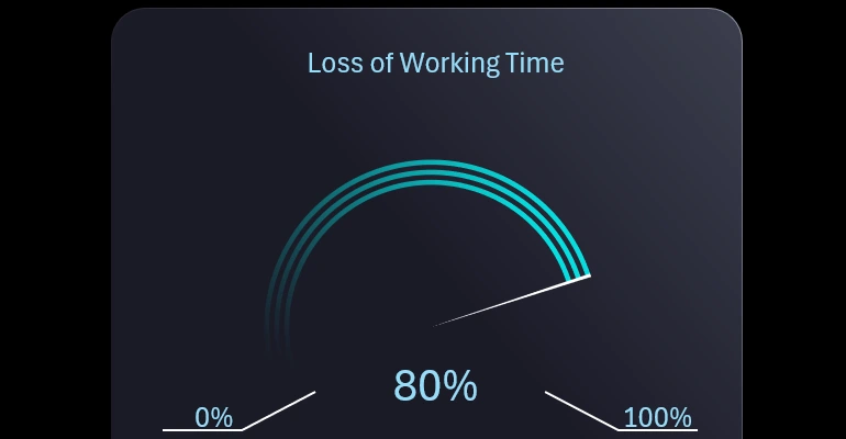
We will create the chart design in a favorite style—minimalism. This means that the data visualization should contain nothing but the essentials. As the famous sculptor Michelangelo said, "I simply take a block of stone and cut away everything that is not the statue."
Step 1: Preparing the source data
We will create a table with the source data and formulas for the progress chart. In cell A2, input data will be entered. Highlight this cell with a light blue fill color. Cell B2 will contain a constant—a fixed value of 0.5%. This is the cursor size, so add a comment to this cell indicating that it contains the cursor data.
Cell E4 will contain the maximum benchmark value. For example, if we are making a speedometer-style progress chart, we need the maximum benchmark to be 150%, not 100%. This is because only 2/3 of the circle will be used in the animation from the minimum to the maximum value. Thus, we need a value of 100% for the animation and 50% for decoration. The benchmark is not a constant; it can be changed. For example, if the maximum progress value is not 100% but 15%, then the maximum benchmark should be 22.5% accordingly.
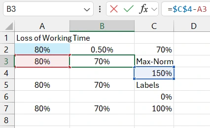
In cell C2, there is a formula that calculates the remainder after subtracting the source value from the maximum benchmark.
The table rows are then filled with every other row left blank. This trick is necessary for designing a progress chart with three bands. Blank rows will also be used in the data series to create gaps between the bands. The first column duplicates the source value, and the second column contains formulas for calculating the remainder after subtracting the source value from the maximum benchmark.
Let's add a couple more values for data labels on the progress scale with a minimalist design. Therefore, there will be only two: the minimum and maximum scale division values.
Creating a donut chart template for progressive design
Select the part of the data table from cell A3 to B7 to create a donut chart template in Excel.
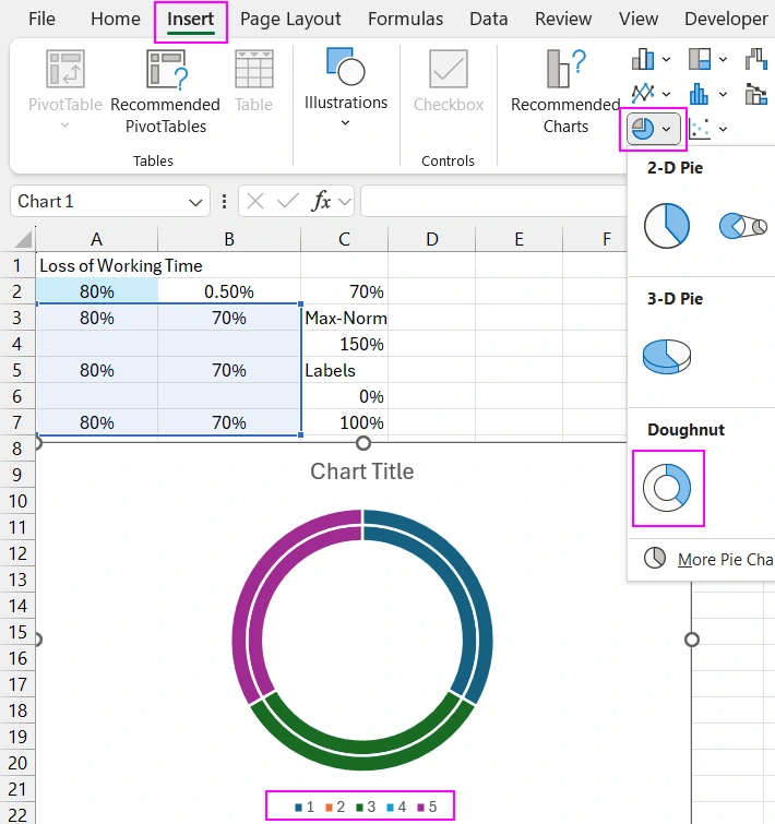
Immediately switch the rows and columns. Rotate the chart 240 degrees clockwise so that the minimum value of 0 starts from the southwest, as in speedometers.
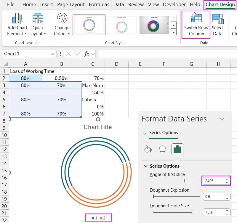
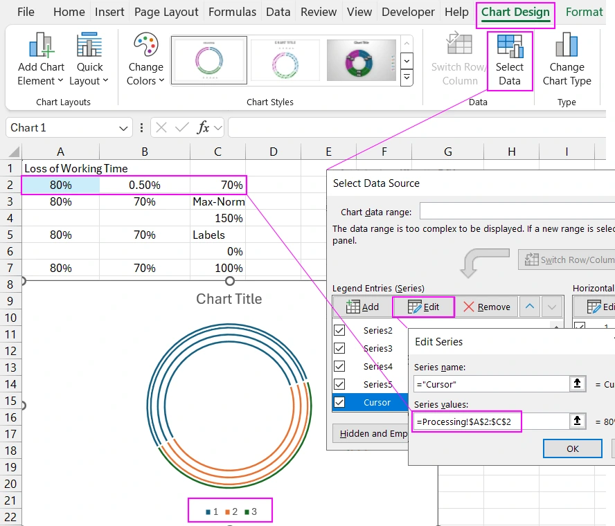
Add another data series to create a cursor—speedometer needle for progress. Add the data series to the chart using the "Select Data" tool, and in the arguments, specify the reference to the first row of the table where the source data for the cursor is located.
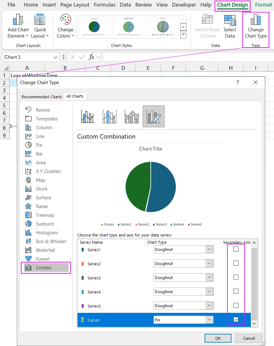
For the cursor data series, change the chart type from a donut chart to a pie chart. First, select the cursor series and use the chart type change tool. In the lower-left menu under "Combo," set the chart types. Donut chart for all series, and pie chart for the last cursor series. It is important to note that the pie chart should be placed on additional axes. Therefore, check the box in the "Secondary Axis" column opposite the last cursor series.
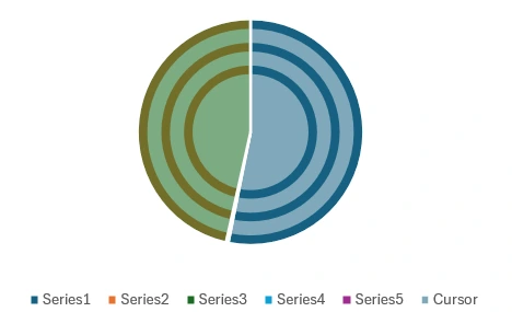
Now the pie chart cursor is in the foreground, and it needs to be made transparent by removing the fill and border lines from all sectors except the smallest one for the cursor.
Beautiful Minimalist Style for Data Visualization in Excel
Create a rounded rectangle on a separate sheet. Set the size and position it in the center of the sheet. Add a gradient fill for the background and border lines.
Transfer the combined donut progress chart template to a separate sheet and place it over the shape in the foreground. Create a minimalist design style for the chart. Turn off any unnecessary data and values on the chart.
Note! The pie chart is in the foreground because we placed it on additional axes. Therefore, to access the donut chart in the background with a single mouse click, we should disable the cursor data series. Alternatively, you can use the series selection menu in the "Format" section without disabling the cursor series. Choose whichever method is more convenient for you.
Now we can set transparent and semi-transparent fill colors for the donut chart sectors. You can rotate it and change the diameter of the inner ring. Using the "Doughnut Hole Size" parameter, you can adjust the thickness of the bands by changing the size of the chart's inner diameter.
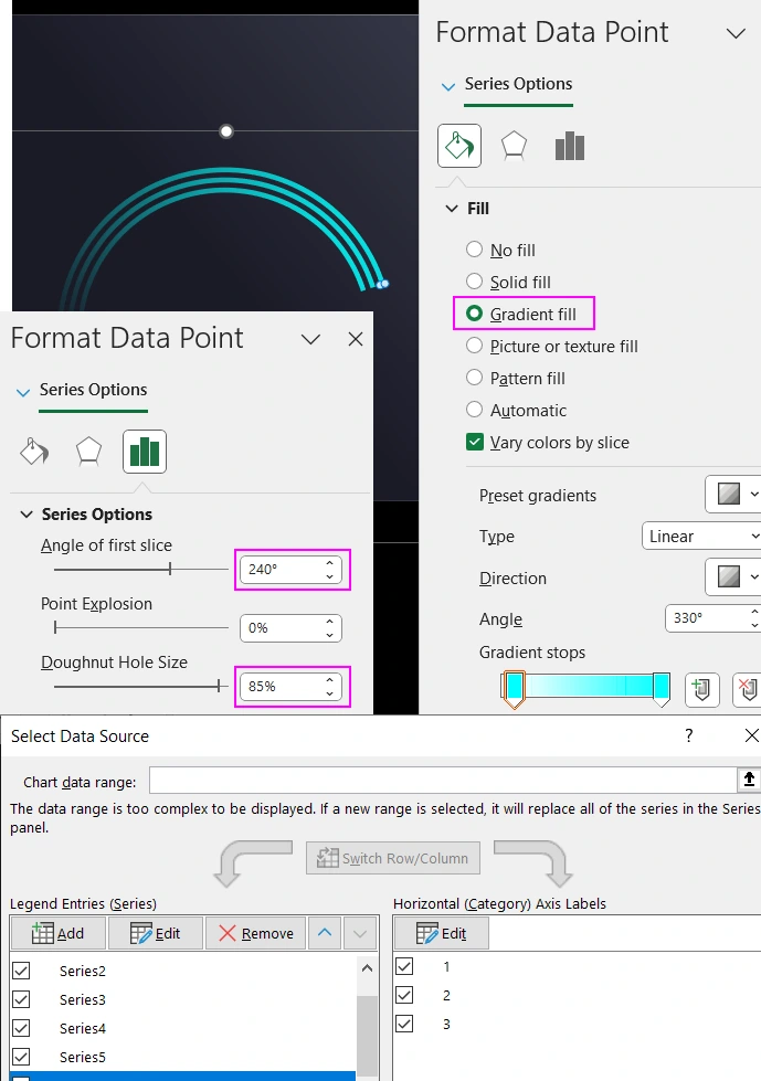
After making all the adjustments, reconnect the cursor series and customize the appearance of the speedometer needle sector.
Add minimum and maximum label values on the speedometer scale. It is better to fill the labels through references to the corresponding cells in the source table. You may need to change the maximum benchmark values, making it easier and more convenient to edit the progress chart template for any values. This also applies to the title of the visualization block and the label displaying the current indicator. This template covers everything.
Adding Interactive Features
Now we will make the progress speedometer interactive and test it in action. Create a table as a mini-database of source values from two columns, the names of the days of the week, and the indicator as a percentage, increasing from 0% to 100%.
Create a pivot table based on the mini-database. In the pivot table totals row, set the field type to average in the field settings. Connect the pivot table to the chart’s source table. In the input cell for the source values highlighted in light blue, specify the GETPIVOTDATA function with a reference to the pivot table totals in the function arguments.
Create a slicer based on the pivot table, which we will use to filter the data, thus changing the final values and interacting with the chart. Create a thematic design for the slicer buttons by duplicating and modifying the slicer templates.
Presentation of a Progressive Chart in Minimalist Design Style
Now transfer the slicer buttons to the infographic sheet.
By controlling the slicer buttons, we dynamically change the donut progress chart infographic. In this way, you can create a beautiful minimalist design for presenting progress on a donut chart in the form of a speedometer.

