How to use GETPIVOTDATA function to Create Charts in Excel
GETPIVOTDATA is one of the most commonly used functions for developing interactive dashboards in Excel based on pivot tables. It is essential for data visualization developers to understand the capabilities and nuances of using the GETPIVOTDATA function in Excel. Let's go through everything step by step.
Structure Diagram of an Interactive Dashboard from an Excel Pivot Table
This diagram illustrates the basic principle of building interactive dashboards in Excel using pivot tables and control elements:
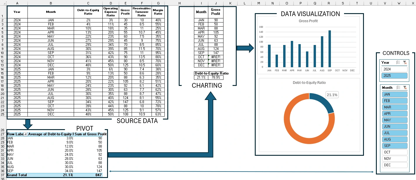
- SOURCE DATA – Enter the source data.
- PIVOT TABLE – Create a pivot table based on the source data.
- CHARTING DATA – Populate the charting table. Use GETPIVOTDATA function to extract processed data from the pivot table for creating dashboard charts.
- DATA VISUALIZATION – Create graphs and charts based on the charting table.
- CONTROLS – Based on the pivot table, also create slicers and use them as dashboard control buttons.
Rules for Using GETPIVOTDATA Function in Excel
It is important to note that for the GETPIVOTDATA function to work correctly, the row and column headers of all tables (source data, pivot tables, and charts) must have identical values.
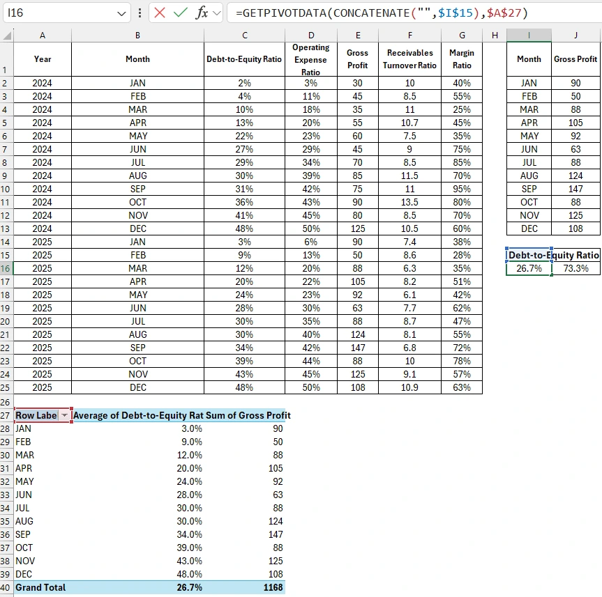
In the charting table, in the first cell for January, enter the equals sign and click on the first cell of the pivot table corresponding to January. Excel will automatically generate the GETPIVOTDATA function with the arguments already filled in. To ensure the function automatically populates the table with corresponding values, you need to adjust the arguments.
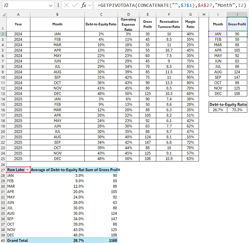
In the last argument, reference the chart table's row header. Use a relative cell reference for this. However, the reference for the column header must be a text type. Otherwise, the GETPIVOTDATA function will return an error. To achieve this, simply use the CONCATENATE function to add an empty string to the reference, ensuring that any value passed by such a reference will be treated as text. Additionally, the reference for the column header should be absolute.
Advantages of Using the GETPIVOTDATA Function for Charts
The main advantage of using the GETPIVOTDATA function to extract values from pivot tables, compared to regular references and formulas, is that it maintains its functionality regardless of changes in the structure of the pivot table, both horizontally and vertically.
For example, we changed the structure of the pivot table horizontally by adding a new column in the middle to extract data to a new charting table. All formulas remained functional.
For the second charting table, we used the GETPIVOTDATA function to reference the total value in the middle column of the pivot table.
Based on the charting tables, we create data visualizations in Excel.
Move the Excel cursor to the pivot table area and select the tool: Insert – Filters – Slicer.
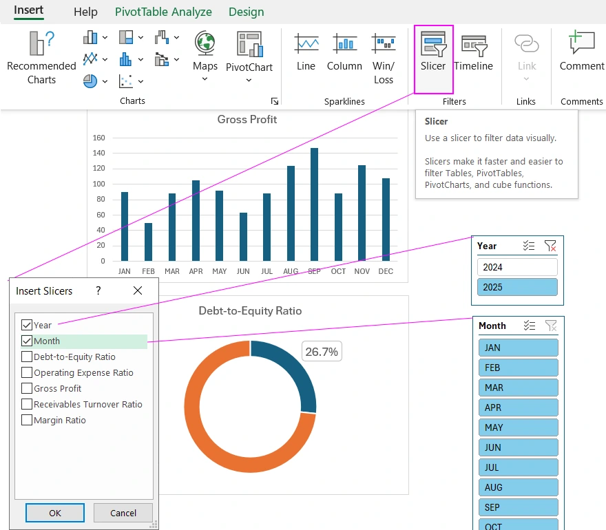
Now we can control the pivot tables using slicers, which means we control the entire dashboard.
Template for Interactive Charts Using Pivot Tables
By mastering the basic principles of the GETPIVOTDATA function and the structure diagram of building a dashboard in Excel, we can understand any algorithm of a template for interactive visualization using pivot tables.
The structure of the interactive dashboard template differs from the diagram only in that all table types and elements are organized on different Excel sheets.
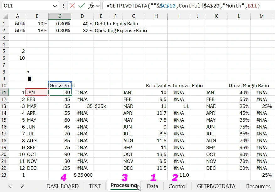
- The Data sheet contains the source data.
- The Control sheet contains the pivot tables.
- The Processing sheet has charting tables filled with formulas.
- The DASHBOARD sheet contains data visualizations with interactive elements to control the pivot tables and charts as a whole.
In upcoming articles, we will explore practical examples of how to create interactive dashboards in Excel using pivot tables and the GETPIVOTDATA function to link data to charts. At this stage of learning, you can download the ready-made template with the examples described in this article and practice the promising material you've learned.
Download dashboard template using GETPIVOTDATA function in Excel 
