Interactive Chart Management in Excel for Dashboards
Modern analytics requires more than static reports—it demands flexible visualization tools. Interactive charts in Excel allow you to manage data in real time, switch metrics, and analyze different scenarios without modifying the underlying report structure. This same principle is used to build fully interactive dashboards in Excel.
Chart types for interactive data analysis

This example demonstrates an interactive mini dashboard with the ability to filter metrics and switch chart types. The visualization block is controlled by Pivot Table slicer buttons in Excel. This is a foundational principle for building complex summary reports in dashboard format.
The example includes three chart types:
- Radar chart.
- Interactive bar chart with cursor highlight.
- Classic doughnut chart.
A full walkthrough on building comprehensive dashboards is provided in the video at the end of the article. For now, observe how dashboard design can be assembled like a constructor from dynamic charts in Excel:
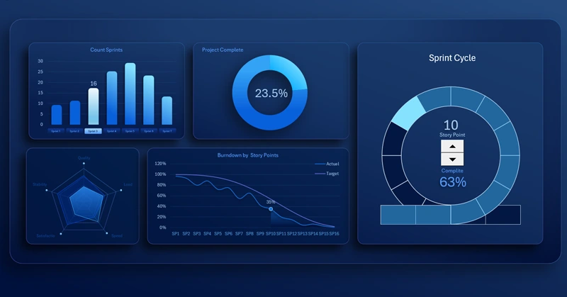
Interactive Excel dashboard for sprint task management
These dashboards are built on the interactive capabilities of standard Excel tools:
- filters,
- Pivot Tables,
- slicers,
- named ranges,
- dynamic formulas.
All of this is implemented without using macros.
Interactive visualization in Excel transforms data into a controllable analytical system. The use of dynamic charts, control elements, and automatic metric updates improves analytical accuracy, accelerates decision-making, and turns the dashboard into a full-fledged tool for strategic management.


Data Visualization Charts for Interactive Report Creation in Excel.
Dashboard Templates