Sprint cycle for agile project management in Excel
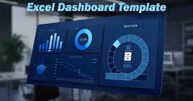
An interesting dashboard concept for agile project management in Excel. In this template, the sprint cycle chart can dynamically change the number of segments for different cycles. Each segment represents one story point. You select the required sprint cycle, and the chart automatically updates according to the number of story points in that cycle. Moreover, the task burn-down chart is directly linked to the sprint cycle chart. It updates automatically when a sprint is selected, and its cursor moves in sync with the sprint circle cursor to select a story point. Below is a detailed overview of the structure and usage principles of this Excel dashboard for analyzing task execution progress.
Agile Project Management Dashboard in Excel
The dashboard structure consists of five data visualization blocks:
- Sprint cycle chart.
- Sprint bar chart with different numbers of story points.
- Overall project progress chart.
- Radar chart for analyzing resource allocation by KPI metrics.
- Dynamic task burn-down chart.
All blocks are interconnected and respond to all buttons and control elements used on the dashboard. Some visualization blocks can dynamically change their structure. For example, the chart length along the X axis or the number of segments in the circular chart. This effect is implemented in Excel by using named ranges with formulas as arguments for chart parameters.
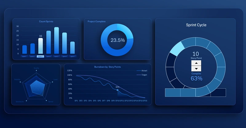
Dynamic Sprint Cycle Chart with Progress Scale
This is the main chart in the template. Each division of the sprint cycle progress scale represents one story point. These are standard chart segments. The number of story points can dynamically change based on the sprint selection on the bar chart, controlled by slicer buttons on the X axis.
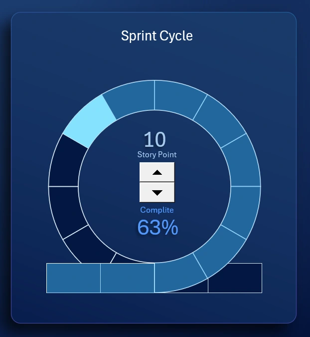
Sprint Bar Chart with Different Numbers of Story Points
The X axis shows sprint numbers, and the Y axis shows the number of story points.
If a bar height is 16, the sprint cycle will contain 16 divisions on the progress scale. If you switch the bar chart to the fifth sprint with the maximum value of 28, the sprint cycle will contain 28 story points, meaning the chart will be divided into 28 segments. The chart updates automatically under user control.
All automation can be implemented in Excel without using macros. You only need dynamic formulas for named ranges. In chart parameters, instead of direct cell range references, you specify references to named ranges with formulas. For example, =Processing!SprintSP. This allows you to control the data range size used by the chart based on defined conditions.
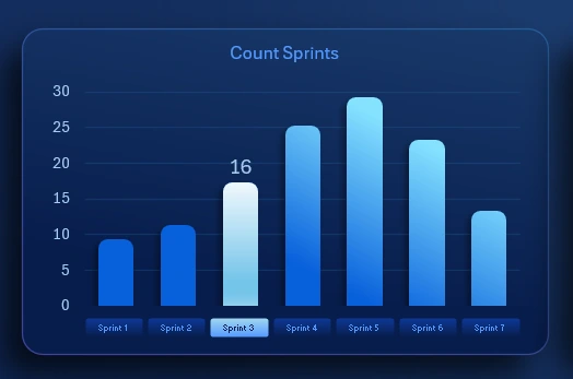
Dynamic Task Burn-Down Chart in Excel
The X axis shows the sequential story point numbers, and the Y axis shows the percentage of task burn-down. The purple line represents the planned trend, while the blue line represents the actual burn-down progress. This chart is also dynamic and interconnected with both the bar chart and the sprint cycle chart. The fill percentage of the sprint cycle progress scale equals the percentage of completed tasks. In other words, the percentage shown on the chart represents the remaining portion of the progress scale from 100 percent.
When the number of story points changes through the bar chart controls on the dashboard, the length of this chart automatically updates accordingly. When the filled area of the sprint cycle progress scale changes, the cursor position on the burn-down chart moves proportionally.
All of this is achieved by using named ranges with formulas in chart parameters, where references to data sources for the X and Y axes are defined.
Radar Chart for KPI Distribution

In agile project management, it is critical to monitor the following key indicators:
- Work quality.
- Process workload.
- Task execution speed.
- Employee satisfaction.
- Stability of the product development system.
Agile project management is a continuous process. Its condition must be constantly monitored using KPI metrics.
The light area in the foreground represents actual values, while the darker background area represents planned targets.
Agile Project Management Dashboard Presentation in Excel
By combining all visualization blocks into a single cohesive composition, we obtain a dashboard template for solving agile project management tasks using standard Excel capabilities:
Download the agile project management dashboard template in Excel 
Impressive design, interconnected data management logic, and interactive capabilities are all available to you today with Excel. This simple example demonstrates how Excel can be used for BI tasks. It once again confirms that Excel, as a universal analytical and computational tool, can significantly expand your capabilities without the need to learn specialized skills. By understanding these basic principles, you can create more advanced dashboards with strong practical and emotional value for your business.

Data Visualization Charts for Interactive Report Creation in Excel.
Dashboard Templates