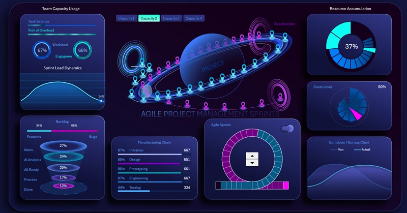
Interactive Excel dashboard with a Sprint Circle chart
The Sprint Circle chart is an essential method for visualizing project task completion data. In this template, it is presented as a planetary orbit. Effective project management requires clear and real-time control over tasks and deadlines. Our ready-to-use Agile dashboard for Excel helps you visualize processes, analyze progress, and make faster decisions.
Agile Project Management Dashboard in Excel

Dashboard visualization example: tasks, status, performance metrics, and more on a single screen. The dashboard structure consists of the following interactive visualization blocks:
- Employee engagement and workload
- Task funnel visualization
- Production chain performance
- Resource accumulation tracking
- Expense fan chart
- Interactive task burn-down chart
For a detailed understanding of the purpose and use of each block, we recommend reviewing the instructions for using this dashboard template:
Dashboard for presenting the Sprint Circle chart in Excel
By downloading the Agile Project dashboard for Excel, you get a ready-made showcase for project oversight and improving team efficiency.
- Dashboard Grid
- How to Draw a Planet with Orbit in Excel
- Creating Sprint Entry/Exit Portals and Acceleration Zones
- Building a Story Point Model for Agile Sprints
- Excel Formulas for Automating Sprint Circle Chart Animation
- Creating Buttons to Switch Between Animation Modes
- Toggle for Sprint Cycle Open/Close
- Sprint Circle Chart for Agile Methodology
- Team Activity Level Visualization Block
- Task Funnel Visualization Block in Excel
- Horizontal Process Histogram
- Line Charts for Comparative Task Burn Analysis
- Fan Radar Chart for Expense Levels
- Custom Pie Chart for Results Accumulation in Excel
- Agile Project Management Dashboard Presentation
Interactive elements and clear reports help reduce planning time and accelerate goal achievement.
Download interactive dashboard with Sprint Circle chart in Excel

Data Visualization Charts for Interactive Report Creation in Excel.
Dashboard Templates