Showcase Agile Project Management Dashboard in Excel
A conceptual dashboard version for flexible project management in Excel. This is an example of using abstraction and metaphor in graphic design to demonstrate Excel capabilities when developing a sprint diagram. It is an excellent template to enrich your portfolio with a new case for creating an interactive custom chart with a unique and original design. It looks professional and delivers a strong conceptual message. The project sprint cycle is presented as a planet, while its orbit represents the time axis for story points, including an acceleration zone after peak workload. Data visualization in Excel expands the boundaries of imagination.
Interactive Presentation of a Sprint Cycle Diagram in Excel
At the very center of the dashboard, an infographic is presented in the form of a project planet:
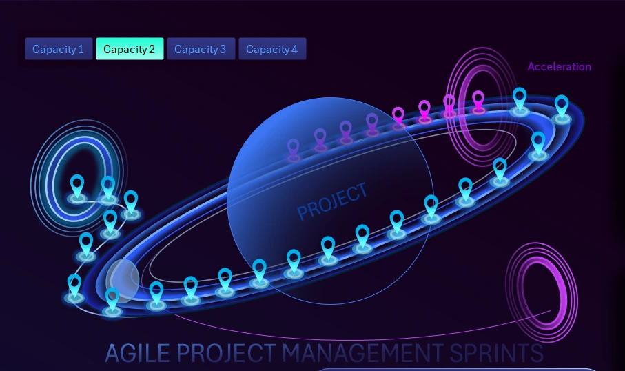
It visualizes the movement of tasks along the sprint time axis.
The planet and orbit abstraction mirrors the values of a standard sprint chart, reproducing all dynamic changes while adding metaphors for interactive graphic design and animation.
In Excel, sprint diagrams are usually built using standard templates with minor enhancements and visualization combinations:
The chart segments represent story points.
The planet symbolizes the project. The planet’s orbit represents the sprint cycle as a time axis. The orbit clearly highlights an acceleration zone after peak workload. Each marker represents one story point as a step in the Agile sprint cycle.
The purpose of this infographic is to visualize sprint progress. It is used to better understand task density and identify bottlenecks along the workflow timeline.
Everything that happens in the lower diagram in the classic sprint cycle format is projected onto the upper infographic in the form of a planetary data visualization.
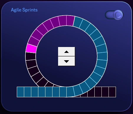
At the very center of the classic diagram, there is a control element—a counter. It controls the entire dashboard. The counter cycles through data and determines the direction of cyclical time-based data, forward or backward.
In the upper-right corner of the lower diagram, there is a toggle to enable or disable entry into and exit from the sprint cycle loop. When entry and exit are disabled, the data remains in a closed loop. In some cases, this is useful to demonstrate on a dashboard.
Employee Engagement Analysis in the Project
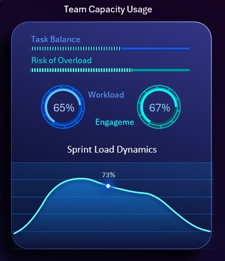
It shows the current team workload and resource utilization dynamics within the sprint.
This visualization block includes several key metrics:
- Horizontal progress bar showing task balance level.
- Progress bar indicating team overload risk.
- Workload distribution chart.
- Employee engagement chart.
- Line chart showing the overall sprint workload pulse.
All metrics are interconnected and influence one another.
Priority-Based Flow Task Implementation Funnel
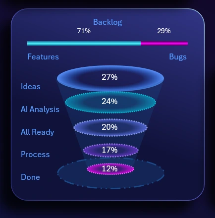
This funnel reflects the path and transformation of a task from idea to implementation.
This visualization block is designed to control structure and maintain focus within the project workflow. It serves as an indicator of noticeable process downtime at each level along the task funnel. It is widely used in Agile, Scrum, and Kanban project management methodologies.
If a failure occurs at any level, all subsequent levels automatically stop functioning.
At the very top of this block, a horizontal histogram shows the ratio between opportunity growth coefficients and the resulting unexpected errors during project execution.
Production Chain Performance Control
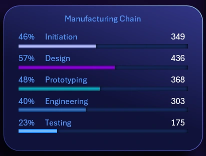
It shows the completion percentage of key sprint processes.
Five horizontal progress bars display the workload level of each production chain stage in both relative and absolute values:
- Project initialization.
- Design development.
- Prototyping and modeling.
- Engineering and development.
- Testing.
Each stage experiences different load levels at different points in time.
Accumulation of Reusable Resources for the Project
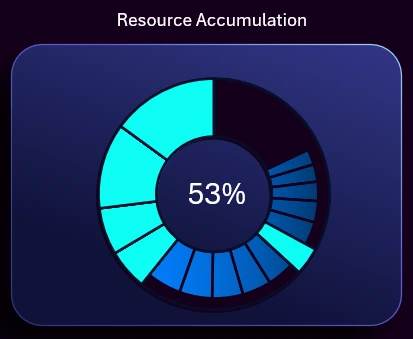
This is a highly technical chart in terms of its execution mechanics during operation. During project execution, certain volumes of resources are periodically accumulated that can be reused or were not fully consumed during initial use, leaving residual capacity. This situation is common in most workflows. Therefore, tracking such resources helps reduce overall project costs. Once the minimum usable resource threshold is reached, the chart automatically resets and the cycle starts again.
Fan Chart of Expense Levels
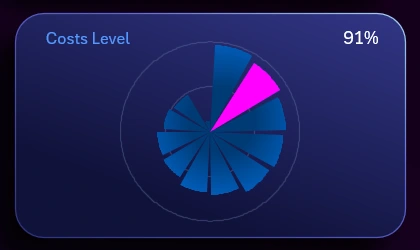
The concept is straightforward. The expense flow is divided into 12 periods. With each subsequent period, the expense level decreases, although exceptions may occur due to unforeseen circumstances.
Task Burndown Line Chart
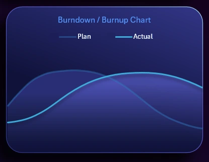
It reflects planned and actual task completion over time.
No Agile project management dashboard is complete without a task burndown chart. The planned burndown is shown in the background, while the foreground displays the actual burndown curve. The chart legend is interactive and allows individual lines to be toggled on or off as needed by clicking their names in the legend.
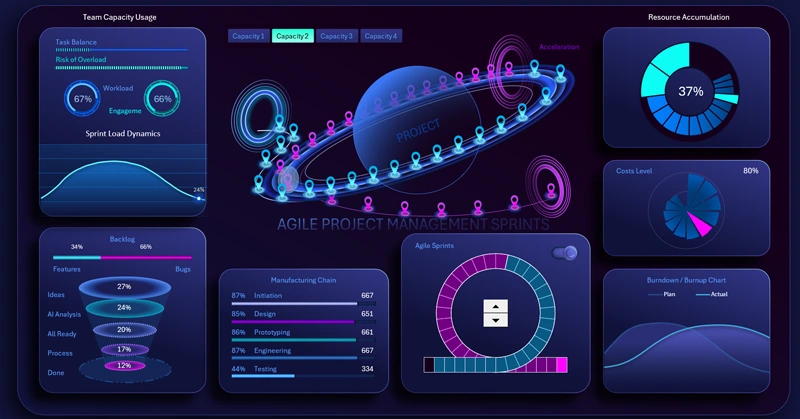
Dashboard Concept for Agile Project Management in Excel
This dashboard is dedicated to Agile Project Management and represents a conceptual visual system for monitoring sprints, team performance, and project progress. It uses a dynamic environment metaphor, where the project is the central element and tasks, resources, and sprints form controllable flows around it.
Download the Agile Project Management Dashboard in Excel
This dashboard is not a classic report. Its purpose is to create a strong visual impact, demonstrate a modern approach to Agile analytics, and show how project management can look inspiring and emotionally engaging. The main focus is on movement, accumulation, and controlled development rather than static metrics.

Data Visualization Charts for Interactive Report Creation in Excel.
Dashboard Templates