Interactive Line Chart in Excel for Data Visualization
Line charts with cursors help better track changes in metrics over time. Making them interactive in Excel allows you to manage data selection, filter periods, and quickly analyze trends.
Excel Template for Interactive Line Chart with Cursors
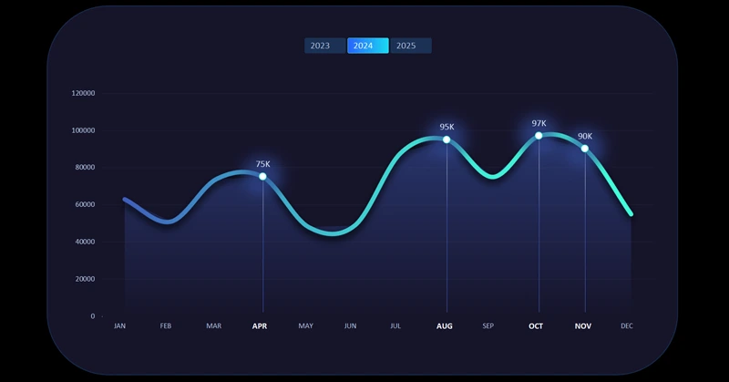
For easier interaction with time-based visualizations, adding cursors is always helpful. Users get better feedback and a stronger sense of control. Moreover, cursors visually highlight the data selection boundaries for accounting periods or custom selections.
To see this in practice, use the ready-made solution available at the end of this article. If you want to learn how to create such beautiful and useful line charts yourself, the video tutorial shows:
- First, create a standard line chart template in Excel.
- Change the chart type to a scatter plot for the second data series.
- Add a vertical cursor line under the scatter plot.
- Add and customize data labels.
- Create pivot table slicers to control the cursor and line chart.
- Create a visualization background block using shapes.
- Add a third data series for the line chart background fill.
- Apply a new color palette to turn the template into a stylish design.
- Evaluate the design and interactive features of the Excel line chart with cursor.
This approach to enhancing line charts is effective for interactive dashboards. For example:

Advanced data visualization in Excel on a single dashboard
An interactive line chart in Excel makes data analysis clear and convenient. The ability to filter and customize display speeds up decision-making and enhances dashboard efficiency. Use interactive charts to make your reports more informative and visually appealing.


Data Visualization Charts for Interactive Report Creation in Excel.
Dashboard Templates