Interactive Sprint Cycle infographic in Excel dashboard
Modern Agile dashboards go far beyond standard charts. A Sprint Cycle in Excel with a central infographic in the form of a project planet allows project management to be perceived not as tables, but as a holistic system with task orbits passing through all workflow stages. Thanks to Excel data visualization capabilities, you can create impactful charts with a competitive edge that attract attention during presentations.
Sprint Cycle charts as the foundation of a visual Agile dashboard

The center of the dashboard is the project planet, around which story points are placed along orbital paths. This visualization conveys key Scrum and Agile concepts: sprint cycle, tasks, acceleration zone, workflow entry and exit points, and iteration loops.
The template offers four animation types to present task progression through the sprint cycle. This solution works effectively as a showcase of Excel capabilities in flow-based and statistical data visualization.
Use animated Sprint Circle infographics within an interactive dashboard together with supporting charts. Below is a strong example of how the Sprint Circle can be harmoniously combined with other data visualization blocks.
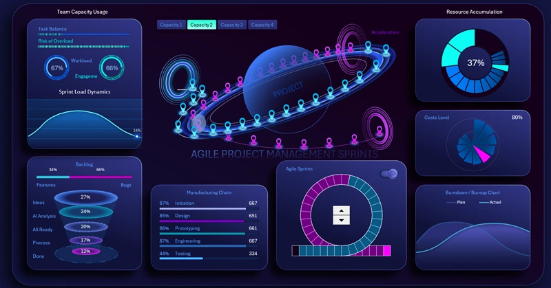
Dashboard template with a planet-style Sprint Cycle Chart
Using Sprint Cycle charts transforms Excel into a powerful visual management tool. A project-planet infographic at the center helps reveal relationships, priorities, and sprint dynamics, making Agile project management more intuitive, transparent, and controllable.


Data Visualization Charts for Interactive Report Creation in Excel.
Dashboard Templates