Orbit and Budget Distribution Spots in an Excel Radar Chart
A salary table gives you numbers, but not a picture. A radar chart gives you both. On a single canvas you can instantly see whose bonus exceeds their base salary, who is approaching the budget ceiling, and where compensation is clearly out of proportion with contribution. For salespeople, where the variable component can outweigh the fixed one, this kind of visualization is especially informative: it shows not just "how much," but "how compensation is structured" across the entire team at once.
Combined Radar Chart in Excel
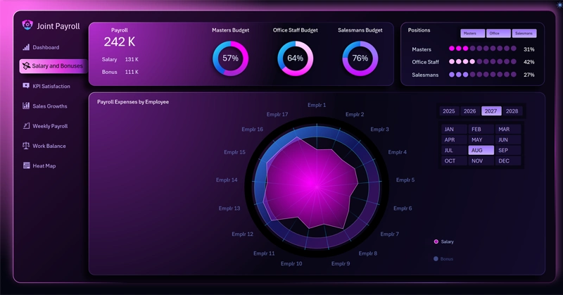
Radar chart of compensation distribution: each axis represents an individual employee, the colored spot is the base salary, the outlined shape shows KPI bonuses, and the wide ring in the background marks the upper limit of the allowable budget; the legend labels act as toggle buttons to show or hide individual layers.
The orbit ring as a budget red line: what does it mean when an employee's salary touches the outer boundary — and why is that a signal, not a verdict? You'll find answers to these and other questions in the article with instructions on using the customized Radar chart on an Excel dashboard:

Key Benefits of the Payroll Analysis Dashboard in Excel
The Radar chart with a budget orbit isn't just a visually appealing payroll visualization. It's a tool for answering a strategic question: how well does the compensation structure reflect each person's contribution to company results? The ability to toggle employee categories on and off and drill into a detailed analysis screen transforms the radar from a static snapshot into a dynamic audit tool. When all the spots fall within the orbit — that's not coincidence, it's a sign that the KPI system has been designed down to the level of specific people, not abstract planning targets.
 Download the Budget Distribution Radar Chart in Excel
Data Visualization Charts for Interactive Report Creation in Excel.
Dashboard Templates