Pivot Stacked Bar Chart with Data Switching in Excel
The interactive stacked bar chart in Excel allows you to clearly show the structure and dynamics of data. By adding a switch, you make the visualization convenient for comparing related or segmented metrics. For example, the number of subscribers segmented by pricing plans.
Excel template of interactive stacked bar chart
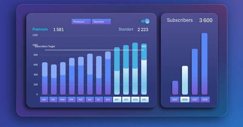
A stacked bar chart with block accumulation and switching between data segments provides the ability to flexibly manage visualization. This is needed for effectively comparing the dynamics of changes in different metrics within the same data category.
To understand the concept and structure of a controlled bar chart, we recommend downloading the ready-made Excel template. This will help with practical exercises and better learning of the training material. But you should start with theory before moving on to practice. Therefore, first watch the training video tutorial, where the full sequence of steps for building an interactive stacked bar chart in Excel is shown step by step. The video tutorial structure is as follows:
- Create the source table for the interactive stacked bar chart.
- Create pivot tables based on the source data of SaaS subscriber counts.
- Fill the bar chart table with dynamic formulas to connect to pivot tables.
- Build a combined stacked bar chart template.
- Add pivot table slicers to control the bar chart in Excel.
- Create an additional pivot table to filter data segments on the chart.
- How to make a nice background using shapes and gradient fills.
- Design the frame of the data visualization block.
- Adjust the sizes and positions of all infographic blocks.
- How to create a stylish bar chart design with rounded columns.
- Example of how to create a custom control element with a unique design in Excel.
- Set up the slicer template design to match the composition.
- Formula table for a helper bar chart with the total number of subscribers by year.
- Create a new bar chart template with a modern and stylish design.
- Add dynamic data labels with formulas.
- Presentation of the interactive stacked bar chart functionality in Excel.
This bar chart template is intended for dashboard development and management in Excel:
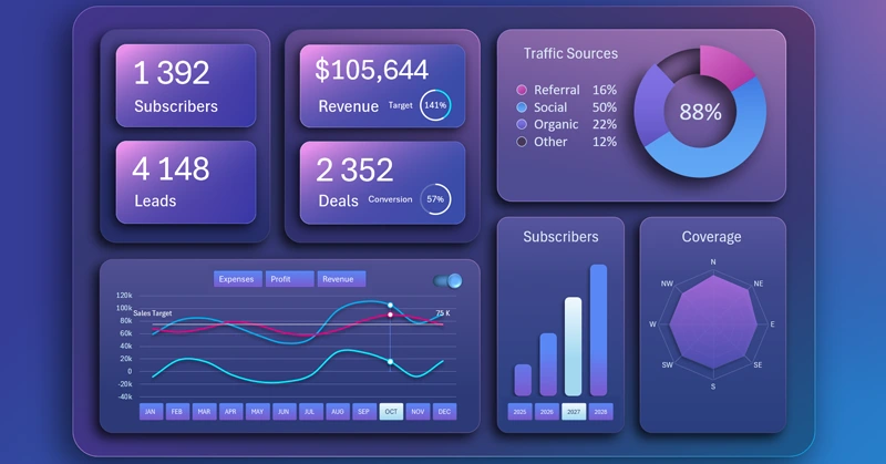
Interactive business plan in Excel dashboard format for SaaS model
This tool makes reports more understandable and helps quickly identify key business insights.
Download Pivot Stacked Bar Chart with Data Switching in Excel 

Data Visualization Charts for Interactive Report Creation in Excel.
Dashboard Templates