Polar Chart for Project Data Analysis in Excel Dashboard
The Polar chart (or spider chart) in Excel is a powerful tool for visually comparing key project metrics. This format helps to clearly present development trends. It is commonly used to identify strengths and weaknesses in processes, effectively analyze resource allocation, and track task progress.
Example of a Polar Chart for Data Visualization in Excel
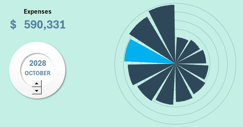
How can you effectively compare key project parameters? The Polar chart in Excel allows you to analyze multiple indicators at once, detect imbalances, and showcase progress. This format is useful for reports, presentations, and internal analysis.
How can project dynamics be visualized using a Polar chart in Excel? In this video, we will go over how to build a Polar chart for an impactful presentation of project data. The tutorial covers the following topics:
- Preparation steps for developing a visualization template.
- Entering formulas for the dashboard control panel.
- Inserting and configuring a counter-type control element.
- Formulas for creating an interactive Polar chart.
- Building the Polar chart using the spider chart template.
- Enhancing the visualization with dynamic data labels.
- Testing the interactive features of the Polar chart in Excel.
This chart type serves as an excellent and valuable addition to a project progress tracking dashboard:
Excel Project Management Dashboard with Infographics
The Polar chart in Excel is a convenient way to analyze and present project data. It helps visually compare indicators, monitor progress, and identify growth opportunities. Use this tool to clearly present information and make well-informed management decisions!


Data Visualization Charts for Interactive Report Creation in Excel.
Dashboard Templates