Sales Growth Oscillator Line Chart in Excel
Comparing five sales locations on a single chart risks turning your analytics into a chaos of intersecting lines. But this is exactly where an Excel dashboard shows its real strength: not just displaying trends, but highlighting the moment when, after a dip or sideways movement, the market turns upward again. Growth markers on the chart aren't decorative — they're analytical signals. These are the spots where you should look for the root cause, scale the process, and plan your next move in the sales strategy.
Beautiful Line Chart Design with Interactive Features
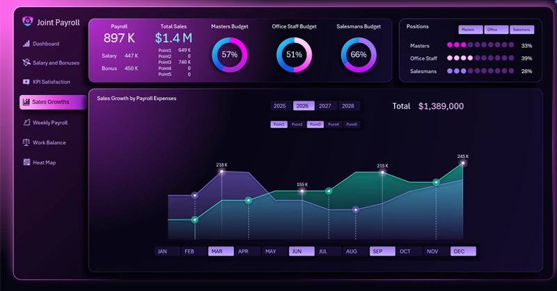
Three lines are already a visual load — five are visual noise: why do sales location filter buttons improve the quality of analysis, not just its convenience?
The comparative analysis line chart allows you to configure:
- Sales by sales location.
- Active lines selected via filter buttons.
- Markers on the curves indicate trend reversal points — moments where momentum turns upward.
- Interactive X-axis buttons control the data slice by month and quarter for the entire dashboard.
How does a line chart with reversal points help you find a growth driver before your competitor even notices it? You'll find answers to these and similar questions in the overview of the multi-functional dashboard where this interactive chart is used effectively in practice:

Excel Dashboard for Managing Investments in Employees
A sales growth chart with reversal points is not just a pretty line on a dashboard. It's a tool for uncovering cause-and-effect relationships: why did the trend break in this particular month and at this particular sales location? The answer to that question is worth more than any revenue report — because it points to a scalable process. Line filtering removes the noise, interactive slicers let you view data across the right time horizon, and the growth point marking algorithm makes the signal visible while it's still relevant — not after it's already been missed.
 Download the Oscillator Line Chart in Excel
Data Visualization Charts for Interactive Report Creation in Excel.
Dashboard Templates