Team Satisfaction Charts for Excel Dashboard
Project effectiveness is determined not only by completing a large number of tasks, but also by the level of team satisfaction. This reflects the core idea of efficiency—the ratio between resources invested and results achieved. It is often said that in nature there is no concept of good or bad, only effective and ineffective. In Excel, this can be represented through a combination of relative and structural metrics that show how the overall state of the team is reflected in results against the resources invested by the company. It also helps identify key drivers of satisfaction. This approach connects emotional and operational metrics within a single analytical system.
Why Analyze Team Satisfaction and Project Progress in Excel
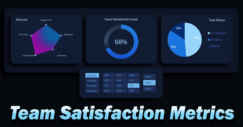
An Excel-based dashboard is a highly accessible tool for solving specific tasks quickly. For example, this set of charts performs the following functions:
- Donut chart for monitoring the overall level of team satisfaction.
- Radar chart for distributing key factors influencing satisfaction and identifying the dominant driver.
- Pie chart showing task distribution by status:


- added;
- completed;
- in progress.
A comprehensive approach to visualizing statistical and interconnected data allows you to break down the situation into “atoms” to find the most optimal solution for improving team efficiency. There is no need to develop custom software just to identify the most influential factors affecting satisfaction and performance. Excel’s data visualization capabilities are sufficient—yet often underestimated by average users.
Here is an example of how a full interactive dashboard can look, where all these charts are effectively used and integrated into a single system:
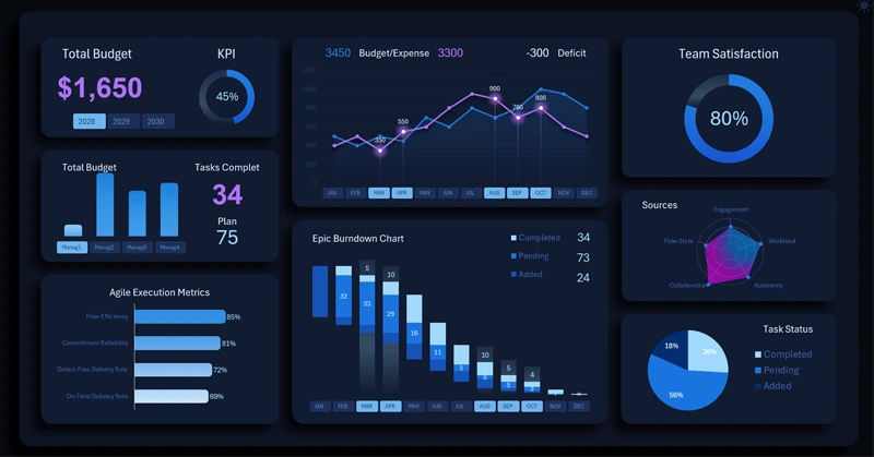
Example of an Excel dashboard for effective project management
Combining team satisfaction metrics with task execution provides a comprehensive view of project health. It also reflects investment attractiveness and not just growth potential, but the strength of growth. What matters more than positive business growth?
- Growth speed.
- Growth sustainability.
- Growth quality—maintaining acceptable margins.
- Growth strength—how quickly and easily the business can absorb increased capital scale.
The donut chart allows quick assessment of the overall level, the radar chart highlights key influencing factors, and task segmentation shows current progress. Such a dashboard helps identify issues in a timely manner, adjust processes, and maintain balance between results and team well-being.
 Download team satisfaction charts in Excel
Data Visualization Charts for Interactive Report Creation in Excel.
Dashboard Templates