Tracking profit flow by income and expenses in Excel
Profit flow control helps monitor the financial health of a business in real time. Comparing income and expense dynamics in a single Excel chart provides a clear understanding of how net profit changes and where resources are going. Working with data through visualization simplifies decision-making and improves financial management efficiency.
Examples of interactive line charts in Excel
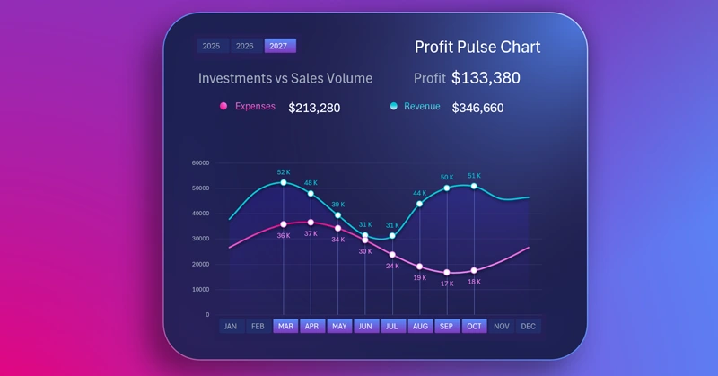
By using pivot tables and slicer buttons, you can create interesting visualization models in Excel. Slicer buttons control pivot tables, which in turn control charts. This way, you can filter data and highlight important periods on the chart using cursors. How to do this is well shown in the video:
- Base for building an income and expense chart.
- Working with source data and pivot tables.
- Line chart template for tracking income and expense dynamics.
- Color palette for creating impressive data visualization designs in Excel. Interactive line chart features controlled by pivot table slicers.
- Adding formulas for dynamic labels.
- Testing the interactive features of the income and expense chart in Excel.
This Excel chart is part of a dashboard and serves as a control tool:

Excel dashboard for tracking purchase and sales profitability
Income and expense flow charts in Excel are a convenient tool for continuous monitoring of financial indicators. Visualization shows the relationship between metrics, helping you quickly respond to changes and optimize business strategy.
Download Tracking profit flow by income and expenses in Excel

Data Visualization Charts for Interactive Report Creation in Excel.
Dashboard Templates