3D Dashboard for Project Management in Excel Free Download
A beautiful Excel-based solution for visualizing sales performance data of a home improvement store. This dashboard is designed to improve project management efficiency in the building materials retail sector. The structure of a home improvement store is divided into sections based on core product categories. Each section in the store is treated as a separate project, requiring detailed analysis to increase sales efficiency across the retail floor. You can download the project management dashboard template at the end of the article. For now, let's review all of its visualization blocks and how it works.
Why Use a Project Management Dashboard in Excel
This type of dashboard is suitable for a building supply store, a large retail outlet, or a DIY retailer and can be especially helpful for:
- Improving the conversion of store visitors into buyers.
- Identifying and eliminating internal project bottlenecks.
- Efficient management of human resources.
- Scaling a branch network.
Competitive advantages and key features of the Excel dashboard:
- Control over key metrics for all internal projects in one place with a bird's-eye view (helicopter look).
- Visualization of how customer flow affects profit. It shows how a project has influenced traffic-to-sales conversions.
- An interactive and informative sales funnel with staff distribution visuals along the customer journey. Helps evaluate and optimize employee workload and improve conversion rates.
- HR visualization showing how employees are distributed into teams within each sub-project. Easily spot where to reallocate HR resources — who’s overloaded, and where staff or customer flow is underutilized.
- An interactive interface for managing data visualization on the dashboard. Filters can be toggled by date, by project (store section or entire branch — depending on business scale).
3D layout of the local sales floor map within the store boundaries tied to the sales funnel. This helps identify bottlenecks in the customer flow where conversion obstacles may occur. It helps quickly answer questions like:
- Where is activity higher?
- Where are projects stalling?
- Where are employees overloaded?
- How to redistribute customer flow workload among service staff?
All data on the dashboard updates automatically thanks to the use of smart and pivot tables for processing source data. Slicers from pivot tables are used as control elements (button blocks). No macros are used at all! — the entire template is fully automated using only standard Excel tools, tables, and formulas. This example clearly shows how standard Excel tools can be used to create non-standard solutions. Use creative ideas instead of macros.
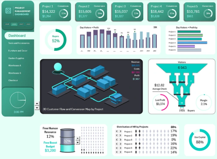
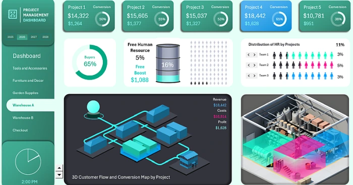
Dashboard Header with Conversion Summary Metrics
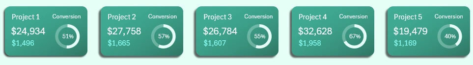
Each visualization block in the dashboard header presents 3 key metrics for each internal project in the building supply store:
- Revenue
- Profit
- Customer-to-visitor ratio (percentage)
The dashboard header consists of 5 blocks, even though the dashboard analyzes 6 sub-projects at the same time. Each project is a section of the home improvement store:
- Tools and Accessories
- Furniture and Decor
- Garden Supplies
- Warehouse A
- Warehouse B
- Checkout
Since checkout doesn’t have a meaningful conversion rate in such stores (or it’s biased because it only includes upsell items), it’s not included in the dashboard header, but it is shown in the main menu and the interactive 3D map.
The logo block should also be considered part of the dashboard header. It is located at the top:

This panel contains buttons for switching between years. When a year is selected, all visuals across the entire dashboard update automatically. Because this panel is built using pivot table slicers, it supports multi-selection — you can select several years at once or even all of them.
The dashboard header also serves as a menu. Clicking on any visualization block opens the screen for the selected project.
Percentage of Buyers Out of All Visitors
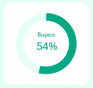
Right below the header is the overall conversion rate across all projects, shown only on the main dashboard screen. On individual project screens, this area displays the relevant conversion metric. Only on the checkout project screen does this section show the supermarket's profit margin instead.
Monthly Conversion Trend
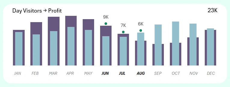
This combined bar chart shows the correlation between visitor numbers and supermarket profit. As shown, visitors have varying levels of impact on profitability depending on the month. This block also includes control buttons for selecting months across all dashboard metrics. Multi-selection is supported, allowing you to choose several months at once, as shown in the image—ideal for analyzing quarters, half-years, or other accounting periods such as seasonality or corporate calendars.
Conversion of Visitors to Profit by Project
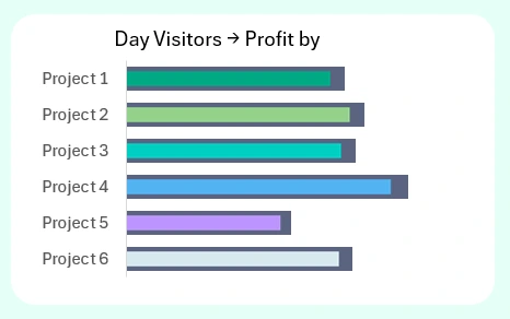
The right-hand block shows the monthly conversion structure for each individual project. You can analyze which project had the greatest or least impact during a specific reporting period.
3D Map of Visitor Flow Distribution by Project in the Hardware Supermarket
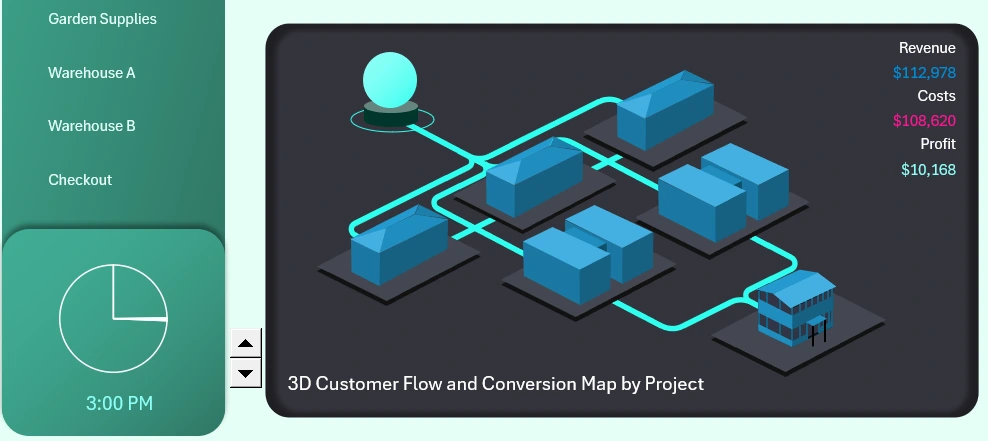
This 3D schematic of visitor flows allows you to view all projects at once in helicopter view mode. Isometry is a very convenient data visualization method when decision-makers need to act quickly. Reacting means making the right call fast. Be a responsive leader—because leadership is not about being the strongest, it's about making the team stronger!
Here we see associative volumetric models created in an isometric style resembling 3D graphics. While Excel does allow you to insert 3D models, in this template everything is built using standard vector shapes and carefully chosen color tones. Any Excel user can replicate this trick without additional knowledge.
Each object on the 3D map represents a corresponding project—there are six in total. It's visually intuitive: where the show sections are, where the storage areas are, and where the checkout is. The sphere object represents a traffic source, such as an outsourced marketing department. However, the sphere is placed outside the supermarket boundaries, as indicated by its distinctive base, even though it directly links to the customer traffic channels.
The top-right dashboard panel highlights the following key metrics:
- Revenue
- Expenses
- Profit
These metrics update according to the selected project for analysis. On the main dashboard screen, aggregated totals for all three metrics are displayed.
This visualization block should be presented together with the auxiliary element—a clock, located at the bottom-left of the dashboard menu. Between them is the control element for animating traffic flow on the 3D map. As the clock progresses through the day, colored streams fill the customer traffic channels in the supermarket. For example, the image shows 3 PM, and the store is fully filled with visitors.
New version of the interactive sales funnel visualization in Excel
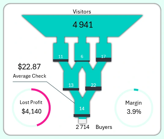
Next to the 3D map on the right is a directly connected visualization block – the sales funnel. It also shows the flow of visitors across projects. First come the 3 exhibition sections, then 2 warehouses, and finally 1 checkout area. As the funnel fills with visitor traffic, three key metrics change:
- Margin
- Lost profit
- Average receipt
At different customer contact points within the projects, managers can observe real-time changes in margin, missed profit, and average purchase value. In parallel, we also track the difference between the number of visitors entering the market and the number of actual buyers leaving the checkout area.
What’s more, we can directly influence these indicators by adding or removing staff in each project! This function is implemented in the next visualization blocks on the dashboard. It’s both convenient and efficient. This way, we can detect and eliminate bottlenecks in the cyclical flow line, while also monitoring the cost of optimization and its profitability depending on the specific situation. More on this in the next block…
Sales boost budget for selected projects
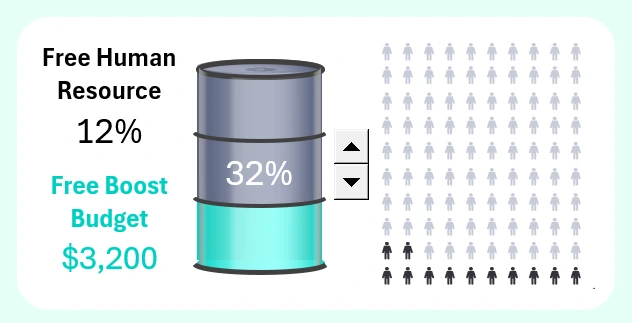
To effectively manage sales activity and maintain visitor flow, it’s crucial to have a reserve of HR resources ready to boost performance at the right moment. This block shows an infographic of connecting additional employees to projects requiring attention.
The visualization scenario is intuitive – the fewer financial resources left in the boost budget, the more HR resources have already been used. The chart may seem a bit counterintuitive at first, as the remaining resource percentages aren't proportional. This is because this block should be interpreted together with the next two blocks, which are designed for managing additional HR resources. The disproportion occurs because a large share of the HR reserve is already distributed across projects and actively used. The chart here only shows the remaining available personnel.
Distribution of additional HR resources by project
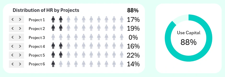
This is the HR management panel. You can specify and observe how many extra team members each project receives when needed. The total number of distributed resources and their detailed allocation are displayed.
This block is also directly linked to the sales funnel, which visually shows which project receives additional employees when you use the control elements.
Team allocation inside projects
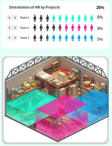
Once additional human resources are allocated to a project, they must be divided into teams. This task is handled on the dashboard screens designed for detailed analysis of project performance.
A special control panel divides additional personnel into three teams. Below, you can see the localized zones of these teams within the project. A 3D bar chart helps visually assess which zone received the most additional HR resources.
Project dashboard screens for detailed control
Download the 3D Project Management Dashboard for Excel for Free 
This is how the child dashboards for project management look in the template, with detailed analysis available on separate screens. You can switch between screens in three ways:
- Main menu
- Dashboard header
- Project models on the 3D map
You now have a unique opportunity to download the dashboard template for free, with no registration required. The Excel file contains no macros and no sheet or workbook protection. After downloading, explore the structure of the template and freely use it in your own projects, reports, or presentations. The source data is entered on the “Data” sheet.

Data Visualization Charts for Interactive Report Creation in Excel.
Dashboard Templates