3D infographics for Excel presentation cheese sales report
Data visualization is useful for all types of businesses. Farmers and artisans will also increase the efficiency of their operations with Excel reports. What's more, the power of data visualization also allows you to add an element of playfulness to your business and make your work an enjoyable experience. The result is the best motivation - action!
Dashboard for a hard cheese producer in Excel
This time we will prepare a presentation in Excel for a simple report-analysis of the ratio of the production costs of raw materials to the sales of finished products in the cheese industry. We are going to use 3D infographics in the design and name the dashboard Cheese Board. And according to tradition we will simulate the situation to illustrate the example.
For the production of traditional hard cheese you need only 3 components:
- Milk.
- Salt.
- Ferment (rennet) - is a product of animal origin and is needed to curdle milk in the preparation of hard cheeses.
The cheese factory produced a variety of hard Parmesan cheese year-round. Ageing period of Parmesan is 3 months, i.e. 1 quarter. Each quarter there were made purchases of raw products and sales of hard cheeses. Naturally, the sales activity differed significantly from the activity of production, as in any business. You need to make a report for visual analysis of the ratio of sales to production costs.
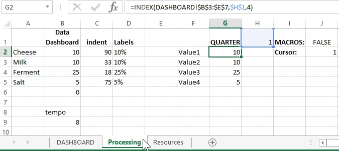
Template structure and data filling
The template with 3D infographics for the Excel presentation of hard cheese sales reports consists of only 2 worksheets. There is no "Data" worksheet in this example, as the source data is filled in a small table on the main "DASHBOARD" worksheet:
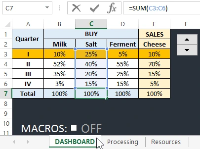
Data processing formulas and raw value tables for charts are located on the "Processing" sheet:
Dashboard Structure with 3D Infographics
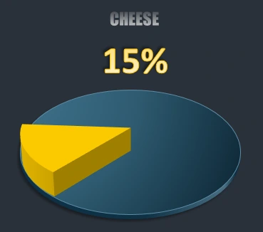
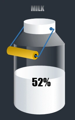
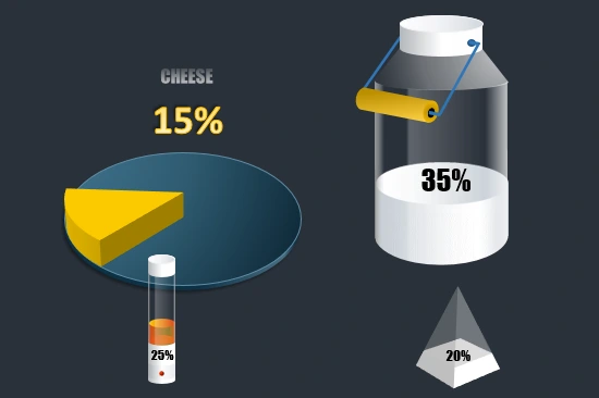
Our cheeseboard is an infographic of a composition of 4 elements made in 3D style with standard Excel tools.
- Cheese board with a fraction of a head of hard cheese. 3D Pie chart with two segments with yellow and transparent color. The traditional cheese board can be made of wood or ceramic as in this example. It is drawn with vector shapes - a circle.
- Glass jug with milk. A complex composition of vector shapes and Bar Chart (Stacked Column). I had to use the MS PowerPoint presentation editor to draw some complex vector shapes.
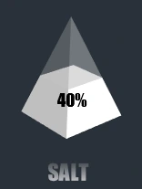
- The Saltbox. Made from a standard 3D-Stacked Column into 2 segments with white and semi-transparent white color. To make it as a pyramid, you need to change the graph settings: "Format Data Series"-"SERIES OPTIONS"-"Full Pyramid".
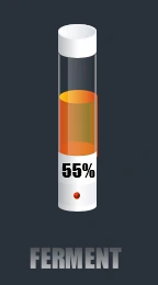
- Test-tube with an enzyme. Made by the same principle of building infographics elements as the glass vial with milk. Gradient fill vector shapes and Bar Chart were used. Some complex vector shapes were made in MS PowerPoint, which is also part of the standard MS Office package, like MS Excel.
All the elements blend harmoniously into the composition of the infographic for the presentation and analysis of the Cheese Board report. For decoration, macros have also been added to make a consistent smooth animation of all the charts on the dashboard:
 Download 3D Infographics for Report Presentation in Excel
If desired, the macros can be disabled with the ON/OFF switch, and the interactive functionality of the template will continue to work without animation. The vector shapes for decorating the graph segments are on the Resources worksheet.
Expand this template with new elements as an idea for new presentations. For example, for presentations of recipes, compositions, raw material cost analyses, waste percentages, and finished product yields.

Data Visualization Charts for Interactive Report Creation in Excel.
Dashboard Templates