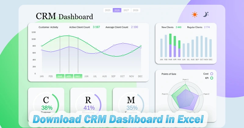
Beautiful Excel Dashboard template for CRM system reports
CRM (Customer Relationship Management) system collects a lot of statistical data that is valuable for building important customer reports. Very often, CRM system developers can't foresee all report types for a specific business. Excel allows you to quickly create a missing interactive report based on statistical data exported from the CRM system without programming skills. We present to you an Excel dashboard template for comparative analysis of specific and traditional metrics.
Example dashboard for analyzing CRM system data in Excel
The most important thing in business is sales, and the most important thing in sales is customers. In the real financial world, no one works for themselves — everyone works for the customer. Because customers are the main source of profit in any business.
Why should you work efficiently with a CRM system? Selling means helping people. A CRM system allows a business to significantly increase the effectiveness of helping customers through sales. And what increases the efficiency of using a CRM system? Of course, it's reports with data visualization for quality and timely analysis.
When we say the word “business,” we generalize many different industries that can vary greatly in business models and target audiences. So no matter how hard CRM developers try to create a universal tool for all types of businesses, there will always be a need for missing reports. In these cases, Excel is very helpful — a universal analytical and computational tool. MS Excel takes a small portion of data from the CRM system and creates pivot tables. Based on those pivot tables, Excel builds interactive data visualizations in the form of dashboards. For small data volumes, Excel’s capabilities allow the creation of visual reports of any complexity. Many of them can be found on this site. But first, let's break down the structure of this dashboard.
Comparative analysis of customer activity in the database
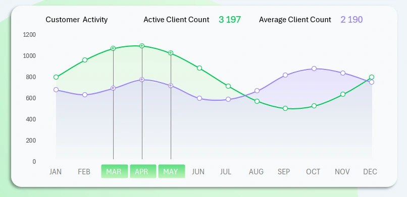
In this Excel dashboard template, the largest visualization block features a non-standard report — the dynamics of the number of active customers in the CRM database. The category of active customers is defined differently, and the criteria may vary depending on corporate culture. For example, a customer may be considered active if they placed at least one order in the past two weeks.
The two curves show the dynamics of the number of active customers over the course of a year relative to an average value over a longer accounting period. So this report will be relevant for companies that have been on the market for more than two years.
This block includes a control element to switch between months. The buttons are slicers from Excel pivot tables, meaning you can perform multi-selection. For example, you can select several months to analyze a quarter, half-year, or seasonality. The image shows a selection for the spring sales season.
To switch the dashboard metrics by year, use the appropriate buttons at the top of the report.
Ratio of new to returning customers
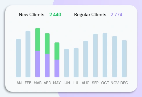
Next, a non-standard report is compared with typical metrics on one dashboard screen. This helps identify the causes behind increases or decreases in customer activity. It also helps assess the accuracy of the values. For example, should new customers be considered active? Perhaps the situation is worse than it appears and immediate action is needed — such as calling the CRM customer base with special offers or seasonal sales.
Pro tip. This version of the dashboard allows switching charts in the main featured block. To make the bar chart the main visualization, simply click on it for a detailed view in the primary section. As a result, the two charts will swap places.
Ratio of expenses to KPIs at retail locations
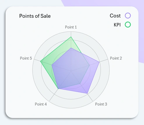
A radar chart is always useful when presenting a lot of data on one diagram. In this visualization block, we analyze how expenses affected KPI performance across 5 retail locations simultaneously.
KPI plans are always related to customer service. Any service requires spending. But expenses are not always justified everywhere. If sales are the top priority in any business, expense control should be second. Not all CRM systems can generate visual reports with interactive features for analyzing the ratio of KPIs to expenses. In Excel, there are no limitations — build all the missing reports you need and get timely analysis for your small business.
KPI Summary Panel for a CRM System
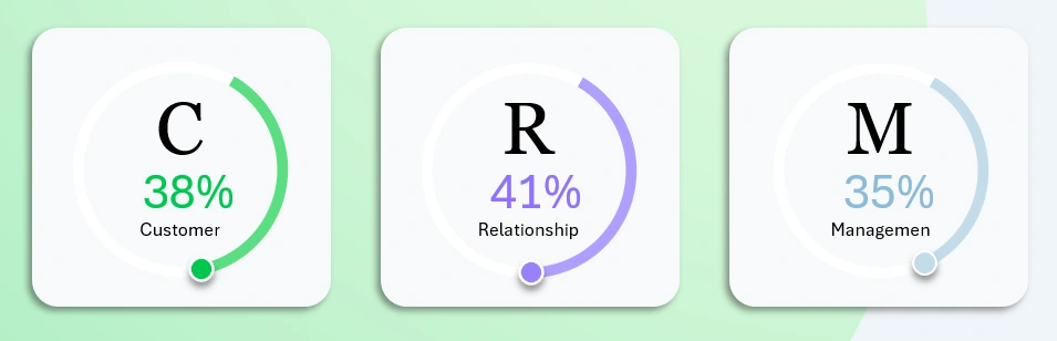
All non-standard reports should always be compared with standard metrics. It’s helpful when an Excel dashboard allows you to overlay key baseline figures as a background to your data visualization.
The bottom panel displays three key service load metrics using three charts:
- Clients processed in the database.
- Interaction efficiency.
- Management efficiency.
The first two points are clear, while the third may require some explanation. The truth is easiest to grasp through comparison. Let’s compare all three metrics for clarity.
Working with the client base includes:
- Building and scaling the CRM database.
- Segmenting by categories.
- Maintaining the client database:
- backups;
- import / export;
- administration.
Interaction covers a wide range of tasks:
- Attracting new clients.
- Communication and feedback.
- Handling complaints and claims.
- Retention and loyalty.
- Repeat sales and development.
Client management is not just interaction — it's a fully intentional process:
- Analyzing client behavior.
- Personalized approach for VIP clients.
- Systematic work with key clients (KAM – Key Account Management).
- Developing and implementing loyalty programs to increase LTV (Lifetime Value).
Thanks to Excel, you can create unique visual reports that reflect your specific analytical approach. These reports help you clearly identify priorities — and most importantly — understand what drives outcomes and what results from them.
Personal Visual Report in Excel Dashboard Format
As a result, you gain the ability to stay several steps ahead of competitors who don’t leverage Excel’s capabilities for building non-standard reports with data visualization:
Download the Custom CRM Dashboard Template in Excel 
Improve your skills in creating unique Excel dashboards to benefit your business. The fastest way to learn is through ready-made examples. You’ll find many on the site, and all templates are free to download without registration.

Data Visualization Charts for Interactive Report Creation in Excel.
Dashboard Templates