Benchmark sales by year on a dashboard report in Excel
Truth is known by comparison. That is why, in any activity, comparative analyzes should be done regularly to understand the current true situation of the situation. Happiness for every person is a feeling of progress, in other words, a change for the better. But in order to see and realize the fact of progress, a comparison should be made of the position of the starting point A with the current point B. All this explains the main principle of motivation - nothing motivates as visualizing progress. Thus, we can safely say that data visualization not only allows you to quickly make the right decisions (in other words, show a high reaction of effective actions in the current situation), but also thoroughly motivate you to act.
Preparing report data for benchmarking sales in Excel
 Advanced sales comparative analysis products download in Excel.
Consider an example of building an interactive graphical report with data visualization in Excel without using macros. The main feature of this example is that several dashboard controls will be used at once.
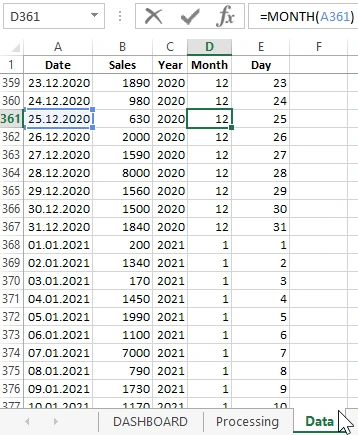
For example, as always by tradition, we simulate a situation. Statistical sales information was exported from the ERP system in the standard Excel file format. As a result, we have at our disposal a sales history for the accounting period of 2 full years: from the last 2020 year to the current 2021 year. As the picture below:
It should be noted right away that daily sales figures are very volatile. One day 170 to another 8,000. As in retail, day-to-day is different. Therefore, it is reasonable in our interactive report of a comparative analysis of sales to preliminarily average all the indicators in order to avoid “statistical noise” on some charts.
Based on the data we need to know:
- The ratio of average sales for the months of the current year relative to the past.
- Changes in percent dynamics between different months for different years.
- Analyze monthly actual sales by week and day of the week.
- Determine which days of the week have a weekly maximum of sales.
This is approximately what our TK (terms of reference) looks like. Indeed, without TK the result is HZ! Based on it, it is already possible to schematically simulate the structure of the dashboard to visualize the comparative analysis report in sales. The basic scheme for this TK consists of 4 blocks (blocks can be in any desired sequence, and not necessarily in terms of TK).
Formulas for creating data visualization in a comparative analysis of sales
As you can see already in the first figure, the template for this dashboard consists of 3 sheets.
- DASHBOARD - charts and graphs with interactive report controls for comparative visual analysis of statistical source data.
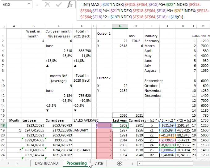
- Processing - the technical part of the template, consisting of complex formulas for selecting data according to several conditions from the “Data” sheet. And tables for building charts or report charts on the DASHBOARD sheet.
- Data - the initial data obtained by exporting from the company ERP-system program.
Next, we consider the main sheet of the report and the principles of its management of interactive elements for convenient visual data analysis.
Dashboard for creating reports on benchmarking sales in Excel
We offer you an overview of the principles of using the dashboard template for compiling visual reports on benchmarking sales in Excel.
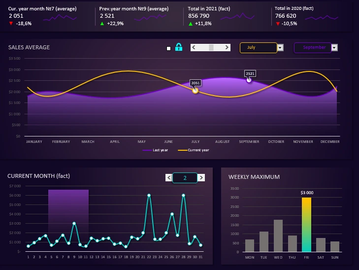
The uppermost first block consists of 4 blocks of signatures and numerical values. Of the graphic elements, there are only triangles of growth and decline. They are against the display of changes in their dynamics as a percentage:
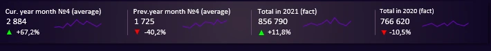
An interesting fact, clearly expressed in this example situation. In order for us to increase the sales rate from 1,725 (April 2020) to 2,884 (April 2021), we need to add as much as + 67.2%. But if on the contrary, in order to worsen the indicators of progress from 2,884 to 1725, it’s enough for us to rub only -40.2%. Be careful with negative percentages in reports. Do not neglect their small values. Indeed, to increase the number by 2 times it will take as much as 100%, but to lose half is enough only 50%. Relative values are insidious, but you cannot do without them, you just need to learn how to use them correctly.
The second largest block called “SALES AVERAGE” displays the dynamics of changes in the average sales indicators for the current (yellow curve) and previous (purple curve) - years:
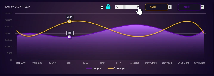
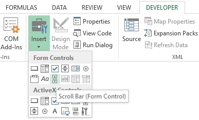
To visually analyze the changes for months of different years, you can use the interactive scroll bar element. It’s worth noting that all interactive elements in Excel are accessible from the drop-down menu on the tab “DEVELOPER” - “Controls” - “Insert”:
Now it’s important to note the scrollbar control feature. This control only controls the cursor to display the months of the current year. If the “Checkmark” element is checked with a tick opposite the “lock” icon, then the second cursor of the values of the previous year will be attached to the cursor of the current one.
Next, go to the follow-up control - drop-down lists. Thanks to them, we are able to compare indicators of different months of different years. BUT! You must first uncheck the box against the lock to unlock the cursors and make them independent of each other. Here's how it works:
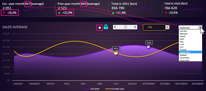
As shown in the figure above, we unchecked the "castle" and using two drop-down lists independently control different cursors of different years for different months. And on the first block we get detailed information about the dynamics of changes in average indicators and in percentage terms. This is very convenient for building different progression strategies based on the obtained statistics and comparative visual analysis of sales in Excel.
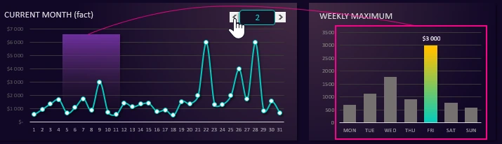
The third block “CURRENT MONTH (fact)” displays daily sales for the selected current month of the current year:
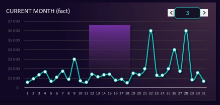
In the background of the chart of this block is the area highlighted in purple, which serves as the cursor for highlighting the days of the selected week number (in this case, No. 3).
The same days of the week are displayed in detail on the fourth block under the name “WEEKLY MAXIMUM”:
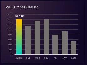
It also shows in detail the day of the week with the highest sales rate (in this case, Thursday). The third and fourth blocks are interconnected and are controlled by the same control element (scroll bar) on the 3rd block. As the picture below:
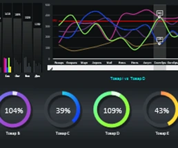
And all together, the blocks form an integral picture of an interactive report for conducting a visual comparative analysis of sales according to statistical raw data for a 2-year academic period:
 Download Sales Benchmark Report by Year in Excel
This dashboard is presented in the form of a template. Thus, you have the opportunity to use it for your own purposes for your tasks, just substituting your original data on the "Data" sheet. Pre-download it at the above link. The template does not contain macros and is not locked with passwords, but is fully accessible for editing formulas or charts. Free: download, use, improve, analyze, share with friends.

Data Visualization Charts for Interactive Report Creation in Excel.
Dashboard Templates