Advanced sales comparative analysis products download in Excel
A comparative analysis of sales of goods in Excel allows you to solve a number of problems: assortment formation, pricing, preparation of product sales plans, construction of trade development strategies, etc. To quickly and conveniently analyze large volumes of information, it is important to use data visualization tools in Excel. Consider a ready-made solution using the example of a dashboard template with an extended comparative analysis of product sales by product groups in Excel.
Dashboard for benchmarking merchandise trading in Excel
To illustrate the use of an example of a visual report, we first simulate the situation. Information on the history of sales of goods in 5 categories (A, B, C, D, E) was exported from the ERP system over the entire five-year accounting period (2021–2025). It is necessary to analyze the dynamics of changes in the activity of monthly sales of each group, the relative indicators of other groups and the established average annual plan. Thanks to the extended comparative analysis of the sale of goods, we will get the opportunity:
- Correctly determine and set prices for goods.
- Organize the necessary volumes of supplies.
- Identify headliners and outsiders of products for a specific seasonality period.
- Set sales plans.
- Form the optimal assortment basket.
- Build a further trade development strategy.
- Identify the strengths and weaknesses of the current situation.
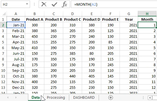
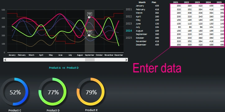
We pass from theory to practice. For further analytical steps, we will use a dashboard template with data visualization in Excel. Using this template, we will process the initial statistical information that should be filled out on the “Data” sheet:
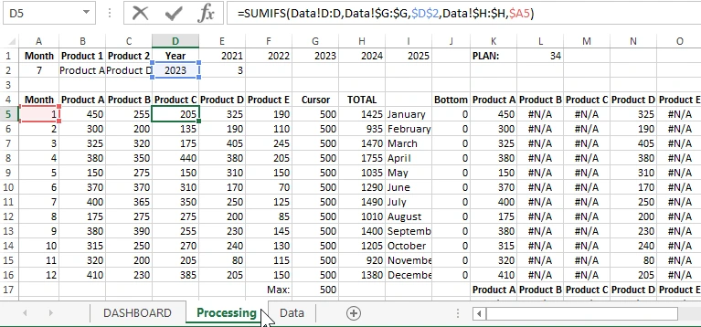
Then, on the “Processing” sheet, all initial data is processed by complex formulas and prepared for visual analysis:
Then all the table values are read from the Processing sheet and transferred to the DASHBOARD main sheet as a visualization created using interactive charts and diagrams.
Structure of visual benchmarking in Excel
A dashboard for an extended comparative analysis of sales of goods consists of only 3 blocks and 4 control elements. The main feature is functionality.
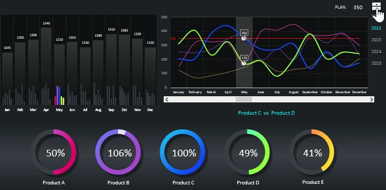
The first block is a combination of two columnar histograms:
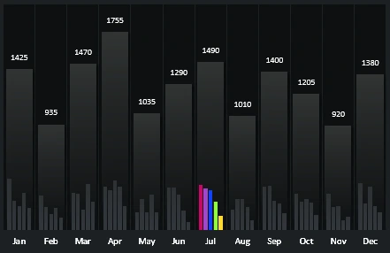
The first big one shows the total sales amount of all product groups for the current month. And on the second histogram, the same indicator is segmented separately for all product groups. Colored columns display values for the selected month.
Each serial number and color of a column corresponds to the color of its group, as on the entire dashboard:
- Scarlet Color - Product A.
- Violet - Product B.
- Blue - Product C.
- Light Green - Product D.
- Yellow - Product E.
The following block shows the dynamics of changes in monthly sales activity for the selected year:
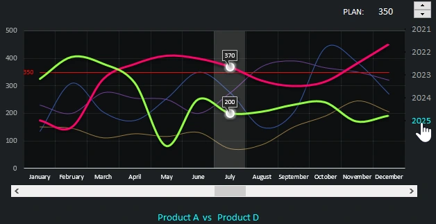
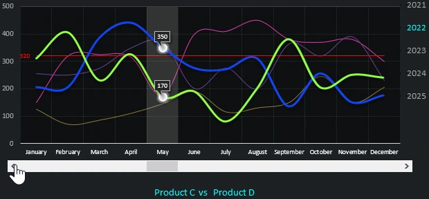
This block includes all dashboard controls. The chart shows all 5 groups at once. To perform a comparative analysis of goods, you must use the lower control unit - 2 drop-down lists. Thanks to him, we have the opportunity to exhibit 2 (or 1-well) groups for a detailed comparison and further analysis of their dynamics:
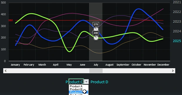
The chart shows a red straight line (at 350). Its value corresponds to the number against the signature "PLAN:". Thus, the level of the average annual sales plan is displayed, which can be changed using the top control - counter:
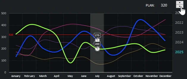
The years on the right side of the block also represent a control for switching between years on the whole dashboard:
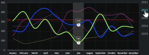
And the last control is the scroll bar. Allows you to switch between months for the selected year:
The last block of the dashboard is a chart showing the percentage of the plan for each product group:
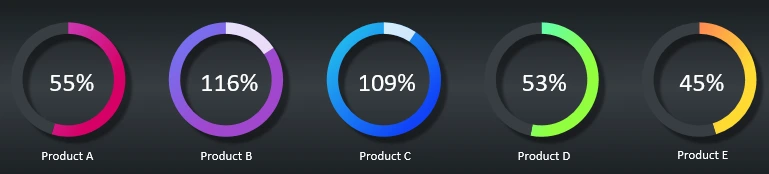
The colored parts of the diagrams fill in the current values, and the dark ones - the missing ones. The overfulfillment of the plan is displayed in white fractions.
If we begin to change the value of the average annual sales plan using the upper control element of the red line level on the chart, then the values of the charts in the third block are automatically updated - respectively:
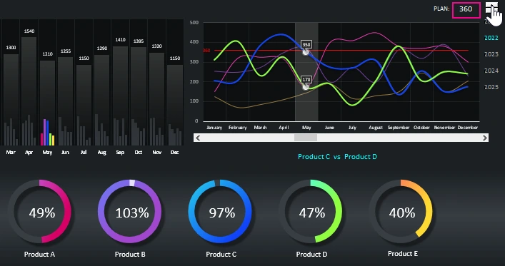
All together, the blocks harmoniously merge into a holistic picture of the visual report in the form of an interactive dashboard:
 Download advanced sales comparative analysis in Excel
Of course, in practice most often the average annual sales plan level is not set the same for all months. It can be done in a step-by-step schedule by setting each level of the sales plan separately for each month. How to make a step graph is described in detail here:
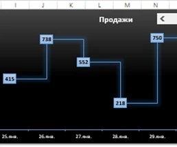 How to build a dynamic step chart in Excel?
Then I will make a new version of the same dashboard with the ability to set a sales plan separately for each month and give a link to a new file in response to your comment.
Our solution is ready!
At the request of readers of the site, I made a ready-made solution and published a new version of the report right at the end of this article. The second version of the analysis with a stepped schedule sales plan:
Download the second step analysis version
Now for each month and each year you can set your own separate sales plan. To do this, just fill out the table with the values of the plans in accordance with the year and month directly on the dashboard.

Data Visualization Charts for Interactive Report Creation in Excel.
Dashboard Templates