Dashboard for Improving Sales Team Performance in Excel
The idea behind developing the dashboard for monitoring retail sales staff is simple. It's absolutely possible to create in Excel not just a tool for tracking key performance indicators of salespeople, but one that also helps identify under which conditions certain sellers outperform others.
The Main Benefit of the Excel Sales Staff Analysis Dashboard
We are all different, and every day we sell something - if not products or services, then time or information:
- opinions;
- ideas;
- personal image;
- priorities;
- decisions;
- principles;
- emotions;
- motivation, etc.
Because selling is an exchange. Whenever we communicate, we exchange information. In essence, we "sell" our information in return for a reaction or action. So each of us is a salesperson, but each has a sales method that works better than others depending on the situation.
- There are 8 basic sales methods.
- Classic Selling (Feature–Benefit–Close).
- SPIN Method.
- AIDA Method.
- Active Listening Method.
- “Hourglass” Method.
- Consultative Selling.
- Five-Step Sales Process.
- FAB Method.
Each method has its own technique, and each person has different abilities to master it. For example, detergent commercials typically follow the SPIN method:
- Situation – the current context;
- Problem – the issue that arises;
- Implication – possible consequences;
- Need-payoff – the best solution for the current situation.
Luxury perfume ads, on the other hand, often follow the AIDA method:
- Attention – grabbing attention;
- Interest – sparking interest;
- Desire – creating desire;
- Action – encouraging action.
Anyone who has read the essence of these two basic methods can feel which one is easier and faster for them to master at a high level.
The list includes only 8 basic sales methods. But they are just the foundation - there are many more. Here are a few others:
- Merchandising;
- Sensorial Marketing;
- Visual Storytelling;
- Passive Selling;
- Display Selling;
- Inbound Marketing;
- Point-of-Sale Marketing (POS);
- Emotional Branding, and more.
Each of us has our own unique set of skills and experiences. We perform differently using various methods. But it’s also crucial to consider the context in which a sale takes place. For instance, the top performers during peak seasons may differ from those who lead in off-season periods (times of lower customer activity).
Therefore, each salesperson needs conditions tailored to specific situations. Moreover, this factor should be taken into account when developing and planning business strategies. During slow sales periods, it’s essential to retain those who excel in off-season sales - they are the ones who can maintain stability and protect the business during hard times. Meanwhile, top performers during high seasons should be given time off during low periods so they can recharge and return ready to break new records.
To identify different types of sellers and leaders in your team, all you need is sales history data. But the analysis becomes much more effective - and enjoyable - when done through visualizing statistical data. That’s exactly what our next dashboard is about. Let’s explore all its features to identify different categories of sales staff based on their performance across various reporting periods.
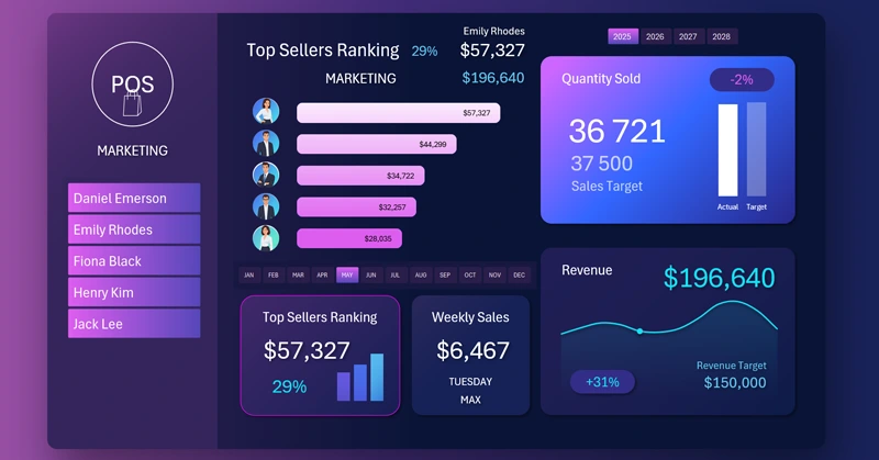
Salesperson Revenue Ranking
At the center of the dashboard is the main chart for analyzing the most effective sales team members. The ranking list is sorted in descending order. The higher the revenue, the higher the ranking. This block contains one of the main controls for selecting accounting periods when retrieving sales history data. It allows you to filter data by month, quarter, half-year, as well as peak and off-season periods on the dashboard.
At the top, the leader’s revenue is shown both in absolute value and as a percentage. For example, the image shows a relative value of 29% - this is the share of total sales generated by the top performer. These same metrics are displayed in the corresponding KPI card:

When switching between other dashboard screens, these important revenue metrics will always remain visible on the KPI card.
The card also includes a miniature bar chart in sparkline style - not just a decorative element, but actual ranking values for the top 3 salespeople. From the mini chart, we can observe the leader's gap from the two next-highest performers. In this example, the ranking is fairly evenly distributed, but sometimes anomalies appear in different months. In such cases, a detailed analysis is required.
Interactive Dashboard Menu with Salesperson Photo Highlighting

On the left side of the dashboard, there is a menu for switching between salespeople. It’s not a typical menu, as you can select multiple items or even all at once by holding the CTRL key on your keyboard.
When a salesperson is selected, their photo appears in place of the dashboard logo. If multiple or all salespeople are selected, the logo is displayed instead of a photo.
This multi-select menu allows you to analyze one salesperson, an entire team, or a subgroup of salespeople. The Excel dashboard provides different data slicing options from the same dataset for the most efficient analysis.
This smart menu was implemented using standard Excel tools: PivotTables and slicers - without any macros!
MS Excel offers the best value for analytics and calculations.
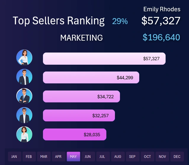
Weekday Revenue Analysis
Clicking on the KPI card for weekly revenue brings up a new dashboard screen. The card shows the most effective day of the week and its revenue. On the interactive bar chart, each day can be analyzed individually or grouped. Use the X-axis buttons labeled with days of the week. This control element is local and only affects this screen - not the entire dashboard.
At the same time, you can still use global dashboard controls on this screen to select months and years. You can also select a salesperson from the main menu to see which days they perform better or worse, helping you determine their optimal days off based on statistics.
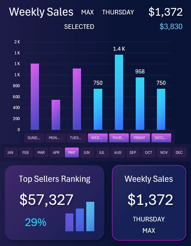
Monthly Revenue Trend Analysis
Switching to the next KPI card brings up a new dashboard screen. Here, we analyze changes in revenue volume across different months and years. The revenue target level is also shown. In the image, it’s $30,000 - the average monthly target for one salesperson. If multiple or all salespeople are selected in the main menu, the data on this screen will automatically update to reflect the correct targets and revenue trends.
This screen helps us understand how top performers behave during active seasons and off-seasons. It also helps identify the best months for scheduling vacations for different categories of top sellers.
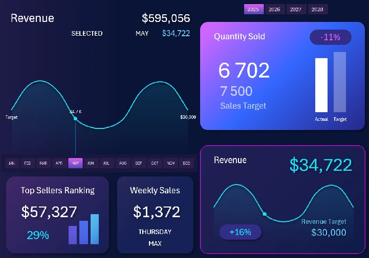
Sales Volume Statistics
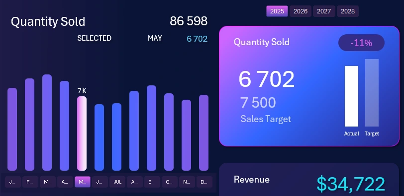
The final screen validates our salesperson analysis. Analyzing the number of items sold is a very important and honest metric. Revenue is easier to manipulate to meet sales targets. For example, a dishonest salesperson might temporarily deposit their own money into the register to hit a target, then withdraw it later along with a performance bonus. That’s not possible with unit sales - they'd have to actually buy the products themselves, which makes the metric more trustworthy.
Here are 3 more reasons why it’s important to analyze and set a product quantity plan, even if you already track revenue:
- Control over sales structure. Revenue can grow due to price increases, not actual demand. Volume analysis shows what’s being purchased and in what quantities - helping track demand in units, not just dollars.
- Evaluate pricing and discount effectiveness. If revenue stays stable but volume drops, prices may be too high. If volume rises while revenue doesn't - discounts may be too aggressive.
- Inventory and logistics planning.
Sales volume analysis and planning help reveal true demand, manage inventory, optimize pricing, and improve forecasting.
Excel Sales Dashboard Presentation
The result is an interactive dashboard for analyzing top salesperson performance across various periods: weekdays, months, quarters, seasons, and years. We can identify what conditions help each salesperson perform better and when - all clearly displayed on a single dashboard:
Download the Excel Dashboard to Boost Sales Team Effectiveness 
Now your sales team will have fewer disagreements and work more cohesively and productively. It also has a major impact on motivation - even more than salary or bonuses.
It’s important to remember: a business owner is essentially “selling” jobs to employees - in exchange for revenue. And it's the most effective people who become the main source of that revenue. Use data visualization in Excel to improve employee performance.

Data Visualization Charts for Interactive Report Creation in Excel.
Dashboard Templates