Excel Dashboard for POS System Salesperson Reports
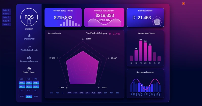
POS system dashboard concept in Excel. The POS dashboard (Point of Sale) helps quickly analyze sales and identify key growth opportunities in Excel. A key advantage of this template is the salesperson filter. This feature sets this dashboard apart from competitors among interactive visual reports made in Excel. With this option, you can segment product data, compare salesperson performance, and identify their strengths or weaknesses.
POS Dashboard Example with Salesperson Filter in Excel
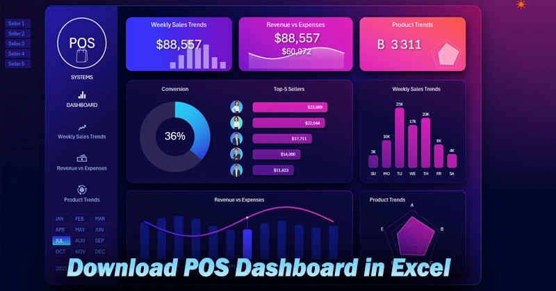
When multiple employees manage sales at a single retail location, it’s important to quickly assess who generates more profit for the store. That’s why the POS dashboard includes a salesperson filter and a ranking on the main screen. Now you can analyze each salesperson’s performance in context with the store’s overall sales picture. Moreover, the filter is implemented using pivot table slicers. This means:
- You can select a group of salespeople by holding down the CTRL key while clicking the buttons.
- Identify the weakest link in the sales department.
- Model scenarios: what if the worst-performing salesperson is let go — how would that affect overall sales? How much would you lose and save?
Now the performance of your sales team is fully under control. Sales history audits help detect bottlenecks in small businesses. Every piece of feedback to employees will hit the mark. Your rewards will be fair and well-founded.
KPI Cards for a Retail Location

The dashboard header contains KPI cards showing final sales performance metrics. Each card also functions as a menu button to switch between dashboard screens. The KPI cards include the following elements:
- Category title.
- Summary values.
- Interactive mini-charts in sparkline style.
The interactive sparklines clearly show a summary of the corresponding dashboard screen. When changing the dashboard's data selection parameters, the sparklines in the header update automatically to reflect the current values.
Salesperson Data Filter

The salesperson selection filter buttons are located to the left of the header and the dashboard logo. When switching salespeople, the logo is replaced with the selected employee’s photo. If all or more than one salesperson is selected, a logo is shown instead of a photo.
Top 5 Salesperson Ranking
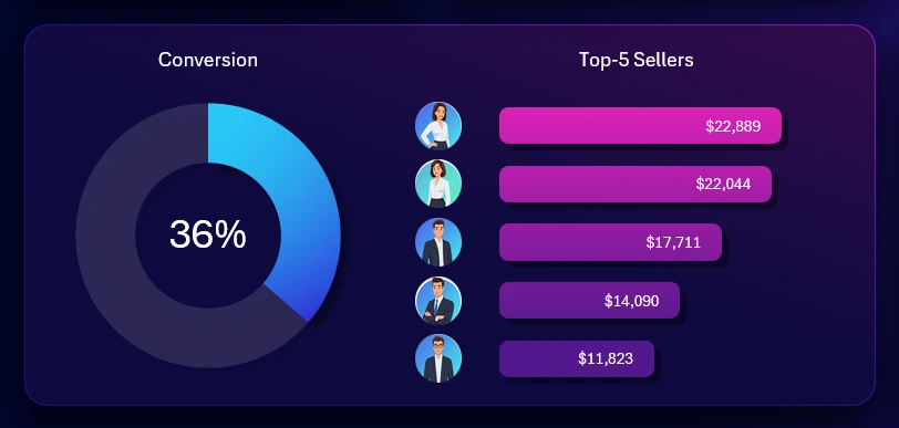
The main visualization block in the center of the dashboard shows the ranking of the top-performing salespeople by revenue. On the left, an important metric shows the conversion rate of visitors to buyers. This metric reflects how effectively salespeople engage with customers. High revenue doesn’t always indicate excellent salesperson performance. If the conversion rate is low, it might be a statistical outlier—possibly due to a few large clients. Manipulation is also possible: a salesperson could add personal funds to the register to artificially meet the sales target.
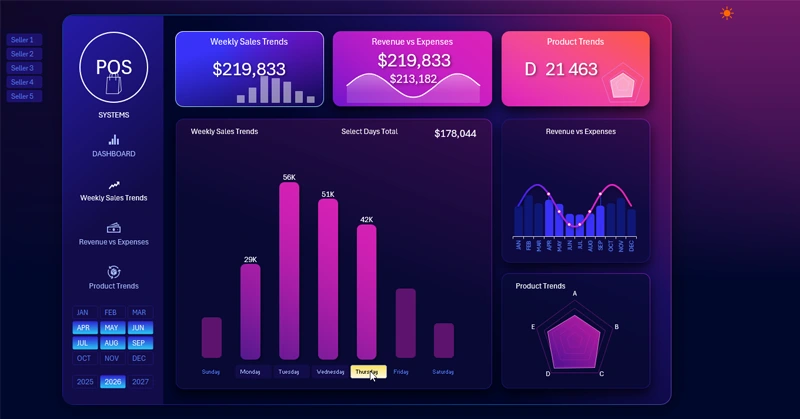
Most Active Days of the Week for Sales
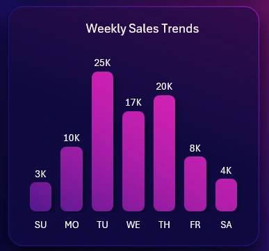
On the right is a bar chart that analyzes sales activity by weekday. When the dashboard screen dedicated to this metric is selected, you can conduct a more detailed analysis. Additional options for filtering and segmenting revenue by weekday will be available there.
Revenue to Expense Analysis
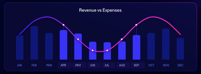
This is a very important analysis of the relationship between revenue and expenses. The visualization block includes a data slicer to switch between months. You can select multiple months at once to analyze different accounting periods: quarter, half-year, or seasonal trends. For example, the chart shows data on revenue and expenses for Q2 and Q3 during the off-season—low-activity period. A detailed analysis with absolute values for expenses and revenue is available on the corresponding dashboard screen.

Top Selling Product Trends
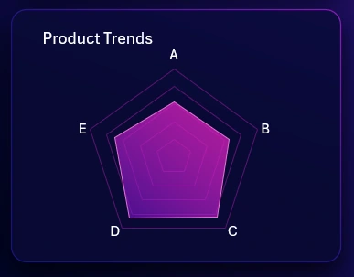
My favorite radar chart shows which product categories are most favored by customers. In this case, the image displays a well-balanced distribution of sales across product categories, which is quite rare but commendable.
It’s clear the retail location is performing well. After all, the biggest issue in retail is unsold inventory. Some stock is necessary and should be accounted for as a separate expense. However, having too much stock indicates poor assortment planning. If there’s no stock at all, it means customer demand wasn’t fully met and the store lost potential profit. Retail can’t function without inventory. But excess inventory ties up cash, occupies storage space, and becomes a loss when expired.
Detailed interactive analysis with absolute numerical values for units sold per product category is available on a separate dashboard screen.
POS Dashboard Template Presentation in Excel
Overall, I’m very satisfied with how this dashboard turned out in terms of functionality and value for small retail business owners.
Download POS Dashboard Template with Salesperson Filter in Excel 
You can expand the dashboard with new screens. The most important part is that you already have the base, and don’t need to start from scratch. When you download the dashboard template, you’ll enjoy its light design version — perfect for daytime use. The clear style has a more refined color palette and a business-oriented layout. It’s always great to have options.

Data Visualization Charts for Interactive Report Creation in Excel.
Dashboard Templates