Create Infographic Charts from Excel data template
The standard Excel chart builder allows you to create interactive infographics. All you need to do is to decorate the rows of chart data with pictures. After that, each decorated chart should be combined into a single thematic infographics composition and grouped.
Interactive infographics in Excel without using macros
Infographics is the art of translating numbers into meanings. It is an entire section of data visualization that can be effectively applied to attractive presentations. Thanks to infographics, cold calculations turn into emotions. That is why experts in the field of infographics can not replace artificial intelligence, neural networks and other most powerful modern automation systems.
Let's consider a concrete example of how to turn ordinary numbers into laconic meanings with emotional background using Excel. Let's assume that we have 6 final relative values of the level of filling of assortment basket of different product categories:
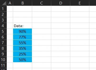
Let's create the initial data of the chart to present the first indicator:
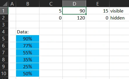
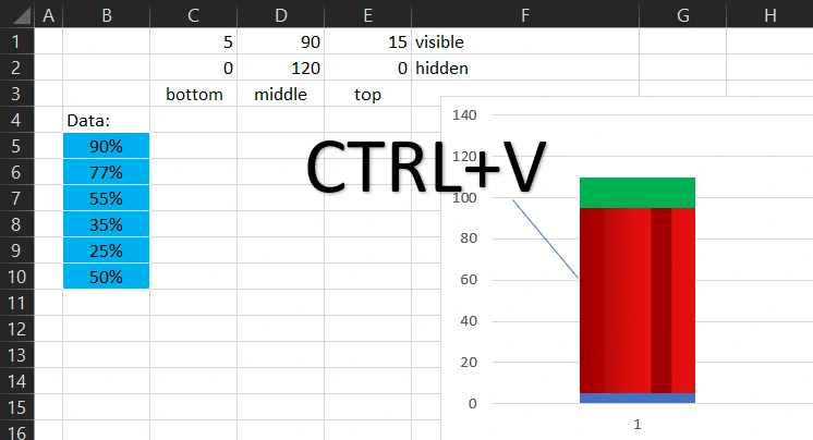
The initial data consists of two rows of 3 numbers. The first row will be visible and the second hidden, and it will be used to correlate the size of columns on different unrelated Bar Charts. In order for each chart to have the correct column sizes, they will all have their hidden columns with the same raw data for the correct ratio of their sizes. For hint, each row of initial values of the future chart is signed "visible" (C1:E1) and "hidden" (C2:E2).
We select both rows of source data (C1:E2) and select the Insert-Charts-Histograms-Histogram with Cumulative. Important moment! In the diagram builder should use the Row/Column switch, so that we end up with a chart with 2 columns of 3 rows of data, rather than the opposite, as Excel suggests by default:
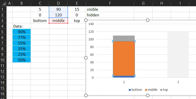
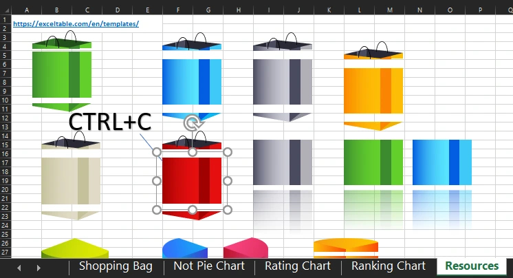
The hidden column is immediately painted in a transparent fill by selecting the "No fill" option. The middle row of the visible column is selected for decoration by a vector figure that is on the "Resources" sheet with a whole set of vector figures:
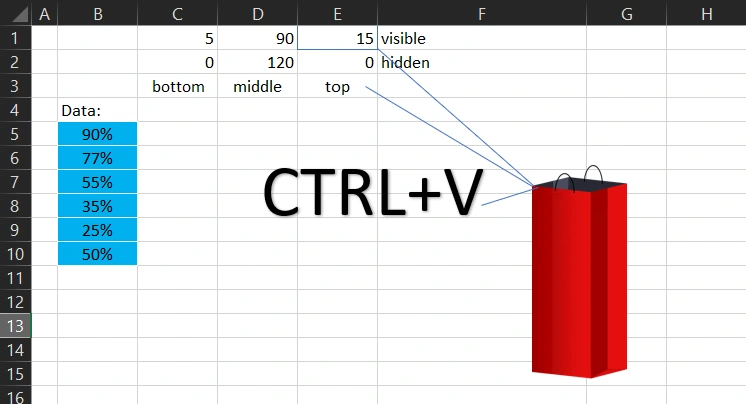
Note that each set of shapes consists of three parts: bottom, middle and top. So we copy and paste accordingly with the CTRL+C and CTRL+V combinations. The middle part to the middle row, the bottom of the set to the bottom row of the chart, and the top to the top:
Next, make a transparent background, remove the background border, remove the grid and X/Y scales, resulting in the first interactive infographic element in the "Shopping Bag" style:
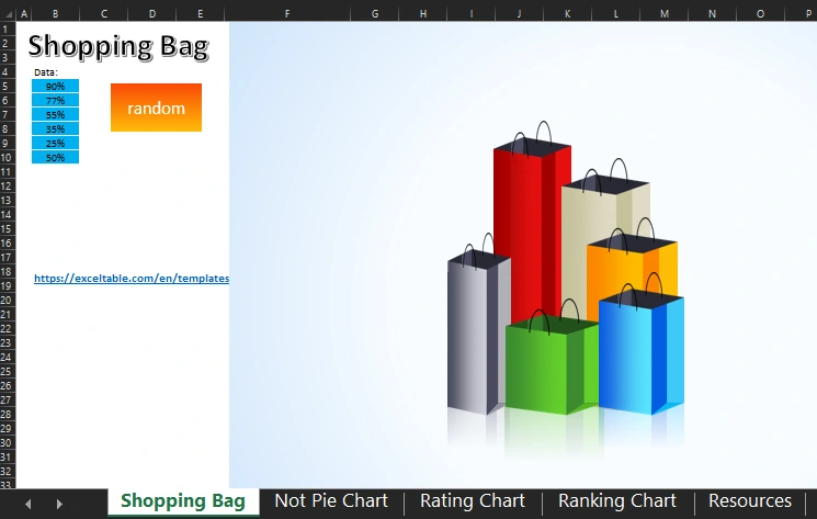
Then do the same with the remaining values and create five more charts in the same way:

As you can see in the figure above in the composition of infographics were added to the background design and mirroring of bags.
Similarly, you can create other stylish data visualization elements, adding positive emotions to boring reports. For example:
- Ranking chart for data visualization.
- A ranking chart for data visualization.


Download the file below to work with all of the above examples and understand the principles of constructing a beautiful data visualization in Excel with the ability to design and combine charts:
 Download template of creating Shopping Bag infographics in Excel
Each example in the file with chart templates for infographics and data visualization is on a separate sheet. And also there are all the sets of vector figure groups used. The most complicated figures were created in MS PowerPoint program, because there the figure editor provides wider possibilities than in Excel.

Data Visualization Charts for Interactive Report Creation in Excel.
Dashboard Templates